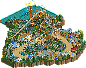
Park / Chimera
-
 12-June 07
- Views 1,077,364
- Downloads 704
- Fans 1
- Comments 1,093
-
1 fan Fans of this park
-
Download Park
704
-
Tags
Community Forum Software by IP.Board
I have judged, im waiting on my helper judge now. Expect the results in about 2-3 hours.
This'll be a depressing round...
It was just beautiful!
Best B&M
Maybe our best round yet as all the entires were strong. In the end the impressive and childishly named Peeee gets the win. Peeee's Chimera entry packed the strongest punch layout wise and the rest of the entry was also very nice. Painfully someone must come in second and this time it's Deanosrs. His Oberon entry was like something Twisted would do in LL. The atmosphere and weird buildings were great, as was the peep friendliness and the layout was also decent. What killed this entry was the bad landscaping. We hope you try again Deano. In third place is Levis, an im calling it now: Best Hack. Ever! How you did that will be a mystery to the community for years. However as amazing as the hack is the rest of the entry just did not stand on the level of the top two. In forth place is Zodiac with Endreau, a pretty nice entry, but I really disliked the 100% tree theming, you need to work on your theming a lot. LL makes a showing again this round with the Black Hole by OLE. Very nice work on the theming, but what hurt you was Pyro's thoughts the layout and architecture. In last place is Alien Invasion by dr dirt. IMO this is the best last place entry so far as it had some pretty nice stuff like the station buildings and big green Alien face, but even tho you did try to bribe me with porn you place last. Also a big thank you to PyroPenguin for helping me judge the results. See you guys next round...
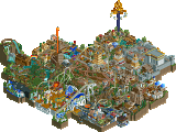
1. Chimera by Peeee
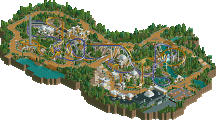
2. Oberon by Deasosrs
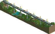
3. Lord Straken Tael Riverine by Levis
4. Endareau by Zodiac
5. Black Hole by OLE (LL)
6. Alien-Invasion by dr dirt
(All entires are in 1 .zip file. The two RCT2 .DAT pieces are needed to open Levis' entry.)
Next round is Adventure Rides!
Preliminary Rounds - Due Date:
FK+Coastermind Created The Best Bridge (May 14)
J K Created The Best Water Ride (May 21)
Geoff Created The Best Inverted Coaster (May 28)
Ling & Vekoma9 Created The Best Wooden Coaster (June 4)
Peeee Created The Best B&M (June 11)
Create The Best Adventure Ride (June 18)
Create The Best Dueling Coasters (June 25)
Create Any of the Above, a.k.a. "The Bonus Round") (July 2)
Wildcard! Create anything you want (July 9)
Hunt for the Bonus Spots!
The following is my list of who is in the lead of the race for a bonus spot:
1. Levis
2. 5Dave
3. Deanosrs
4. Panic
5. Xin
6. Lucas92
7. OLE
8. Fisch
And I'd love to know your thoughts on the architecture Pyro. I can see where you're coming from on the layout but I think you missed the point of it maybe?
Congrats Peeee, and to all the other contestants. As soon as I install LL I will download all of them and take a look...
I will take a look at the other entrys soon.
congrats to my fellow majesty member for winning
Alien Invasion- I actually had this at #4, you showed flashes of brilliance with some great themeing. The crop circles, alien head, and saucer were all top notch. However, it was tiny, and the layout was about as simplistic as it gets. You have some skill, just work on expanding your scope a little.
Black Hole- For me, this just didn't click with me. The layout was decently solid compared to Alien Invasion, but still a little unimpressive. I wasn't a big fan of the vertical hill after the first drop, or the way it transitions into the triple loop from the break run, both could have visually been a little smoother. The colors is probably what threw me off the most. The buildings are covered in grey, yellow, light blue, and red, then you have the colorful flowers, and scenery... nothing seems to fade into the background, there is no base. And that makes it look very chaotic. I like the idea of trying to open up the buildings so you can see inside, but if you do that, make sure something worthwhile is inside. The building forms were also a little simplistic. With LL these days it seems to impress you either have to capture the nostalgic simplicity of older parks, or go crazy complex and make the game rival RCT2 in complexity via hacking (see Busch Gardens San Simeon). This didn't really do either, it lacks the charm of older work or the complexity of the most recent LL parks and ends up feeling a little like something we have seen before.
Endareau- The pacing was excellent, and the overall layout entertaining, but there could have been more interaction. Overall there was really not a whole lot to hold one's attention. Architecturally it was solid but nothing was overly eye catching, especially with such a neutral color palette. Then the rest of it was trees and waterfalls. Next time consider working the coaster a little more into the landscape, so it doesn't feel like it was just planted onto it, but rather integrated into it. With all those waterfalls everywhere I was surprised to see the coaster didn't play with them a little more to take full advantage of them.
Lord Straken- That hack was just incredible. You could watch that baby go all day. However, after that, the coaster is about as boring as they come. With the size of the ship I really wanted more detail, for it to be much more intricate. As is, it comes across as a little blocky and and overly simplistic. Your hacking skills are unmatched and if you can find a way to develop a little more atmosphere you will be downright scary to have to go up against. Because the hack gives you the wow factor you need in contests like these, but you have to have the quality with everything else to seal the deal.
Oberon- It was a hard debate between the last two for first and second, and you can blame me for this one deasosrs. Yours showed a lot of creativity and promise, and was very different which made it stand out. But I felt like it lacked focus on certain levels, you just couldn't tell what was going on. The biggest throw off was the plateaus of grass with wood sides.... what was up with those? I just could not figure out the theme. The inverted covers over parts of the track also seemed to hurt more than help I think. At minimum, they probably should have been painted a different color than the track just to differentiate. I really love those lamps though. In the end, I think what settled the argument between the two was the layout of the coaster, which was good, but not standout. Overall a very nice, original entry. But focus it more next time, make it more visually interpretable.
Chimera- A very technically strong and charming entry. The layout and landscaping are both very well done. The coaster really won it for you, just a joy to watch. It is a very fluid design that flows nicely throughout, has great pacing, and interacts very well with itself. The landscaping is done nicely as well, great use of small rock cropping and a nice foliage mix that really adds a lot of character to the entry. I particularly like the area around the queue, how it flows through the rocks and under the covered sections, all with a quaint little waterfall nearby. Some of the buildings, particularly the station's were standout, but overall the architecture was a little subdued. Nothing was overly interesting to look at. And while this creates a nice village effect because you take the buildings as a whole rather than individually, I would have liked a little more to dive into. Not an overly original entry which prevented this from being a complete slam dunk win, but everything else was so solid that it still manages to nudge the others out.
Although I felt you rushed your entry ever-so-slightly (i.e. Entrance/Exit paths), you pulled off your goals well. The concept you had going was really cool. All the little things you had (BBQ Grill, black tiles), and all the big things you did (Buildings w/ touches inside) were really fun to look for. I do agree with Pyro about the colors being somewhat chaotic, but I think that mostly comes from the foliage/flowers.
Overall, I liked it a lot, man. Congrats on your first 'finished' work!
Next was dr. dirt's entry.
Theming was excellent, but I have to agree with Pyro on the layout.
Peeee's came afterward.
Wow. That was so elegant. The theming was not spectacular, but it wasn't supposed to be. The archy was really good, and the feel it gave off (Especially with the flat rides) was excellent. The layout and supports were great too. There wasn't much I didn't like here, other than the Medieval music.
Then zodiac's.
This was quite a surprise. You've improved a ton. There were still some bad things however. Firstly, too many trees, a-little-too-jagged landscaping, and too much flat, boring water before the waterfalls took away from the natural beauty. The archy was nice, though too gray/tan. The shooting range and gladiators were cool, but there was no way to get to them (Yes, I see the tan ground represents a trail, but how do you get to the trail?).
And the [stand-out] goods. The shrine was really cool, as was the entry area. The layout, contradictory to some other layouts of yours I have previously seen, was very graceful, with the exception of a missing MCBR.
Very nice, 'breakthrough' entry of yours.
And Levis' entry:
I'm speechless. Completely brilliant, massive, fantasy... It's amazing. The pacing was a tad slow, but I loved it nonetheless.
Finally, Oberon.
I think, although I loved Peeee's entry and am happy my fellow Majesty mate is in the finals, that I'll have to say Oberon should have won IMO. Amazing archy, atmosphere, layout, interaction, you name it. Oberon had it IMO.
Edited by Gwazi, 12 June 2007 - 01:44 PM.
I actually prefer Deano's entry to Peee's.. Layout and pacing wise it was quite even, but what clearly cut it for me was the coaster theming.. Deano's was clearly better themed, where the coaster's going through some amazing architecture and scenes that all contributed to the overall experience of the coaster.. Peee's was just a layout placed in a landscape.. Also, while I disliked both landscapes, I once again prefered Deano's to Peee's.. I assume an Oberon theme fits a burned out kinda landscape, and while bare it kinda suits and doesn't bother me as much as Peee's confusing overwhelming landscape.. The foliage in Peee's isn't really appealing to me with all those randomly placed flowers and bushes.. Deano had a better placement and selection of his foliage imo..
Another difference I noticed was that Peee's supporting system was way better than Deano's.. Deano's was pretty incosistent with at some places the old way of custom supporting and at other places still the original supports visible.. That was really my only major gripe with his entry.. I think Deano deserves more to go through than the woodie round where you gave 2 persons with a less quality entry access to the PT3..
So in short the theming cut it for me.. I assume Peee's was themed to Greece, yet it didn't really remind me of Greece.. I thought Oberon was better themed as the king of shadows and fairies.. I also felt it had a better atmosphere..
Furthermore I think Levis earns a spot only for making the first working Thrill Lift in RCT2
It's really amazing to watch it work, and must've cost you a lot of time and effort to figure it out and to create the custom scenery rides necessary.. Amazing job! I think the idea and execution of your entry could've been a bit more elaborate, but I understand creating the Thrill Lift alone already cost you as much time as creating the #1 entry.. The other RCT2 ones didn't really do anything for me.. I enjoyed watching them but the quality on the other entries just was at another level..
Didn't have a chance yet to view yours OLE, but I will once I find my RCT1 disc
SF
ALIEN INVASION:
Too small to really count for anything, could have used a little more substance and a more well-thought-out layout to the coaster, but it was interesting to look at and held my attention for about ten minutes. Just keep trying, dr dirt.
BLACK HOLE
I really liked all the hacks involved with this entry... the originality of the buildings and the way you used those vertical supports from your tricks topic. While the triple loop seemed... off, I suppose, the rest of the ride I thought was well done. And I've tried the maze trick, I know what a pain in the ass it is to do, so I respect all the work that goes into that. I personally think this entry should have been higher on the list.
ENDAREAU
Nice and quaint... the buildings were nice and the ride was very well-done. However the waterfalls and all those trees kind of killed it... Not bad but unfortunately not great either.
LORD STRAKEN TAEL RIVERINE
The boat was awesome... the thrill lift was fucking crazy (although the little tidbits like the cars turning up and down and the way they were off by a bit is something no one can really avoid, but were almost annoying) and I can't imagine the amount of work it takes to do it. Great work on everything else, although the coaster looked like it was really trying to rely on the boat and thrill lift to get it a high-ranking spot.
OBERON
I really liked this entry... and then I really disliked it. And then I liked it again. The marketplace look really served the ride well, and the details on the buildings looked cool. But then as I watched the ride, it looked very unfinished... I'm not sure if it was intentional or not, but there was seemingly too much empty space. And finally I looked at the whole thing overall, the hacks (all the 4D track, all the inverted track) and how everything flowed and it turned out to be a very nice entry. It's just a the right spot in this list.
CHIMERA
Hmmm... now, despite this entry's small size, the archy MORE than makes up for it, because there's a lot there, and it all looks nice. The support-work was for the most part spectacular, although some points annoyed me (whole sets running into the ground without footers when footers would have fit) but it was overall very good. Also, the coaster had a nice (albeit a bit common) layout and ran well. Congratulations.
The other side of things is, LL and RCT2 operate at different scales. You know that by using LL, you are putting yourself at a disadvantage to an RCT2 player when it comes to smaller scaled items because RCT2 can build at essentially 4 times more detailed levels than LL because of 1/4th tile pieces. Which means that your entry would have been far superior had it been done with RCT2, because it could have been more developed. So why try to use one game's weakness (lack of small scale) as your selling point when going up against entries from a game where that is it's strength? LL does certain things very well, it creates great atmosphere is used right. I felt your entry lacked a lot of atmosphere.
Now I'm not saying it was a bad entry, I just think it fell a little short stacked next to the other ones. You had some great details, the black hole pathing, your interiors. But overall, I don't think the details helped to develop the entry at all, the details didn't define it. And I understand if this was experimenting with a concept. It could be a promising concept if you work with it, and it is always encouraging to see new ideas in the works. But my job was to judge the entries and place them in order, and that meant comparing the other entries to yours. It has nothing to do with having high expectations because it was experimental, it was simply how your entry related to the others. If you look at them, in my opinion, Chimera and Oberon really stood out above the others and were instantly the two to debate between for winning. Levis' hack was incredible, and something as innovative and difficult to pull off as that deserves to be up there, but the overall quality of the rest of the entry holds it back from being the best coaster. So that instantly puts your entry in the bottom 3 just based off of shear strength of the other entries alone.
Now, lets look at your entry next to the other two. Alien Invasion was my number 4, and you can draw a lot of similarities between the two because of ballpark theme similarities (space) and same coaster styles. Your layout wins hands down, your entry was much more developed and the coaster was more interesting. However, the Alien Invasion entry went beyond just a simple generic space theme, and had the theming to back it up. It is presented as an alien invasion, so there are flying saucers, crop circles, and aliens. To me, this makes the entry more thematically developed because it has some sense of place and story. And for me, that is the essential end all be all thing I look for in parks, I like to see stories, purpose. So while his was smaller and the layout wasn't as good, I felt the details and development of the theme beat yours out.
That would leave it between you are Endareau for fifth place. And this one will get you into the controversy the community went through right when RCT2 came out. RCT2 is much easier to do right. There is a significantly lower learning curve with RCT2 where stuff just comes out looking better with less effort. So while I think you were stretching the limits of LL far more than Zodiac taped into the potential of RCT2, his still resulted in a nicer looking product. And there has always been plenty of argument on how to judge the discrepancy between the two games, but I personally judge them on even ground. I am not going give someone bonus points just because they choose to use LL. I think LL can still very much compete with RCT2 if done right, and I happened to find Endareau more visually appealing than Black Hole. I thought the layout was better and the architecture a little stronger.
So please do not interpret this as me hating your park and wanting to put it down in any means. You didn't come in last place because yours was awful, you came in last place because the overall level of quality was high for this round and I thought the other entries were better. And do not let results like these discourage you from trying new things, because it wasn't the new thing that held you back but rather the overall quality of everything else. You need new and innovative ideas to turn heads as an LL parkmaker, especially now. And, I really don't want you to feel like you got screwed judging wise, so if you still want more clarification or have any other questions by all means, send me a pm and we can set up a time to chat or something.
dr dirt: A nice little entry from you, however I think you overdid the flowers slightly and some of the supports were slightly off position. I wasn't sure on how you placed some of them. But overall I enjoyed yours
Peee: Woah Woah Woah! The first thing I thought when I opened it was Steve for some reason. This was some excellent work! Lot's of nice little details and an amazing layout, I loved that the most, the theming was just immense as well. I am ecstatic with entry very dapper
zodiac: yours was okay, I quite liked it. Supporting was fine. However the masses of foliage you did, I didn't find appealing to me. Most of the trees had the wrong type of tree trunk and it looked bad, from my point of view.
deanosrs: although i wasn't confident with the brown and the barrels. It was a great entry. Really liked it
OLE: haven't viewed yours yet, can't find my LL disk
As I said before.. on the layout front I agree with you. I'm pretty well... shit... at coasters. I don't understand them or how they work so I obviously struggle to create any type of appealing ride that isn't hacked out the ass. One thing I didn't understand was how you said you wished the vertical hill and transition from the MCBR to the triple loops should/could have been more appealing. The layout is so simple I'm not sure what else could have been done.
And I also don't think it's possible to judge LL and RCT2 on an "even field" as you say. Especially with your system of judging where you purely compare entries. And going in with the thought of "LL has a disadvantage, tough shit" isn't something that I agree with either. Obviously I was going against rct2 on its strong points but that pure comparison just leaves almost no chance whatsoever to "new" inexperienced LL players like me which is what I meant by high expectations.
A deserved winner. I told you already I really like this coaster. the lay-out looks very nice to me, the only real complain I could make about it is that the last brakes are really hard ... maybe you could have set those a bit else. The archy looks really nice to.
One of the problems you still have is that every building you make is made up in the same way. everythink is just a block of the same walls with some windows and some awnings etc. this isn't bad and it does give a nice atmosphere, but maybe you could try to use some more decoblocks etc. try creating a balcony with some blocks to break up the shape of your building, or give your building a diagonal wall to give it more.
I personally thinks the foilage is to mixed up and doesn't look that nice ... but it seems that my interpatation of foilage isn't what the other think about it so I will shut my mouth about that....
The supporting of the coaster was nicely done and the lay-out of the path's was good to.
All in All a really fine entry!
Oberon
One thing I notice instantly in this entry is that I can't find the trains .... you've got one hell of a coaster but it's only operated by 1 train .... if you can't select more trains with the contitieus circuit mode you could try to add some blockbrakes to add more trains or maybe putting the operating mode to boathire will increase your amount of trains.
I'm probally not long enough in the international community to understand that this entry has a certain historic value .... cause I think the archy wasn't that good, the buildings really lacked colors. You did try to make some nice things with poles and stairs, but most of the buildings are just plain ...
Also when I first openened the park I tought it wasn't finnished....the last parks I saw didn't have large amounts of land without foilage ... I always liked to see a bit of land but this was to much for me ... I would have liked a bit more foilage or ways you could have added some water.
The coaster goes really fast trough the circuit...maybe on some place a bit to hard (like the barrel roll)...but overal this was also a nice entry, maybe I would have placed it above my entry but I think it's still a deserved seccond place.
Lord Straken: Tael Riverine
Let me tell you a little bit about my entry:
like most of you know the thrill lift hack isn't new, I made it in fantasy to. I just wanted to make a large flying ship in rct2 once and tought I could use this hack. Because I figured out how to make this hack already it wasn't that hard. I tried to improve it on some point but most of the improvements didn't work. For example at a certain point I had merged a coaster so that it went from vertical track to horizontal track instantly. When I used the contrustion screen and used the arrows to go to the following track piece it worked, but when the coaster reached the point I got an error trapper.
The idea behind this park was based on the novels of Terry Brooks. In his novels there is a world which is populated by Demons, this world is called Jarka Ruus. The Lord Straken of this world was called Dagda Mor, but after a failed attempt to enter the real world he was killed and the new lord Tael Riverine stood up. You can see this in the park to because there is a person called Dagda mor walking somewhere on the ground.
In the novels you go to the demon world by very special magic ... in these books they used Airships like thisone to gather this magic ... so the idea behind this park is really that this ship is on his way to Jarka Ruus now.
It flying over the land to a place where it can go to the other world.
The coaster goes trough the ship and resembles a crew member who must check the sails, and check the supplys and also sometimes need to see if we're still going in the right direction .... all this is featured in the coaster.
The ship self has indeed not so many details ... I couldn't really find details to use...maybe if I had some more time I would have tried but for now I was satisfied with this,
Endareau
This coaster has also high stats ... seems like it's good now to keep the stats just below red.
The lay-out of the coaster looked nice but I didn't care for it very much ...
The archy was nice but not very special. you use only two or three dull colors to make your buildings. Try to use at least one brighter color to highlight the details you maken.
The foilage I really didn't like .... it's not bad to use a lot of trees ... but at least try to make some ground foilage to than to break it up a little bit.
Black Hole
Sorry no LL
Alien-Invasion
this was a nice small park.
Altough I must admit the colors didn't really appeal me and the cropcircle you tried to make didn't really work for me.
you've got the same problem as me... you want to make everything as compact as possible ... if you do that you will notice that a solo park will take ages to complete so try to make your coasters and other things a bit larger ....
some more foilage isn't bad.
tough still this park wasn't bad at all and had some nice things