Park / Rangda
-
 27-December 09
- Views 5,991
- Downloads 750
- Fans 2
- Comments 24
-

-
 77.69%(required: 65%) Design
5dave 85% CedarPoint6 85% Kumba 85% Fr3ak 80% inVersed 80% posix 80% Six Frags 80% ][ntamin22 80% chapelz 75% geewhzz 75% Nokia 75% SSSammy 75% zodiac 75% Ozone 65% nin 60% 77.69% -
2 fans Fans of this park
-
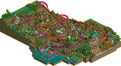
Full-Size Map
-
Download Park
750
-
Tags
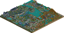
Recently, the Place-to-Release-Your-Parks Land has been swamped with the release of unfinished projects. Unfortunately, some of these projects have been from robbie92, the exceptionally talented member that has shown amazing promise with his several releases, including a design and two great parks in H2H5. He had also been receiving the reputation of posting too many screens, and then not finishing these projects. Well, no more will robbie92 travel this path. He seems to have gone a new route, and is now pleasantly surprising us with projects showing up on the front page, instead of screens in the advertising district. Here is Rangda, robbie92's newest finished design! Read On...
robbie i love you
It just lacked an immersion to put it on the level of a Kindred, Fenrir, Wildcat, or El Encierro. At least in my opinion
My expectations for you are set high and I know you can reach them
I still like it, there was just obviously something missing, which I feel is the "wow" factor.
good.
As for the drop, CP6 hit it on the head. You don't need something large to gain speed. Besides, imo, what would make this fun is the fact that it gradually gains speed until it hits practically the end.
To those who enjoyed it, thanks! For those who didn't, well, don't put such high expectations in me...
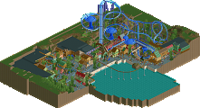
And please, take a look at it in-game before you comment. Overviews won't do anything justice.
That being said, I actually liked this quite a bit, which is funny because through the maelstrom of "Robbie you are a God" comments, I've never really been blown away by your stuff. Don't get me wrong, it's always been nice--just too over-detailed. Now you release this, everyone seems to be dissappointed, and I'm actually pretty pleased with how nice of a design this was. The layout was a lot stronger than I expected given the comments. While I'm still getting bored beyond all reason with B&M designs, this one was unique and held my attention for a good amount of time. The only thing I really disliked was how fast it came into the diagonal break run. If you want to give the illusion that there are actually breaks there, the train should probably be going a bit slower lol. But as for the layout, I thought it was really good.
As for the surroundings, though, it was all just okay. I know designs should be all about the layout, but lately atmosphere along with additional rides, etc. have been really important in the scoring. To me, this was just like a little brighter version of Kindred. I did love that waterfall though, and your architecture is always pretty nice, although I still do think you over-do things sometimes. Oh well, probably just personal preference.
And I guess I'm with Comet here. Hard to point out too much wrong when I don't think I could have done any better. Nice work man. The revolutionary design people unfairly expected you to come up with? No. One of the stronger designs as of late? I would say so. Congrats man. I'd say 15/20
unfortunately it's quite unfair to do this which is why i never jumped on the i love robbie bandwagon and so i found that i was able to enjoy this.
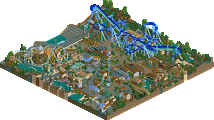
+ Fantastic details here and there
+ Good colours
+ Good landscaping/foliage
+ Very positive atmosphere
- The layout had too many helices
- Last cork was too fast
- I think this would work better in a park-context
- Not much cohesion between areas, it's almost chaos
- Would've loved to see more of those custom trees
Overall this was average design. The atmosphere was the highlight and chaos the biggest flaw. This was your best release yet Robbie, and I know you can do a lot better. Just don't force too many styles in a too small map and make it flow! (and finish it)
15/20
I cannot wait for your next release, I know it's going to be good whatever it is. Congratulations, thanks and good luck on future projects!
I thought the desugn was good i liked some parts but there was some messy stuff in there, mailny the supports and the coasters intensity.
Personally I liked the french theme you were originally going for. This theme just didn't go all the way for me, it seemed a bit flat-faced. The ideas were all tghere and I knew what you were going for, but the overall atmosphere didn't come together.
in:Cities: Thanks man! I'm glad you enjoyed it.
Cena: I wouldn't say that this was that "overhyped." People seemd to expect me to make something like my more recent stuff, i.e. cleaner, more realistic work. As for the overdetailed mess from the overview, please at least look at it in-game before final judgement. You can't judge a release by it's overview. I'm sorry it wasn't "impressive," but next time, don't expect for perfect RCT to explode out my ass every time.
Comet: Again, the expectation thing bugs me a bit, but I do understand what you're getting at, and I can see how it's not that immersive. In fact, after sending it in, I regretted it a bit, but a release is a release, and this was a learning experience. The next projects of mine should be better.
Luketh: See above, and CP6 got it right with the whole drop thing. Sometimes trying something new may shock some, or some may not understand it, but it still gave it speed, so it worked.
CP6: I agree with a lot in there. You are right w/ the landscape and Nemesis connections. About the multiple temples, I contemplated it, but figured it would come off too much like Bayon Falls, and get too repetetive. Plus, that station was a pain, and a lot of time went into it, so the other building were made different to help me keep my interests up for this. Also, thank you for all your help in this with your testing!
Gwazi: Thanks! Always glad to hear from a fellow Cane!
Zburns: Thank. You. That post might be one of my favorites in a while. That "God expectation" you mentioned has really thrown me into a loop after this. Although I think the whole god thing is taking it far, I admit that my screens tend to be received well, but the project just doesn't live up. I've struggled with this throughout. I was looking at Scarecrow's old voting topic, and someone (no names) made a comment on how people "creamed over the screens, but the finished product left [them] dry." I can't seem to escape it, unfortunately, and it's gone even to this project. As for your comment on the design, I'm glad you liked it, and I'm glad you understood that I wasn't going out to create the next El Encierro; I just wanted to finish something to let people know that I cna finish something.
SSSammy: Same here. I mean, it's a new release. Be happy, even if it's shitty!
Louis!: I know that you aren't on that bandwagon (and I'll need ot convince you
Liampie: Great post. Although I thought the amount of helices was fine for this, that final cork was a bit speedy. About the chaotic nature, that probably came from the rushing that I did in the last 30% or so of this. Although I don't find it crazily chaotic, I do understand why you foud it that way. However, thank you for the in-depth critique, and I'm glad you enjoyed it.
Chapelz: Thank you! I find it now a little messy, but it fits the them, so I like it.
Goliath123: I don't love you either. Sorry it wasn't up to your expectations, and yes, the intensity was a tad high, but the supports were fine and realistic, so we'll have to agree to disagree on that point.
RRP: Thank you! I'm sorry that the station wasn't exactly up to par, but I'm glad you enjoyed the layout. I wanted something to differentiate it from the plethora of inverts already released.
rK_: I'm sorry you found it "meh."
nin: Yeah, that French theme is something that seems mighty tempting now. I wish I listened more to you and gee about leaving that, but what's done is done; I have a stereotypical asian invert.
Jusmith: Thanks for the wonderful write-up, and I'm glad you loved it!
All in all I'm glad you got this released, it may have some people guessing about your parkmaking ability but at least we know you can finish parks
Plus without releases park-makers cannot better themselves and you can do that every time. It pains me to see projects get released unfinished and it strains someones ability to get better. You however can take this on board and smash it next time as I know you will.