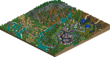
Park / Huntington Thrills Theme Park
-
 05-November 09
- Views 7,495
- Downloads 961
- Fans 1
- Comments 36
-
-
 58.08%(required: 50%) Bronze
Steve 75% Xcoaster 75% 5dave 65% inVersed 65% Kumba 65% zodiac 65% chapelz 60% geewhzz 60% posix 60% CedarPoint6 55% Fr3ak 50% Ozone 45% Six Frags 45% SSSammy 45% Nokia 40% 58.08% -
1 fan Fans of this park
-
Full-Size Map
-
Download Park
961
-
Objects
409
-
Tags
Similar Parks
-
[H2H8 R3] A Year in Winkelheim
![park_4113 [H2H8 R3] A Year in Winkelheim](https://www.nedesigns.com/uploads/parks/4113/aerialt3858.png)
-
FreeRider's Sylvan Realm
-
Canyon Racer
-
A Study in Mountain Composition
-
Atilus Republic
-
Hyatt's Lake Scarlett Resort
Oh, fucking awesome logo, who did it?
I guess Dave or JK?
First off, I think your behaviour is a bit childish, Goliath.
You think the writeup is too short? IMO it was really well written and please keep in mind that the Release Prep team is investing free time for this site so please be thankful.
About the park: I think I rated the park a bit too high looking at it back now. But Bronze is the right accolade for it.
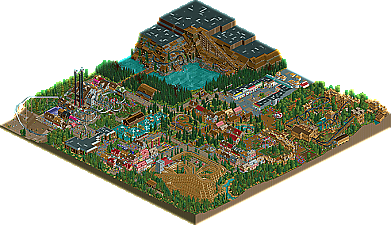
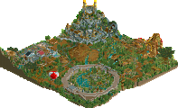
Things I really liked where the mine coaster - while huge it was unique and was done really well. Also the beaver ride was a nice idea, although not executed as good as it could have been. You also did a great job on the custom flats and the invisible entrances and such.
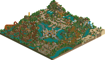
As the others noticed already - I didn't like the copied stuff it had. The Harry Potter area reminded me of the Sweeney Todd area in WOTB, the invert reminded me of X250's african stuff, the entrance area and the medieval area was a rip-off of Canthose valley. It's flattering to me, but really there's not much skill needed to do this, especially when your skill is really not bad!
One thing I also didn't like: Why did you even did that Harry Potter area? No castle, no Hogsmeade, no attraction even named after Harry Potter main characters. You just made a Fenrir Greyback coaster, some Dementor gyro drop towers and a Bellatrix twister... Maybe you wanted to have the area themed after the bad guys... But why no Voldemort? I just couldn't figure that area out - sorry.
I liked the park, but it was too much copied stuff in it. You should work more on individual ideas, and you seem to have nice ones when I look at the beaver thingy and the mine coaster... Please take those hints to your heart.
"MFG"
the foliage sucked, this si a bronze. deflate that big head of yours, youre ridiculously arrogant, gosh.
And it is uploaded here on NE?
Thanks.
Yannik
Anyway thanks for taking the time to wrigh up all the citicism, much appreciated.
Oh, and for a review...
You clearly show that you have skills. Not just anyone can build at the detail that this park has. However, I would like to echo what I said in the AD topic and what others are saying in that this seems to be a rehash of previous ideas, without the execution that made the original ideas magical. Most of the areas seemed ripped from other parks, and very little did I see beyond those ideas. I would cosider this as a WW/TT park: Taking previous ideas and dressing them up differently without improving them, often making them appear worse in the process. I believe that if you take the time to develop some original concepts, like in your first parks like Wisker Lake, you can go far. You clearly have skill, but now let's see some good ideas.
Oh, and the reason why I made the write-up for Zippo's long was because it was the first spotlight of 2009, and a spotlight deserves a long writeup. Also, I don't Steve had time to spend an hour and a half on writing a writeup like I did for Zippos.
The nice thing about the accolade panel is that the votes even out, so you don't have to worry about the low votes. Not everyone will see eye to eye.
Keep up the good work, looking forward to your next submission!
Gee I've sent the logo.
It was a really nice submission congrats on that and good job with the passion and stuff but there is a better way of being more humble. We didn't have to spend time on the write-up or do the logo but we did because you have a good release. Just remember that and your'll be getting more positive reviews.
Just noticed Vince Noir! Mate I've been to see the mighty boosh live!!!!!!! So dam good!!!!
will write some comments later.
when I had the park I liked it a lot.
And at the moment, so are you sammy.
The park had parts where it was great, but it also had it's parts where it wasn't. Bronze was definately deserved here but no higher.
The entrance was one of the weakest areas. Some of the buildings and details were nice but it was completely ruined by the fact that there was no height variation. All the buildings were built to the same height which made it extremely boring.
I don't think i've ever seen in a real life park buildings all in a row built to the same height with the same roofing, it's way too boring and has completely ruined an area that would have been a great area.
Moving onto the invert. Yes the coaster is very much like Mamba Kilima but that doesn't bother me. Of course it is incredibly similar and would have been nice to see the Africa theme done a little bit different but for me, the layout was just awful.
I also felt that there wasn't enough architecture to justify the parts of the coaster that had the building interaction. It seemed a bit funny just having the coaster interact with a few buildings, especially when they aren't even buildings that guests can make use of. I would have thought if someone is building architecture to theme a coaster, they would do it to the whole coaster or do it where the buildings can also be functional as shops etc.
Also why was there tables by the lift hill? Maybe i'm being stupid but how do people get to them? What is their purpose?
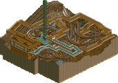
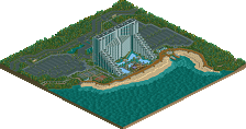
The powered coaster really wasn't that great a layout either. That's something I think you need to work on. Plus the station looked half finished with it out in the open. By all means it's a nice idea to have it all in the open but surely if you can see the platforms you might as well make it look like a station by putting in an operators booth etc, plus it looks like the station of the coaster has just been dumped there, would have made it look more finished if you had tried to conceal the station of the coaster itself.
It's surrounding area was great if you look at the first one or two buildings. After that you've seen the whole area as every building is a repeat of the previous. All 2x3, all around the same height. The only real difference between the buildings is the difference in textures and colours, but apart from that it wasn't really worth looking at all of them. My advice to you is to make each building slightly unique. Attract viewers into each building. The foliage was quite nice but you definately over used the sunflowers and the yellow flowers as well. It is ok to leave some grass showing and not pack foliage into every little area.
I quite enjoyed the woodie's layout. However it's placement seemed to split one area into two halves. Both halves where the same style and same architecture etc, just they seemed very odd to be split from each other. If I were to comment on the architecture I'd be repeating my comment on 5dave's Canthose Valley. So well done for the fact that it's a really nice area with really nice architecture and well done on creating an area that is as fantastic as 5dave's work. But that's just it, it's his work, not yours. There isn't even a slight change of idea to show that you have taken dave's idea (which is fine) and put your own twist on it. But you haven't done that, you've just styled it almost exactly how dave has. I like to be able to recognise the builder of the park without being told who built it as everyone has a different style. Had I been shown this screen I wouldn't have been able to tell you had built it, I wouldn't know who had built it because it doesn't have someone's unique style on it. I know that maybe you're still trying to find your style but other area's in this park show that you still have a style, even if it is a bit under developed at this moment in time.
The station for the woodie was a nice idea, however it lacked execution. The surrounding architecture is so detailed and this wasn't. It made the station look a bit odd. The fences in this area I loved. I normally always build my fences like this now as I love the effect it gives off so well done for creating your own custom fence.
I also like the Screamin' Swing. It was built well.
Moving on to the Harry Potter area. I couldn't tell it was Harry Potter themed. The architecture was built similar to the previous area. The coaster's layout again, wasn't great. However I really liked the station. You have great skill, it's just sometimes you don't use it which is a shame.
One side of Falcon Mines was great. The other not so much. The side that had all the rock texture among the wooden roofs wasn't great. It didn't look right. It would have been better if it had looked like it was built into the rock face, like at the bottom of the 'mountain', but it seemed like some people had come along and put some roof straight down on some rock and left some patches bare.
The other side was really fantastic, the queue was brilliant. The height variation of the building was superb and I really liked how you had removed some parts of the roof and placed the catwalk scenery piece as if they had boarded up those parts of the roof to stop it from leaking. This area really showed off your skill but I do wonder why the whole park wasn't built to this level of brilliance?
Overall the park was a nice park. Definately worth rewarding, however definately no more than bronze. If you want to get higher, next time develop your own ideas a but more or take ideas that have already been done a make them your own.
Also work on your layouts. They are, if not the most important part, one of the most important parts of a park. If the layout is good a lot of the time the theming doesn't have to be all that brilliant to still create some great.
Congratulations on your first acolade. I hope you continue to give NE more, and please don't be offended by anything I've said in this review, anything negative is purely to give you advice on how to make a better park next time.
wow, please explain why.
posix: in private, kthx.