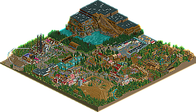
Park / Huntington Thrills Theme Park
-
 05-November 09
- Views 6,845
- Downloads 772
- Fans 1
- Comments 36
-
-
 58.08%(required: 50%) Bronze
Steve 75% Xcoaster 75% 5dave 65% inVersed 65% Kumba 65% zodiac 65% chapelz 60% geewhzz 60% posix 60% CedarPoint6 55% Fr3ak 50% Ozone 45% Six Frags 45% SSSammy 45% Nokia 40% 58.08% -
1 fan Fans of this park
-
Full-Size Map
-
Download Park
772
-
Objects
409
-
Tags
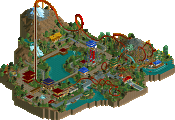
It seems now more than ever that new blood is being infused into the community whether it be in accolades or simply in the New Element forums. Amongst the heavy hitters like Roomie and RCTNW garnering wins, we have seen newer members such as In:Cities and hulkpower25 take home some medals as well. Next up to join them? First-time accolade winner, Goliath123 with his Huntington Thrills Theme Park taking home the Bronze! Read On...
Lowenaldo Offline
Congratulations on the bronze, Goliath123!
It seems a bit repetive in parts but I love the lift of that black coaster. (I can look at this one when I get home tomorrow, have rct2 at home
This is what I said in the accolade forum;
The quality is there, now you need to focus on being original,
SF
Edited by Goliath123, 06 November 2009 - 04:06 AM.
do you leave the grid on? do you apply the land texture smoothing? shit, would you even be daring and show peeps?? or coaster trains
you sit in front of your monitor, you realise these questions are ridiculous, and yet they kinda stop you from aerialing. it's funny.
i like grid though, you know
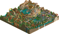
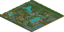
goliath, the park showed great potential and dedication. i got the feeling as if you dived into your own park more than once and had vision when you built it. especially the huge dark ride struck me with this.
overall i would say your ride and path composition could become a little more consistent and planned out so you can achieve better 'interaction' of things.
i'm much looking forward to what you'll do next.
Oh btw, i mapped out the whole Falkon mines layout, the rocks, out door, lift hill everything was planned, and in my opinion was pulled off really well.
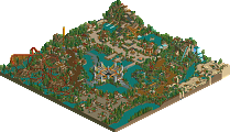
Oh, and Mamba Kilima also is inspired by Black Mamba, so maybe that's why they look alike, but I couldn't help but notice you used the same textures and colours throughout.. Black Mamba does not look like that at all, too (I've ridden it a couple of times so I should know
Mamba Kilima;
Python;
SF
There are some nice areas within the park. The layout of the vertical indoor coaster wasn't to my tastes but otherwise I thought the layouts were good. The inverts layout was nice. I especially liked the finale.
Good work Goliath. Keep it up
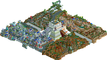
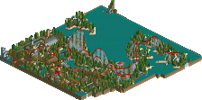
Moreover the theming wasnt well executed everywhere, e.g. the woody
station was really "detail-less".
Another negative aspect was the foliage, which looked randomly placed.
The strong points imo were the good hacks (Custom Flatrides) and the mine.
(+ some of the theming).
All in all I'd have voted 13 (maybe 14).
Looking forward to your next (Solo-) projects.
Yannik
you have no idea how angry these comments make me.
wait wait wait.
these are two separate coasters from two separate people?
why the heck did you copy it so closely man?
i mean, even down to the little ruins on the roof and the multicolored roofing tiles.
i would probably enjoy this more if it wasnt so blatantly similar to the work of others.
and for the record, the first thing i thought of when i viewed this park was 'Zippos'.
because of the bunches of buildings grouped together like that.
be more original next time man, and you'll get an even better accolade.
though i dont like the fact that this is so heavily inspired by others work, congratulations on the accolade win.
you've really really improved at this game since i've been around.
^Also i dont see what wrong with copyong the little details. A roofs a roof dont get so angry about it. The layout and amount of buildings and the landscape were different enough to make it unique.
Also ^^ why?
And steve why not make the write up exciting and long? Zippos had a really long one, a description of each area, even the little things like foliage. I'd of thought that for a fully themed park it would of been a bit longer.