Park / Sabretooth
-
 15-December 08
- Views 4,590
- Downloads 678
- Fans 0
- Comments 20
-

-
 65.42%(required: 65%) Design
CedarPoint6 80% Xcoaster 80% zodiac 80% FullMetal 75% geewhzz 75% nin 75% chapelz 70% Milo 65% posix 65% Fr3ak 60% Magnus 60% 5dave 45% Evil WME 35% RCTFAN 25% 65.42% -
No fans of this park
-
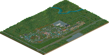
Full-Size Map
-
Download Park
678
-
Objects
204
-
Tags
Similar Parks
-
Rebuilding Silverwood
-
Britney Spears Lives Here
-
KnoxVegas
-
Maghreb
-
Fatha's Scenario
-
Paramount's Xtreme
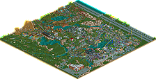
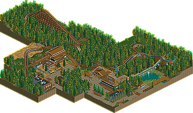
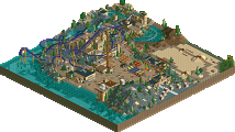
It's apparent the old saying third time's a charm isn't always true. Comet strikes gold with his second design submission in a matter of two months. Zephyr, his first attempt at design just missed with a score of 11.55 showing he needed just a bit more to make it over the 13.00 threshold. Sabretooth barely squeezes by with a score of 13.08. We know Comet has the drive to finish small projects, but does he have the motivation to finish something bigger? He teased us a few months back claiming to have given up on Bayside Amusement Park. Still unreleased, everyone must be wondering if Comet has an Ace up his sleeve in the coming months. Read on
I know many of you will disagree, and I respectfully figure you will have just cause, but when I see a design of this level I have no anxiety about opening it like I have with so many in the past; the layout is not that great, the atmosphere is lacking, and the overall look/landscaping/foliage does not add to the park.
anyway, congrats on the Design Comet. You're improving and I'm starting to like your style more and more. Hopefully you continue to build and improve but with this you had a real nice calm, natural feel that worked well.
Something like;
-e-ticket: Attraction designs like El Encierro/Arch Angel
-d-ticket: Attraction designs like Sabretooth
Because while I agree this design isn't really on par with recent NE releases I agree with Milo it should win something..
Anyway, congrats comet.. I hope to see the forementioned solo in the (not so near) future!
SF
kingarv, i can understand your standpoint as well, though. please do not forget that this submission barely managed to win with a score of 13.08. -0.09 and it would already not have won. and then i can guarantee you people would go "comet got robbed!!!" at us again. i agree with you that alameda pier shouldn't have won silver, but well, that's what the panel voted it to be. like milo mentioned though, you seem to be noticing the "weaker" releases more than the solid ones. i think we've had some pretty nice releases as of late and not everything can be absolutely amazing. if you were a panelist, what score from 1-20 would you have given sabretooth?
comet, i'm sorry if i'm labeling your design as "low quality" or anything. i definitely think it should have won, hence my 13 vote, but it wasn't really groundbreaking. i love your sense for realistic style parkmaking and i know the screens of your more recent work have greatly impressed me. i'm really happy to see people going for this kind of parkmaking because those who can really pull it off well are rare and it's even more rare for them to actually finish a project. i have faith that you can do it though. thank you for sending us your creations
It's a great way of working this out more objectively than before, and it's working very well.
Comet, I liked this without it jumping out at me. I can already tell you've moved on from this, which is very encouraging in such a short time span. I think the ride as a whole was a little too small. I understand it's a realistic terrain woody, and as such without a ridiculous (unrealistic) terrain it can't be too large. But I felt that if a ride is going to be this small, it needs to be themed beautifully throughout to make it special. This wasn't, to be honest, although parts were brilliant. I loved the station, very nice. I still find stations one of the hardest things to get right, I don't think i've ever built a station that i'm proud of afterwards, so I am envious of those of you who it seems to come to so naturally.
All in all, I guess my feelings on Sabretooth have already been posted. I thought it was a really solid design, without ever being spectacular or groundbreaking - but it still definitely deserved to win a design spot. The map was well presented, and whilst not particularly unique, nonetheless conveyed an atmosphere and sense of theme, but vitally remained realistic. I really liked the Log Flume, although it was a tad short; I liked how the opening of the ride (the little drop from the station) went past the picnic tables - nice realistic touch, and shows that you're thinking about the design from a peep's point of view. Didn't really dig the Log Flume's station, but the pond under the final splashdown was very nice.
The interaction between the Flume and woodie was nice. As the write-up says, you get the feeling the Flume's been there for a while, and the park has designed the coaster to fit around it. Likewise, I also agree with the write-up when it says how good night-rides on the coaster would be! Overall, the coaster looked really fun to ride; its only downsides were that it was a little short and I thought the final brake-run was a bit weird, with the odd forced s-bend back into the station.
Really liked the majority of the architecture; the ride station, BBQ restaurant and souvenir shop all spring to mind. I think you over-used the red flowers, green shrubs and the brown long-grass a little too much, but it didn't impact too much on the design. There wasn't quite enough on the map to hold my attention for that long - as I say, I think part of the reason is that the coaster itself is quite short. All in all though, a solid entry - it doesn't break any boundaries - but who says it has to? - it's still well worthy of a design spot, and I'm glad to see it as another new release on NE's frontpage.
Xcoaster Offline
And just fyi, I keep track of all my votes, on both accolades and the earlier test votes, for making comparisons when I vote. On this one I was between 15 and 16, and I went on the higher end. My personal design cutoff is somewhere around 14 or 15.
Either way, nice design and congrats! (for whatever it's worth coming from a newb
The first thing that actually came to mind when I heard that this won was "oh shit there's gonna be a lot of contraversy over this one", guess I was right.
Anyway it feels great to finally win an accolade, on only my second try at that. I really appreciate all the lengthy reviews, thanks for those as well.
Finally thanks to the prep team for the amazing page, and in particular to whoever did the write-up.
glad you all took notice to my write-up as I feel while writing it, it opened up spots of the design easily overlooked otherwise.
i too liked the log flume next to the seating area, so much i almost made that the shot for the banner rather than the actual coaster, but i chose the spot that looked to be the best point on the ride.
also, KingArv, i hope you realize how ridiculous you sound. last 4-5 designs not up to par? what? i'll leave it at what milo said...
there is no, design or no design anymore, there is a range of 13.00-20.00 that a design can achieve.
i also agree about the station, i loved the roofing with the fence and the wooden beams, very creative.
i think your foliage needs a lot of work however. my suggestion is to take a look at RRP's recent works and bust out a notepad.
So, from what pretty much everyone has written in reply, people seem happy with this being design, consequently I have no leg to stand on. So, only thing I have to say is that I was generalizing when I said the "last 4-5 entries" and was not specifically singling out anyone's work. RRP's a legend at NE, as well as many others.
Parkmaking has changed since RRP's Sea World Atlanta, and Nevis's Atlantis (#2-3 on the list of course). There is a growing trend of realism since RCT2 came out and RoB for sure, and it has forced parkmakers to be more technical; architecturally and in terms of the amount of detail. So, in light of that, this park, imho, doesn't offer that required level of detail. Even so, 5 years ago this wouldn't have made design I don't think. So, it lacks the detail for modern parkmaking standards, and it lacks more than that for historic parkmaking standards.
So, I will very respectfully disagree with some of the great names at NE right now, but you may disregard this minorities voice and I will not in the slightest be offended.
And I wasn't saying you were singleing out RRP's work... but when you say the last 4-5 entries being sub-par no matter who made them I just can't agree. And I do understand RRP is a legend but again, I'm not comparing everything to SWA just because that was a great release back in the day.
You seem prone to focusing on old great releases, which really isn't a problem because that timelessness is what makes them so great, but forget that the trends of here and now are what these accolades are being based on, not old Spotlights. And even if they may not have made the cut 5 years ago, I view them as very solid releases of current times and implore you to try and focus on the good in each one and not what makes them bad by past standards. That's all I ask.
that said, good stuff Comet. i agree with the others on the foliage, but you have it down pretty well otherwise.
EDIT: actually, it seems to me that everyone is stuck in the 'glory days' of RCT. everyone always seems to think that past parks were made so much faster (which is true, i have to say) and were so much better and more frequent. honestly, i wouldn't say that's true. if it is, why do you think that parkmakers just suddenly lost their quality? what makes the other parks better than they are now?
the fact that we are probably just getting used to seeing different ideas and ways to do things nullifies our amazement when a new park comes out. just because you've seen an amazing hack done time and time again doesn't make it any less amazing than the first time, but you are used to it. that's why i think people say all the old parks are good and nowadays parks can't live up to the glory of the past. to me, a good park is a good park, regardless of its ingenuity, and there are many good parks from many different periods of NE.