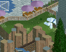
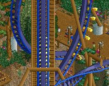
That tree is incredibly good, apart from that round bush object becomes repetitive. The building on the right looks really cool but I'm not a fan of the buildings on the left, they're quite plain and dull
for real now though. add one relatively vibrant colour, preferably washed out a bit. the bordeaux red would look cool here i think. it adds a bit life while not standing out way too much
for real now though. add one relatively vibrant colour, preferably washed out a bit. the bordeaux red would look cool here i think. it adds a bit life while not standing out way too much
edit: somehow it didn't show up as posted at first, sorry admins
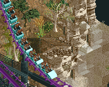
Hate the tree, love the waterfall. Too much brown for me; the flames are a step in the right direction but I think you really need some planters in the path or, as Liam said, change the path colour to something like grey.
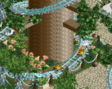
The details and arches are quite nice but I'm not a huge fan of the foliage; I think you need some colour (use flowers) in the underbrush. Looks a little too green and monotonous right now even though you've used different shades.
I'm also in the 'change the tree' camp. The trunk looks okay, but the bush at the top is just not right. It needs to be much bigger and I don't like the repetitive texture of the bushes you have used.
The waterfall is decent but I'm not sure why the 1k ruins are there. Either it needs more around the whole area or you need to get rid of the few that are there. Having just a few random ones just looks like you had space to put them there so put them there rather than it looking like it has anything to do with the waterfall.
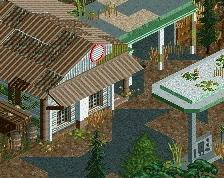
The architecture looks okay, I'm guessing it's meant to represent some sort of South/Middle American tribal shrine type thing, but I think you could do it better.
Tried my hand at this older project again. Trying to hit a more jungle, hidden, ruined vibe than before. Also wanted to do some giant trees because why the fuck not?
 28-September 14
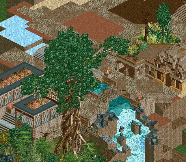
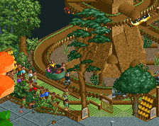
Wanted thoughts on this area before I went too crazy finishing it up.
FullMetal Offline
Mother of god, that tree looks amazing.
Agree^
Wow, I remember this. Looks really cool.
Not a fan of the tree. The bush clustering doesn't look good and it isn't large enough for the trunk.
The trunk is a nice idea, but for me, is messy as hell.
Tree - awful
The rest - not bad, but subpar for you now.
That tree is incredibly good, apart from that round bush object becomes repetitive. The building on the right looks really cool but I'm not a fan of the buildings on the left, they're quite plain and dull
A lot of brown though...
How do I go about adding contrast without making this area too lively?
Pubes.
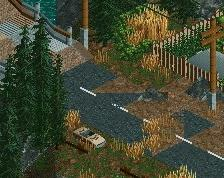
I had gray path chunks scattered about before, but they contrasted with the other path types too much. Maybe exclusively gray paths would be better?
edit: wat?^
for real now though. add one relatively vibrant colour, preferably washed out a bit. the bordeaux red would look cool here i think. it adds a bit life while not standing out way too much
He wrote Parrots and I tried to be fun
for real now though. add one relatively vibrant colour, preferably washed out a bit. the bordeaux red would look cool here i think. it adds a bit life while not standing out way too much
edit: somehow it didn't show up as posted at first, sorry admins
Hate the tree, love the waterfall. Too much brown for me; the flames are a step in the right direction but I think you really need some planters in the path or, as Liam said, change the path colour to something like grey.
The details and arches are quite nice but I'm not a huge fan of the foliage; I think you need some colour (use flowers) in the underbrush. Looks a little too green and monotonous right now even though you've used different shades.
I'm also in the 'change the tree' camp. The trunk looks okay, but the bush at the top is just not right. It needs to be much bigger and I don't like the repetitive texture of the bushes you have used.
The waterfall is decent but I'm not sure why the 1k ruins are there. Either it needs more around the whole area or you need to get rid of the few that are there. Having just a few random ones just looks like you had space to put them there so put them there rather than it looking like it has anything to do with the waterfall.
The architecture looks okay, I'm guessing it's meant to represent some sort of South/Middle American tribal shrine type thing, but I think you could do it better.