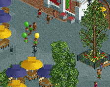
Screenshot / Six Flags Northwest Escape
-
 01-October 13
-
Six Flags Northwest Escape
-
2 of 5
- Views 2,858
- Fans 1
- Comments 5
Community Forum Software by IP.Board
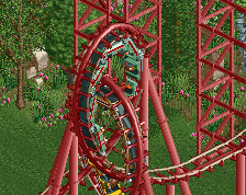
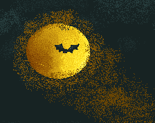
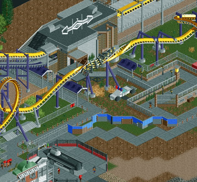
I like the idea of the bat symbol on top but it looks more like a shake weight right now, I feel like if you found a way to make the middle appear thinner/taller and add the ears that it would be better. You want to make it so someone can tell what it is without it being in context, and right now if you took away the whole ride and everything else around it I wouldn't know what it is.
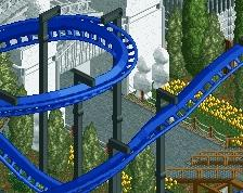
Thanks for the input. I took it into consideration and made a few changes. Here's a new screen,
Hahahaha great improvement lol but I think these kinds of improvements warrant an entirely new screen.
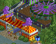
It's really interesting to see how much things have changed since 2013... a lot wouldn't think so but not not only is the second screen a huge improvement, it's an entirely new aesthetic style.
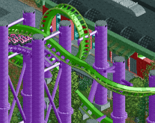
Holy shit, that improvement is insane
lol reminds me of bubbs', rec's and my batman: the ride but instead it's better.