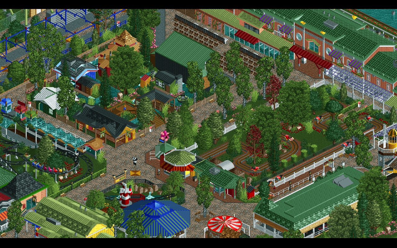
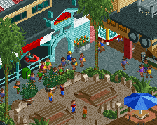
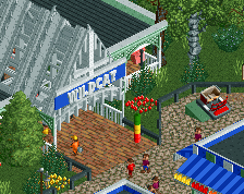
I feel this is the first screen from this project where you seem to lose control of the park. To many colors, to much variety in objects and texture, foliage is a little out of control as well. Maybe its just the source material but its kind of uncomfortable to look at and almost feels like a Jkay park, well not quite that level but its almost on the verge of that.
Maybe try and reproach the area, reduce the amount of colors a bit, give it more of a cohesive feel. I'm not all that familiar with the source material, but I have a hard time believing this is accurate in terms of color. Not to say you're going for 100% accuracy, but I think in this situation it might be to your benefit.
I feel this is the first screen from this project where you seem to lose control of the park. To many colors, to much variety in objects and texture, foliage is a little out of control as well. Maybe its just the source material but its kind of uncomfortable to look at and almost feels like a Jkay park, well not quite that level but its almost on the verge of that.
Glad I'm not the only one who thinks this. Don't get me wrong the park is phenomenal but sometimes the amount of textures is perhaps a little too much.
@bigshootergill, @Jappy, @FredD, @Chocotopian, @Live on earths ass, @Cocoa - Thanks guys! Glad you like it.
@G Force, @Stoksy, I really appreciate your input. I was afraid the colors would stand out too much. I think I might tone them down a little bit.
About the textures, is there any texture in particular that stands out too much, or is it that there are too many mixed within the same area? I'm no good at textures at all. Any help is appreciated.
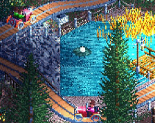
I agree about how many textures and things there are, but I don't think it's a bad thing. It's done with thought, care, reason, and most importantly: consistency. I'm not saying some more cohesion would be unwelcome - wherever you can, it would probably be welcome. But since this is a recreation I wouldn't know where to start. The only things that come to mind are the oak tree objects and Kumba steel roofs... That white Kumba roof especially. And something else comes to mind now, it's more obvious in that second screen: the orange-red awning is darker and more saturated than its surroundings. If you swap the dark red for dull red it'll blend in more without sacrificing accuracy.
I think deleting some trees would create some more tranquility. Especially the silver birches are really cluttered. And I don't think the red trees work either.
Reducing the number of roof textures could help, you seem to use every roof type possible when you really only need to use a few. I'd try to limit each building to one roof type unless its and awning or a special case like that.
There's a lot of different fence types, too. I agree that the area could use some cleaning up, but overall has a great sense of charm to it. Nice work!
School has finally come to an end for this year. I had the time to upgrade the kids area a little bit. Hope you like it. Some of you might have seen pictures of this area before.
 17-December 15
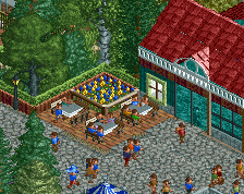
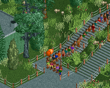
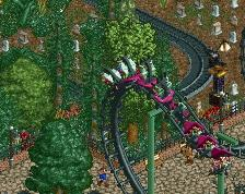
From the other angle:

Full of life, colours and shapes! Great stuff!
Has there ever been a debut spotlight?
I tried, but failed
I think it is prettier than the park irl Nice job!
You've really captured the miniature scale well - perfect for a kids' area! Great colours, ride choices and general atmosphere. Excellent screen.
I feel this is the first screen from this project where you seem to lose control of the park. To many colors, to much variety in objects and texture, foliage is a little out of control as well. Maybe its just the source material but its kind of uncomfortable to look at and almost feels like a Jkay park, well not quite that level but its almost on the verge of that.
Maybe try and reproach the area, reduce the amount of colors a bit, give it more of a cohesive feel. I'm not all that familiar with the source material, but I have a hard time believing this is accurate in terms of color. Not to say you're going for 100% accuracy, but I think in this situation it might be to your benefit.
Glad I'm not the only one who thinks this. Don't get me wrong the park is phenomenal but sometimes the amount of textures is perhaps a little too much.
nah, I love it. feels just right. cluttered and sort of awkward, but like the real thing. Great work IMO.
@bigshootergill, @Jappy, @FredD, @Chocotopian, @Live on earths ass, @Cocoa - Thanks guys! Glad you like it.
@G Force, @Stoksy, I really appreciate your input. I was afraid the colors would stand out too much. I think I might tone them down a little bit.
About the textures, is there any texture in particular that stands out too much, or is it that there are too many mixed within the same area? I'm no good at textures at all. Any help is appreciated.
I think deleting some trees would create some more tranquility. Especially the silver birches are really cluttered. And I don't think the red trees work either.
Alright, thanks guys. I'm pretty sure what to do from here.
Really appreciate your help.
Reducing the number of roof textures could help, you seem to use every roof type possible when you really only need to use a few. I'd try to limit each building to one roof type unless its and awning or a special case like that.