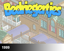
Screenshot / WIP Entrance
-
 01-April 16
- Views 1,626
- Fans 1
- Comments 10
-
Description
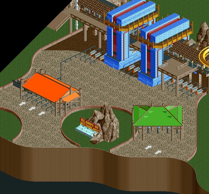
Start of my first full-scale project in years - an IOA type park. No cares that it's been done hundreds of times. Drew up a bunch of sketches for the park, and am now translating into RCT. The building method is much different than is typical, so wanted some feedback on how it's shaping up. Lots to be added yet (foliage, turnstiles, lamps, finish).
-
Full-Size
-
1 fan Fans of this screenshot
-
Tags
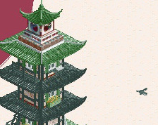
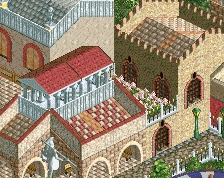
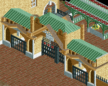
Secondly: I love how the blue buildings pop.
Thirdly: The curves are smooooth (that map edge!).
Fourthly: Not keen on the orange and green, I'd rather see more colour recurring from that entrance building (gold! or I reckon white will look great). The browns blend quite a bit into the path, so watch out with that.
Lastly: This is fucking awesome.
Change the paths, they blend with the brown way to much. Maybe try the cena path or even the KONG colorable path. Cool stuff though, I like the name.
OK, I'm really liking this. Map edge is very neat. Don't know how unfinished this is, but the rock feature / signage needs some love.
Interested to see where this is going!
I'm not a big fan of the entrance sign. More specifically I don't like the edge around it. It's not symmetrical and therefore it kind of looks like the shape of a deformed egg. Also, I think the rock work is still unfinished, but if it isn't it needs work.
The entrance building itself looks absolutely spectacular though, I really love it. Great combination of colours and the overall shape is just great. Also I love the way you did the entrance booth thingies, so much I want to steal it.
I also agree with liampie on the oranges and greens looking out of place, although the buildings themselves look nice.
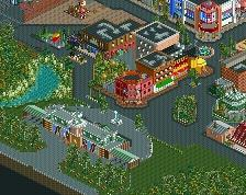
this, compositionally, doesn't feel anywhere near ioa to me. i feel like you could have done better by giving it more room before you hit the turnstiles, using a lot of foliage cover along the way.
Thanks for the comments all. Some great points brought up I agree with. Concerning the path color, I think it'll be changed to grey, but the darker brown will be extended further out. As for the awning colors, I like the idea of white, so I'll switch the green out. The orange I'm planning on keeping for nostalgia sake. The sign area is planned to have much more rock work, foliage, and a statue worked into the sign.
@Shotguns, I can get behind that feeling. I originally just planned out this brief entrance near the map edge. But, expanding it out larger is a good idea, this'll also fix the little bit awkward sign area and centralize it. Also, I don't think the lack of foliage is helping any here.
Dont worry though, I totally blow at making ioa-esque stuff. Port of entry is obvious proof of that
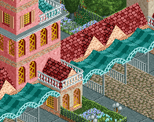
Very cool, the canvases do seem a bit harsh colour-wise but perhaps darker surroundings/foliage would contrast that nicely. Not a huge fan of the map-edge curves, rest are awesome and work really well (it's just because of the shear height of them I'd say).