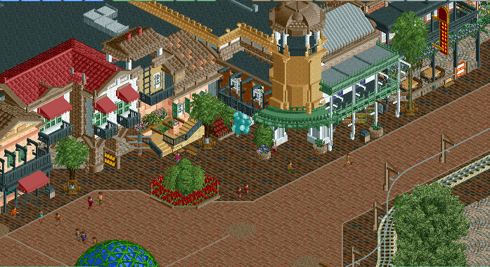
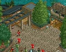
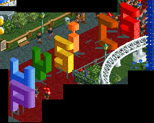
So, you're combining Disney California Adventure's entrance, Disneyland's New Orleans Square, and Disney Studio's NYC street... but not anything from the ACTUAL Mainstreet U.S.A. ...
So, you're combining Disney California Adventure's entrance, Disneyland's New Orleans Square, and Disney Studio's NYC street... but not anything from the ACTUAL Mainstreet U.S.A. ...
The composition and the colors of every building are fantastic, but everything is so extremely messy. Especially the windows and fences are unnecessary complicated. Removing all those ladder objects in front of windows and fences would make it already so much better! The planter with the red flowers doesn't work at all. Replace that one for a different planter. I don't like the concept of mixing different Disney main streets at all. Doesn't make sens. That said, I really like the scale you're using. Seems to fit the scale of the RCT peeps.
I agree with Sulakke here, the screen is promising but a big mess. Get rid of the ladders, stupid trend that adds hardly any detail. Also, replace one of the two brick textures with something else, this combination doesn't work IMO.
It's not so much that there's too many objects, but it's the selection of those that make things a little illegible and messy. I think entirely taking out all of the ladder objects used (besides for the ladders themselves), replacing it with others if necessary (the only case of this is on the green balcony), would go a long way. You dont need anything on the windows besides windows, too. I'd replace the stone texture with brick. Also, don't use trackitecture right there.
Something i'd love to see is some sort of 1-tile "barrier" that seperates the entrance archy from New Orleans/NYC on the other side. An arch over the path might work, or just some sort of rock barrier or tower? IDK if any of those solutions are Disney, but on a macro level it would help readibility and boundaries.
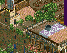
I think its fantastic, the only thing that sticks out is that blank diagonal texture right in the middle of the screenshot. Not really sure if there is anything you can do about it at this point however.
As for the path textures... honestly I'd rather see you keep the dark brick and replace the light brick with just standard tarmac or something to give a break in the textures. Right now the whole thing has a lot going on so it would be nice if there was a bit of a division in the street to allow us to focus a bit better.
Maybe its just the perspective of the screen and where its cut off but it feels like the black roofing is deceptively too low compared to the red roof. But sick textures all around
Screen of the main street section of Scoop's and I's duo park. It's a Disney Park and the idea of the main street is to have Buena Vista, New Orleans, and NYC as the three archy styles. Only BV and New Orleans are pictured.. Enjoy.
 28-April 17
So, you're combining Disney California Adventure's entrance, Disneyland's New Orleans Square, and Disney Studio's NYC street... but not anything from the ACTUAL Mainstreet U.S.A. ...
Is that a problem?
I think that's why there's a blank.
Looks nice. Kinda missing lights and such though.
fuck this is great man
We need more satire on the site
The composition and the colors of every building are fantastic, but everything is so extremely messy. Especially the windows and fences are unnecessary complicated. Removing all those ladder objects in front of windows and fences would make it already so much better! The planter with the red flowers doesn't work at all. Replace that one for a different planter. I don't like the concept of mixing different Disney main streets at all. Doesn't make sens. That said, I really like the scale you're using. Seems to fit the scale of the RCT peeps.
I agree with Sulakke here, the screen is promising but a big mess. Get rid of the ladders, stupid trend that adds hardly any detail. Also, replace one of the two brick textures with something else, this combination doesn't work IMO.
It's not so much that there's too many objects, but it's the selection of those that make things a little illegible and messy. I think entirely taking out all of the ladder objects used (besides for the ladders themselves), replacing it with others if necessary (the only case of this is on the green balcony), would go a long way. You dont need anything on the windows besides windows, too. I'd replace the stone texture with brick. Also, don't use trackitecture right there.
Something i'd love to see is some sort of 1-tile "barrier" that seperates the entrance archy from New Orleans/NYC on the other side. An arch over the path might work, or just some sort of rock barrier or tower? IDK if any of those solutions are Disney, but on a macro level it would help readibility and boundaries.
so is this robbie92 in disguise?
I think its fantastic, the only thing that sticks out is that blank diagonal texture right in the middle of the screenshot. Not really sure if there is anything you can do about it at this point however.
As for the path textures... honestly I'd rather see you keep the dark brick and replace the light brick with just standard tarmac or something to give a break in the textures. Right now the whole thing has a lot going on so it would be nice if there was a bit of a division in the street to allow us to focus a bit better.
Maybe its just the perspective of the screen and where its cut off but it feels like the black roofing is deceptively too low compared to the red roof. But sick textures all around