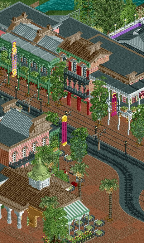
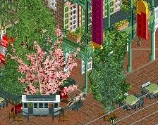
Some really great things here, especially the use of that wall-awning object - super effective. Interesting subtlety with the brick arrangement, something I would never have thought of but surprisingly works here (especially with the diagonal object). However, best thing is easily the scaling/spacing. Plenty of room to see the architecture yet it still feels quite dense. Will always appreciate multiple-object trees.
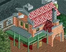
I think the building with the awning is very awkward looking. Unbalanced maybe. Definitely more simple than the rest of the screen, which makes it feel out of place... I think lowering (or extending) the awning two units will do a lot, as well as adding a second awning on the side.
Rest of the screen is amazing. Wasn't blown away by your earlier New Orleans screen but now that you completed the other side of the street it's actually looking like a street and it ignited a great urban atmosphere. I imagine that with peeps and trams, this couldn't get much better.
Would love to see more themes like this from you. Make a Legacies sequel for me
liam thats a perfect copy of cafe du monde please rob do NOT listen to this man! i wish i could be this inspired to build.
Note that the awning is at a normal height, and not reaching for the sky as in Rob's screen. The awning is lower and longer, and the canvas continues IN the arch, which I think is quite peculiar and cool to include. Another big difference is that Rob's building is completely hollow, lacking walls. The sides with the white columns should feel like arcades alongside a solid building, but now the whole thing kinda feels like a roof on poles.
I do actually agree with Liam, regardless of its real life accuracy.
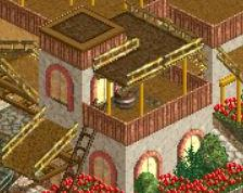
This looks awesome though. Biggest offender for me is the tree trunk colors here. The birch trees are too bright of a white color and the palms and willow browns are a bit dark. I think even simply just have the palm trunks as tan would make things even more lively.
Merging three tree objects into one seems unnecessary and messy to me. Just silver birches would be fine and makes the area more tranquil and easy to look at. Everything else is really good.
Liam, thanks in particular for the comments on the cafe building. Stupid me caught some unfinished bits in the screen, so the walls that form the arcade behind the columns weren't done, unlike the other side. I've looked into how to add the bits of canvas awning in the arches, but I'll keep experimenting.
This other side of the street outside of the screen is going to be pushed and pulled more than the original side, so hopefully it'll come off a bit less "perfect" and more spacially compelling and all that. The park's original concept was a themed amusement park a la Knotts Berry Farm or Hard Rock Park, but perhaps something more Legacies-esque would be interesting (if not take a hell of a lot longer ).
Experience the magic and romance of New Orleans at its jazziest, its most colourful, and its most magical, only at Jazzland, Avery Island' premiere family destination!
 07-June 17
Appears reminiscent of feces. I would suggest beginning anew.
Don't you tease me like this unless you plan on finishing it.
I expect it done in 2 weeks tops. Good job.
^^lol @ tim
Some really great things here, especially the use of that wall-awning object - super effective. Interesting subtlety with the brick arrangement, something I would never have thought of but surprisingly works here (especially with the diagonal object). However, best thing is easily the scaling/spacing. Plenty of room to see the architecture yet it still feels quite dense. Will always appreciate multiple-object trees.
Great to see you back rob
wow that shop in the front with the awning looks exactly like the famous beignet place in new orleans, exactly how i remember it
That brick texture is amazing. Also those barrels as columns. Lovely stuff Robert.
I think the building with the awning is very awkward looking. Unbalanced maybe. Definitely more simple than the rest of the screen, which makes it feel out of place... I think lowering (or extending) the awning two units will do a lot, as well as adding a second awning on the side.
Rest of the screen is amazing. Wasn't blown away by your earlier New Orleans screen but now that you completed the other side of the street it's actually looking like a street and it ignited a great urban atmosphere. I imagine that with peeps and trams, this couldn't get much better.
Would love to see more themes like this from you. Make a Legacies sequel for me
That's amazing.
liam thats a perfect copy of cafe du monde please rob do NOT listen to this man! i wish i could be this inspired to build.
Is it though? I see some crucial differences when I look at this picture:
http://mikestravelgu...ans-800x450.jpg
Note that the awning is at a normal height, and not reaching for the sky as in Rob's screen. The awning is lower and longer, and the canvas continues IN the arch, which I think is quite peculiar and cool to include. Another big difference is that Rob's building is completely hollow, lacking walls. The sides with the white columns should feel like arcades alongside a solid building, but now the whole thing kinda feels like a roof on poles.
Looks great, although the path in the lower left of the screen looks a little random.
Finish this
This looks awesome though. Biggest offender for me is the tree trunk colors here. The birch trees are too bright of a white color and the palms and willow browns are a bit dark. I think even simply just have the palm trunks as tan would make things even more lively.
I'd say the fact that I recognized it as cafe du monde immediately after having been there once in 2007 speaks to the quality of it though
also i'm gonna steal that round thing on top of windows look
Merging three tree objects into one seems unnecessary and messy to me. Just silver birches would be fine and makes the area more tranquil and easy to look at. Everything else is really good.
Thanks for the comments, guys.
Liam, thanks in particular for the comments on the cafe building. Stupid me caught some unfinished bits in the screen, so the walls that form the arcade behind the columns weren't done, unlike the other side. I've looked into how to add the bits of canvas awning in the arches, but I'll keep experimenting.
This other side of the street outside of the screen is going to be pushed and pulled more than the original side, so hopefully it'll come off a bit less "perfect" and more spacially compelling and all that. The park's original concept was a themed amusement park a la Knotts Berry Farm or Hard Rock Park, but perhaps something more Legacies-esque would be interesting (if not take a hell of a lot longer ).
).
Damn Robbie you always make some clean structures dude, very inspirational.