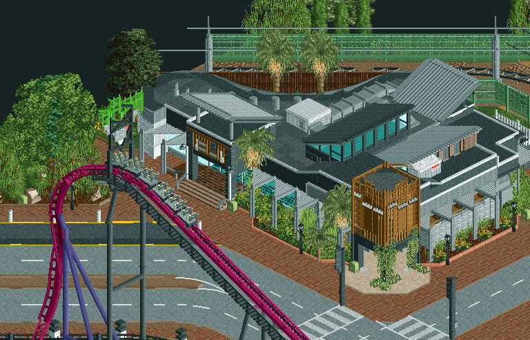
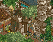
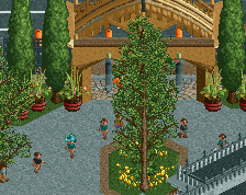
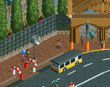
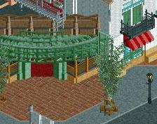
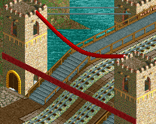
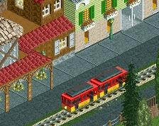
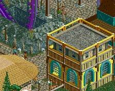
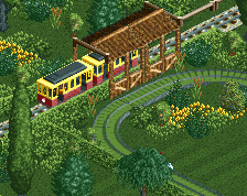
Screenshot / LunaPark Adelaide - Warradale Hotel
-
 29-August 17
-
LunaPark Adelaide
-
3 of 8
- Views 3,909
- Fans 7
- Comments 26
-
Description
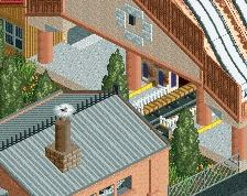
The Warradale Hotel - Fine food, great atmosphere, excellent hospitality.
Back(ish) into building again, just bits and bobs at the moment. Hopefully will have some time to really get back into RCT and specifically this park which is surprisingly far ahead. -
Full-Size
-
7 fans Fans of this screenshot
-
Tags
i almost think the textures are overboard a bit. but regardless, that looks really similar to one near me, good shit
It looks very good. What's that coaster supposed to be though, an Intamin Blitz?
i love it
Wow Stosky, this looks very original. Very good work
Fantastic work! That hotel is amazing. It almost doesn't look like RCT.
One nitpick: try the curb colors as either dull red or brown; the peach color IS the one thing that distracts me.
Great stuff.
Holy crap that building has some awesome shapes. I can't wait to see more of this.
Looks like a variant of the new Mack hyper coming to Australia.
This looks great, I'm looking forward to this park so, so, much.
Something tells me that there's a bit of architectural background in you. I dig it !!!
Fun Fact: the peach color and the dull red are the same color on different parts of the gradient.
Those bits of creeper vines are executed so perfectly, I can't believe it.
Could you try the intamin launcher quad track for the drop? The B&M sticks out a little to much without the merged overlays. But no biggy.
Great screen otherwise
It feels like there's something missing but I just can't name it...
I think you're confusing dull red and the lightest pink. Peach is a different colour.
As for the screen it''s pretty good but I agree with ][. I can read the roof but the sides are too unintelligible for me.
Hi, my name is Tim and I look like an idiot
wow.
i think that is the most realistic piece of RCT architecture.
beautiful.