Screenshot / Forbidden Desert
-
 27-October 17
-
The Conquests of Quinlan Quinto
-
3 of 10
- Views 3,809
- Fans 7
- Comments 31
Community Forum Software by IP.Board
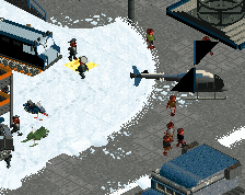
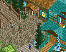
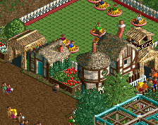
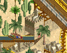
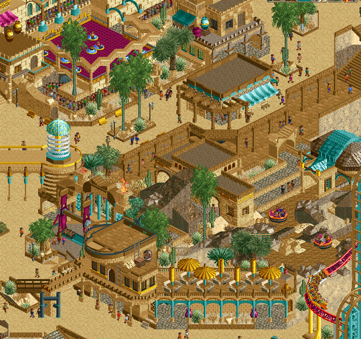
Blue water is a nice contrast and works well. The white path; I like it - I think it makes the architecture pop more and provides another welcome contrast, but that's up to you.
hpg Offline
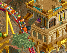
I think I agree on the second screenshot–especially after looking at your other screens from this park. The second feels like a more realistic desert themed area whereas the first looks more like the whole park should be set in the desert.
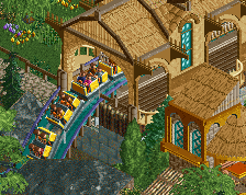
Second screen looks great, I say keep the changes!
You're style is so great and uniqe! Keep doing what you do!
Excellent screen.
Yeah, blue water actually turned out better. I had to think a bit about the paths... The Kumba path looks really good but initially I thought it pushed everything too far towards a generic hyper-realism instead of the oldschool fantasy feel that's been so prevalent in your previous work... But eventually I felt that the Kumba path IS the best choice, aesthetically, so go with that one!
Love that second screen
Glad to see some cool stuff from you! Second screen is a big improvement, love it.
Thanks for the feedback. The NE group persistence has worn me down, I'm going with the 2nd screen. The paths have actually grown on me.
wow. just wow.
Told you, the off-white paths work