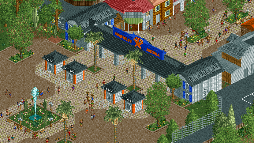
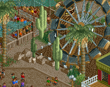
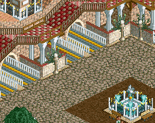
I like this a whole lot. I think that path actually works very well here. The white railings might work better as black, the white blends in quite a bit. Also I'd consider the regular trims around the paths.
I think there is a bit too much green (grass and foliage) considering it is Arizona, but great screen nonetheless. Be careful to not use this path type too much.
Pretty cool entrance! I particularly love the ticket booths. I do agree that you should be careful with that path and that the white railings probably would look better in black.
Green planters are okay; green anywhere else is not. Arizona is very dry and sparse; so the only place they'd really be able to water would probably be within the planters and *maybe* a bit close to the paths.
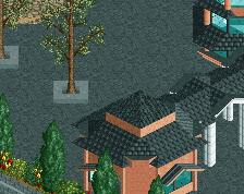
Absolutely love that tiled path texture. Foliage looks good too, architecture maybe slightly under-detailed? Or just old fashioned, depending on how one looks at it...
Thanks a lot for your responses and suggestions! I tried the black railings but they might stick out a little too much now. The foliage in the whole park is quite dense at the moment, I went for what looks better in-game rather than realism at first. But I think I found a way now to create aesthetic arid foliage. Oh and you will love the kiddy area which is completely covered in tiled path right now until I come up with another solution
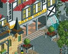
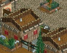
It's very clean to the point where it's almost empty, but maybe that's your unique selling point. Cut the crap, basic shapes laid out in a pleasing way. Entrance sign looks great indeed and I'm digging the path choice.
The archy could be better. Not necessarily the shapes that are too basic (as I said, it kinda fits), but the colours and textures that do not contribute to a cohesive whole. The main street can also use some life in the form of map racks/displays and signs.
 28-February 18
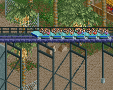
simple and effective!
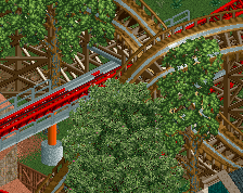
That's actually really awesome
I like this a whole lot. I think that path actually works very well here. The white railings might work better as black, the white blends in quite a bit. Also I'd consider the regular trims around the paths.
Pretty cool entrance! I particularly love the ticket booths. I do agree that you should be careful with that path and that the white railings probably would look better in black.
Lovely
Green planters are okay; green anywhere else is not. Arizona is very dry and sparse; so the only place they'd really be able to water would probably be within the planters and *maybe* a bit close to the paths.
So far, looks exciting!
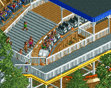
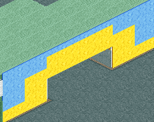
I like it but the backstage could use more touching up, a bit more depth. It looks a little flat right now
Absolutely love that tiled path texture. Foliage looks good too, architecture maybe slightly under-detailed? Or just old fashioned, depending on how one looks at it...
seems a bit too basic for a entrance
Thanks a lot for your responses and suggestions! I tried the black railings but they might stick out a little too much now. The foliage in the whole park is quite dense at the moment, I went for what looks better in-game rather than realism at first. But I think I found a way now to create aesthetic arid foliage. Oh and you will love the kiddy area which is completely covered in tiled path right now until I come up with another solution
The sign looks great my dude
The archy could be better. Not necessarily the shapes that are too basic (as I said, it kinda fits), but the colours and textures that do not contribute to a cohesive whole. The main street can also use some life in the form of map racks/displays and signs.
Looking forward to seeing the rest of the park!
RMM Offline