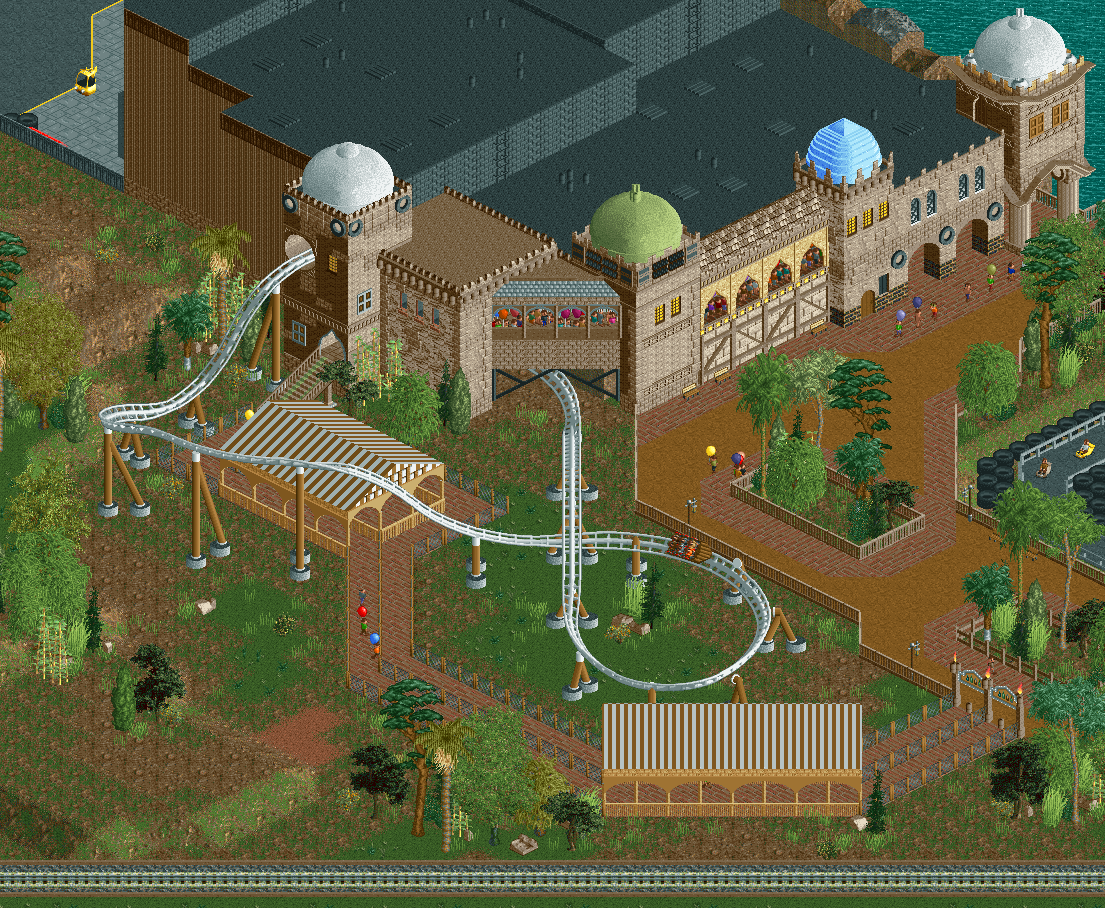
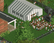
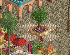
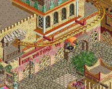
half of this screen has the potential to be great and your best work, the other half is meh. the "exposed" parts of the queue are weird. either it needs to be themed out completely, or it needs a more convincing fence/cover type along with a LOT more foliage.
the diagonal tunnel is also pretty unconvincing. the fisherman balcony objects almost never look good and here is no exception
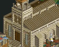
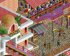
among the "good" stuff, try to elaborate on this more and keep cohesion in mind. cohesion is more than just roof colors, it's the little detail motifs that you also have to consistently use. the two rightmost towers are by far the best btw.
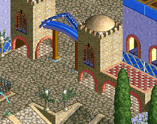
Spacial scale is something you need to work on I think. Just the way things are laid out and all is awkward. Flat roof is huge and there is just a lot of space between things.
Archy wise you've gotten quite good, same goes for most the color choices here, tho the supports are a bit odd.
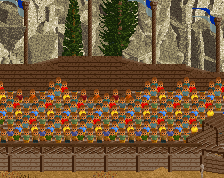
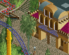
Due to this screen containing huge amounts of brown, the screen doesn't feel very eye-catchy to me. The coaster itself is good, the supports are alright and the archy is too. I would suggest you to perhaps add something like a river next to the coaster, to have some diversity in this landscape.
The archy has some very attractive bits, but the towers are so evenly spread out that it looks like a string of anal beads draped over a box.
I think the main problem with this screen is how spread out everything is, leaving a lot of empty space, and not the good kind. All the content would look good if compressed into a space half this size. The outside portion of the coaster is sitting on an empty mudflat. Everything is flat. Make it more interenting with some elevation. Trenches, bridges, ponds, streams, tunnels, whatever fits. Lose the big queue covers, they don't contribute to the theme nor to good looks. The diagonal one is especially confusing.
I agree with the general thought has been. I'm not a huge fan of those queue covers - they stick out, to me. Add some colour! (Other than balloons). Perhaps you could put small quarter-tile flowers here and there to liven it up?
On a good note, I think this is a pretty big improvement over the last couple screens. Keep it up!
 16-March 18
half of this screen has the potential to be great and your best work, the other half is meh. the "exposed" parts of the queue are weird. either it needs to be themed out completely, or it needs a more convincing fence/cover type along with a LOT more foliage.
the diagonal tunnel is also pretty unconvincing. the fisherman balcony objects almost never look good and here is no exception
among the "good" stuff, try to elaborate on this more and keep cohesion in mind. cohesion is more than just roof colors, it's the little detail motifs that you also have to consistently use. the two rightmost towers are by far the best btw.
Spacial scale is something you need to work on I think. Just the way things are laid out and all is awkward. Flat roof is huge and there is just a lot of space between things.
Archy wise you've gotten quite good, same goes for most the color choices here, tho the supports are a bit odd.
Due to this screen containing huge amounts of brown, the screen doesn't feel very eye-catchy to me. The coaster itself is good, the supports are alright and the archy is too. I would suggest you to perhaps add something like a river next to the coaster, to have some diversity in this landscape.
The archy has some very attractive bits, but the towers are so evenly spread out that it looks like a string of anal beads draped over a box.
I think the main problem with this screen is how spread out everything is, leaving a lot of empty space, and not the good kind. All the content would look good if compressed into a space half this size. The outside portion of the coaster is sitting on an empty mudflat. Everything is flat. Make it more interenting with some elevation. Trenches, bridges, ponds, streams, tunnels, whatever fits. Lose the big queue covers, they don't contribute to the theme nor to good looks. The diagonal one is especially confusing.
On a good note, I think this is a pretty big improvement over the last couple screens. Keep it up!
Still needs more destructuration overall
Listen to Liam's words, otherwise not bad!
I thought I'd commented on this, but I think Liam said everything I thought I already said.
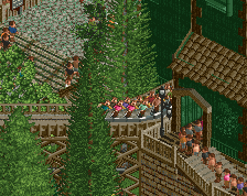
Agree with all the others. Plus, break up that huge diagonal train track at the bottom. Put some curves in it!