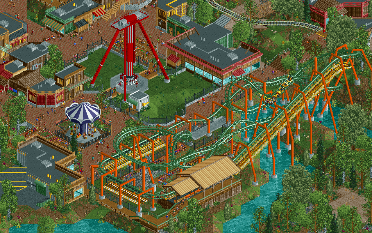
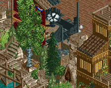
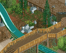
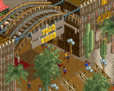
Try to add some supports around the catwalk, looks like it's floating. I would also like it if more of your buildings were distinguishable from each other or had a clear purpose. But good shit nonetheless.
Think about it a bit more from a peep perspective, and from what you experience at an actual park. It's usually hot at a park, and it sucks standing in a line forever without shade-- therefore add queue covers. It gets crowded, especially near ride entrance areas.. would it be best to add another ride here? How would the flow of foot traffic be affected by whatever your about to place?
Thinking of how parks and people work will greatly improve how you plan out areas and their composition. Not only in terms of traffic, but how rides and iconic moments and features correspond with their surroundings, and how it would actually be like to be a peep and experience your park. Consider if you would enjoy being there, and that's not simply a "I love the rides so I'd love to be there".
I wish you chose a colour that's not dull green for the coaster. The supports stand out and the track fades into the background. Maybe simply changing the rail colour to white or whatever to fix that while still preserving the overall look.
This is nothing mindblowing but it's a solid, complete screenshot. Wel done
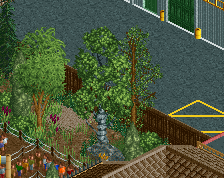
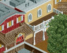
Colors are not great, like liam said. Also feel there are too many buildings, and while they might be well made, just filling every open space with a structure isn't necessary.
 04-May 18
Reply to the discussion...
By far your best stuff yet.
This is good.
Try to add some supports around the catwalk, looks like it's floating. I would also like it if more of your buildings were distinguishable from each other or had a clear purpose. But good shit nonetheless.
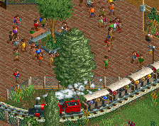
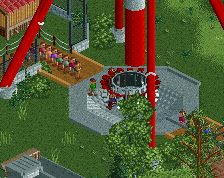
You made that swing ride look a lot better than I'd have expected based on the initial placement. Good work!
I also love the SLC's path visibility and the frisbee is great. You're making this work really well, considering how ride-dense it is!
Great work, Sens!
Think about it a bit more from a peep perspective, and from what you experience at an actual park. It's usually hot at a park, and it sucks standing in a line forever without shade-- therefore add queue covers. It gets crowded, especially near ride entrance areas.. would it be best to add another ride here? How would the flow of foot traffic be affected by whatever your about to place?
Thinking of how parks and people work will greatly improve how you plan out areas and their composition. Not only in terms of traffic, but how rides and iconic moments and features correspond with their surroundings, and how it would actually be like to be a peep and experience your park. Consider if you would enjoy being there, and that's not simply a "I love the rides so I'd love to be there".
Your best stuff Sens ! One advice : next time switch off the map grid for your screenshots !
I wish you chose a colour that's not dull green for the coaster. The supports stand out and the track fades into the background. Maybe simply changing the rail colour to white or whatever to fix that while still preserving the overall look.
This is nothing mindblowing but it's a solid, complete screenshot. Wel done
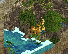
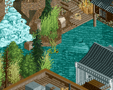
good screen. could do with some colorful flowers in the foilage and maybe some more color in the buildings. but a great foundation for sure
Colors are not great, like liam said. Also feel there are too many buildings, and while they might be well made, just filling every open space with a structure isn't necessary.