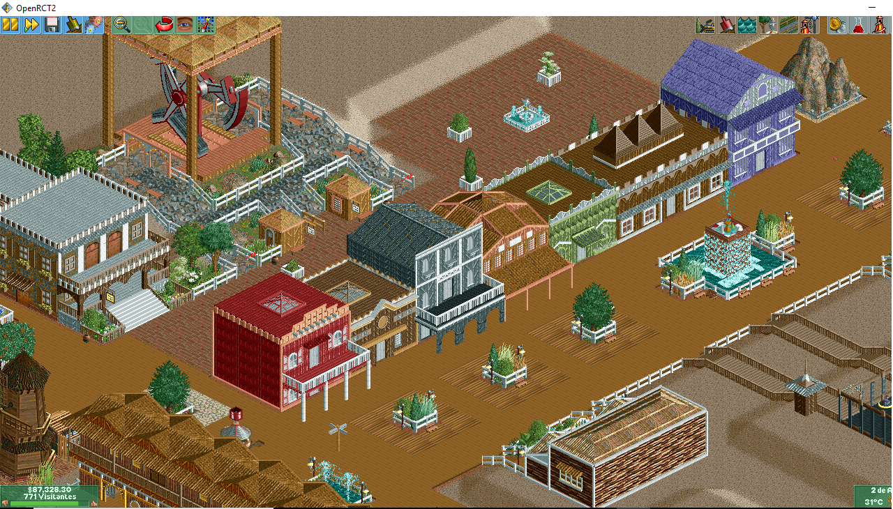
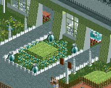
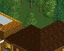
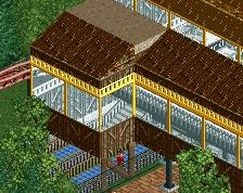
Despite the blocky architecture and odd use of objects, this is actually a pretty refined screen. Your foliage and architecture are definitely improving. I will never not love those miniature trees.
My one complaint would be that your parks are too symmetrical and have this odd, spread-out layout. Include more variation and maybe make things a little more compact. For instance, all those buildings are in the same position and thus their facades look flat.
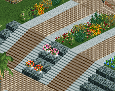
Having some of them jut out more, narrowing the paths, and adding larger, more varied planters for foliage would do wonders for this screen and make it a lot less agoraphobic.
Despite the blocky architecture and odd use of objects, this is actually a pretty refined screen. Your foliage and architecture are definitely improving. I will never not love those miniature trees.
My one complaint would be that your parks are too symmetrical and have this odd, spread-out layout. Include more variation and maybe make things a little more compact. For instance, all those buildings are in the same position and thus their facades look flat.
Having some of them jut out more, narrowing the paths, and adding larger, more varied planters for foliage would do wonders for this screen and make it a lot less agoraphobic.
Haa jaguar true, I make symmetrical parks, even though I have other parks here in the NE as an example, I have already tried and I can not. I understood "Having some of them jut out more, narrowing the paths, and adding larger, more varied planters for foliage would do wonders for this screen and make it less agoraphobic."
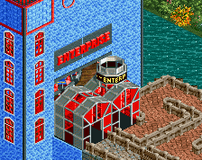
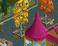
I really like the building on the left with the sign. Especially the combination with the foliage looks good imo.
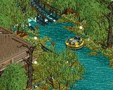
For the other buildings I feel like they are bit blocky and flat as Jaguar already mentioned. Try adding details to the facades of the buildings or try to use quarter tile objects to make some buildings stick out a bit more, this way the buildings will look less flat.
But you are definitely improving which is nice to see
I really like the building on the left with the sign. Especially the combination with the foliage looks good imo.
For the other buildings I feel like they are bit blocky and flat as Jaguar already mentioned. Try adding details to the facades of the buildings or try to use quarter tile objects to make some buildings stick out a bit more, this way the buildings will look less flat.
But you are definitely improving which is nice to see
The comments Ling on my last screen that I found productive, helped me to rethink from another perspective, since I want to make park on the theme wood.
So starting over again, challenge is a good stimulant.
 14-February 19
Despite the blocky architecture and odd use of objects, this is actually a pretty refined screen. Your foliage and architecture are definitely improving. I will never not love those miniature trees.
My one complaint would be that your parks are too symmetrical and have this odd, spread-out layout. Include more variation and maybe make things a little more compact. For instance, all those buildings are in the same position and thus their facades look flat.
Having some of them jut out more, narrowing the paths, and adding larger, more varied planters for foliage would do wonders for this screen and make it a lot less agoraphobic.
keep being unique, mrtycooncoaster
I understood "Having some of them jut out more, narrowing the paths, and adding larger, more varied planters for foliage would do wonders for this screen and make it less agoraphobic."
I really like the building on the left with the sign. Especially the combination with the foliage looks good imo.
For the other buildings I feel like they are bit blocky and flat as Jaguar already mentioned. Try adding details to the facades of the buildings or try to use quarter tile objects to make some buildings stick out a bit more, this way the buildings will look less flat.
But you are definitely improving which is nice to see
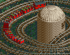
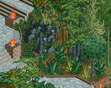
I don't love the path texture but everything else is great. It's unconventional but I like it.
hummm ok ok, thx