Something about the way you have those planters with the flowers looks really off to me. Having just a sea of that same object over and over doesn't help, and I'm not crazy about the color combo. Try using the diagonal path in more places to help keep the midways from looking so rigid. The structures are solid but the drab colors mixed with bright gold don't totally work.
I really like the shapes. But the colors are hurting the area somewhat I think. They kind of clash with each other right now. I would maybe use a more consistent color scheme to really help the atmosphere
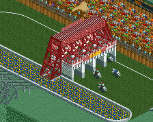
Gotta agree with Iron Rattler, The colors don't seem to fit in very well, I do like the red and white building though, Maybe keep the green, white, and bordeaux red color scene.
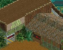
Thanks for you feedback guys! I recolored the bookmaker office building to a more neutral light brown. Also I adjusted the paths to a bit and it looks a lot better now!
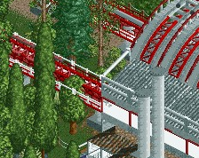
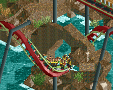
I am working on this park for some time now, and the first section is headed to a place I start to like, so I thought I'd share. Feedback is welcome as always!
 20-February 19
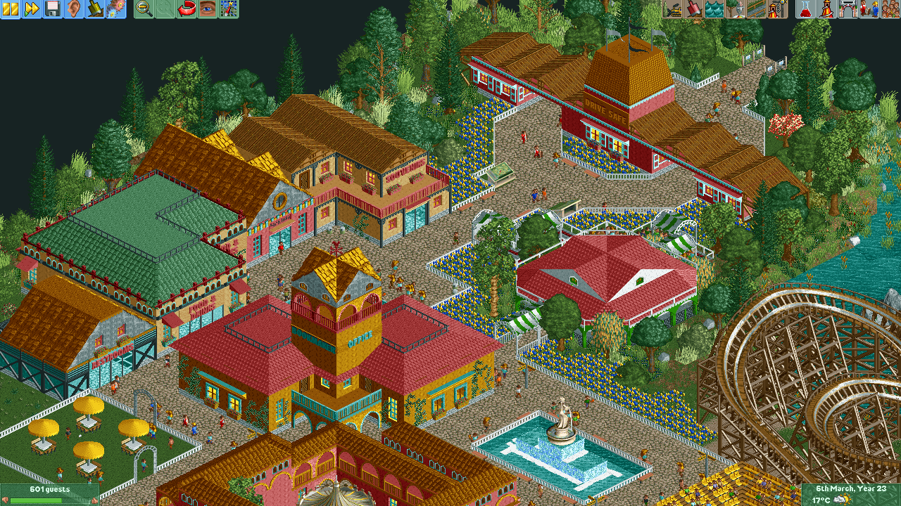
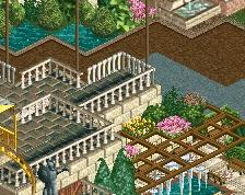
Something about the way you have those planters with the flowers looks really off to me. Having just a sea of that same object over and over doesn't help, and I'm not crazy about the color combo. Try using the diagonal path in more places to help keep the midways from looking so rigid. The structures are solid but the drab colors mixed with bright gold don't totally work.
Gotta agree with Iron Rattler, The colors don't seem to fit in very well, I do like the red and white building though, Maybe keep the green, white, and bordeaux red color scene.
The building is cool, but the yellow is not.
Thanks for you feedback guys! I recolored the bookmaker office building to a more neutral light brown. Also I adjusted the paths to a bit and it looks a lot better now!