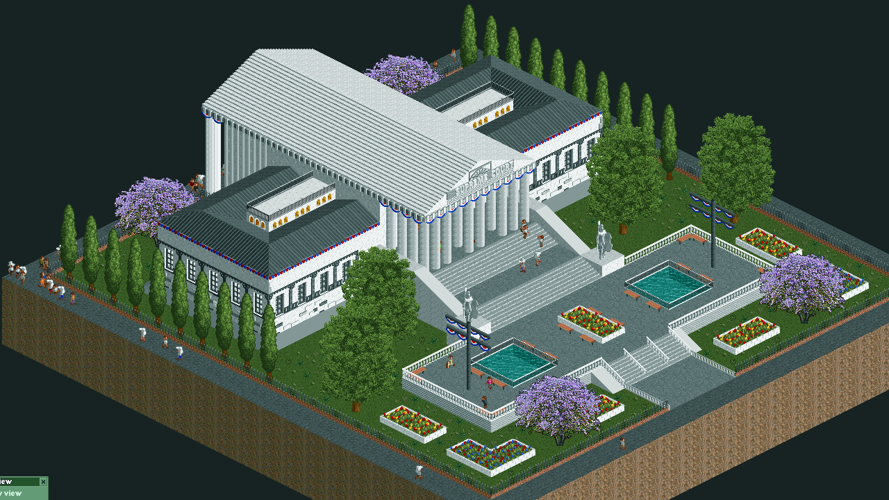
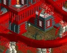
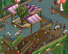
I like how clean this looks. For some reason people around here think messy is the way to go, but thats not always the case; irl empty space exists. I think the color of the center part of the roof could use a little more contrast with the walls and pillars, and a little more detailing in the archy throughout would be good, but I like the dark color of the lower roof, and I love the red/white/blue banners along the top of the pillars and throughout the front courtyard.
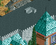
I gave this one pretty high marks. It wasn't exciting but it captured the intended theme better than most of the other plots. It is lacking a bit in detail, and the color choices on the foliage look off (especially those purple trees, that's just a hideous object all around). I do have an appreciation for empty grass, probably more than most, but a few patches of tall grass around the bases of the bigger trees would have rounded this out a bit better. That's a polish nit-pick though.
@SimFox, Thanks for your feedback! The roofing is indeed a big boring slab now I look back on it! Definitely will go for even more detail in the future.
@Ling, Thanks! I see what you mean with the trees, but I saw some pictures online where these kinds of trees were around the SCOTUS building so that is why I went with them. Definitely not the most pretty ones yes. Thanks for the tip with the tall grass!
@Ling: FredD would like to talk to you about those trees...
I like this, even if it lacks a bit in detail. Some small modifications would've made this better IMO, like a different trim around the roof, a different base for the columns, maybe a different roof type than the steel ones... But these are just niggles. Like Ling, I can appreciate the open grass. Don't think it needed more.
For the crime related multiplayer squares on RC&F I made the Supreme Court building of the USA. It is my first screenshot here and I hope you can give me some feedback to further improve my game!
 04-February 19
I gave this one pretty high marks. It wasn't exciting but it captured the intended theme better than most of the other plots. It is lacking a bit in detail, and the color choices on the foliage look off (especially those purple trees, that's just a hideous object all around). I do have an appreciation for empty grass, probably more than most, but a few patches of tall grass around the bases of the bigger trees would have rounded this out a bit better. That's a polish nit-pick though.
@SimFox, Thanks for your feedback! The roofing is indeed a big boring slab now I look back on it! Definitely will go for even more detail in the future.
@Ling, Thanks! I see what you mean with the trees, but I saw some pictures online where these kinds of trees were around the SCOTUS building so that is why I went with them. Definitely not the most pretty ones yes. Thanks for the tip with the tall grass!
@Ling: FredD would like to talk to you about those trees...
I like this, even if it lacks a bit in detail. Some small modifications would've made this better IMO, like a different trim around the roof, a different base for the columns, maybe a different roof type than the steel ones... But these are just niggles. Like Ling, I can appreciate the open grass. Don't think it needed more.