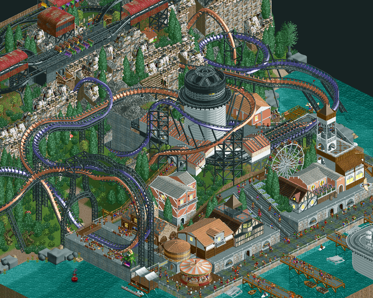
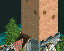
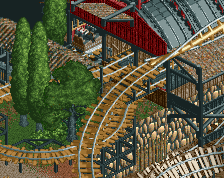
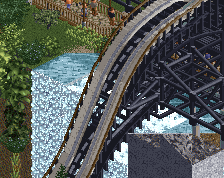
I'll never be a fan of the ncso look. Especially not the ncso+expansions look. That said, there's a lot of talent shining through here. I love the bit where the purple coaster inverts over the peach coaster. The lighthouse is very thick, but it looks good.
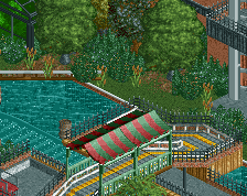
I wish the coasters werent the same color as the buildings and that there could be a bit more variation in the color scheme - but it's not a huge issue.
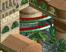
The overall composition of this is so good! Lighthouse is very well done, and I really love the lower pathway along the water. Great stuff!
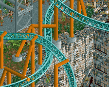
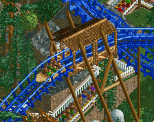
I like the actual lighthouse, and that double dive loop element is super cool. Some of the red texture on top are kinda cool i guess. Those rocks really ruin the screen for me, that texture is gross.
Man, that immelmann/dive loop turnaround is fucking inspired. So good. I just wish that the peach of the coaster had been different but that's a very minor point I think. Please continue posting to NE!
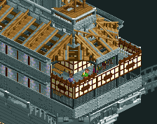
The WW expansion objects work well in the upper part of the screen, but the architectural ones in the lower part don't do it for me. The architecture generally needs some work. The best part of it currently is the lighthouse with a nice trackitecture dome, but I agree with Liampie it's a little thick. The layout is pretty cool, great interaction, over all it reminds me of old school fantasy parks.
My favourite detail in the screen is the custom supports for the double Immelman/diveloop inversion, with that arch widening towards the bottom for the track to pass through, that's brilliant!
 31-May 19
![screen_6140_Bathhouse [10x10]](https://www.nedesigns.com/uploads/screens/6140/6140_thumb.png)
I'll never be a fan of the ncso look. Especially not the ncso+expansions look. That said, there's a lot of talent shining through here. I love the bit where the purple coaster inverts over the peach coaster. The lighthouse is very thick, but it looks good.
This is fantastic.
I wish the coasters werent the same color as the buildings and that there could be a bit more variation in the color scheme - but it's not a huge issue.
The overall composition of this is so good! Lighthouse is very well done, and I really love the lower pathway along the water. Great stuff!
So good
Great composition. A really cool project. The track colors are liked. The atmosphere of the place is contrasted with white. It's character.
I like the actual lighthouse, and that double dive loop element is super cool. Some of the red texture on top are kinda cool i guess. Those rocks really ruin the screen for me, that texture is gross.
Skiffa Offline
Actually one is an Immelmann loop.
You can also see this park in Deurklink's video here
https://youtu.be/9JIpQbe1gdQ?t=2291
I liked
This was one of my favourite parks of the contest! Great job!
Don't love the peach track color. Love everything else. The head-on flyby is awesome.
The WW expansion objects work well in the upper part of the screen, but the architectural ones in the lower part don't do it for me. The architecture generally needs some work. The best part of it currently is the lighthouse with a nice trackitecture dome, but I agree with Liampie it's a little thick. The layout is pretty cool, great interaction, over all it reminds me of old school fantasy parks.
My favourite detail in the screen is the custom supports for the double Immelman/diveloop inversion, with that arch widening towards the bottom for the track to pass through, that's brilliant!