^Agree - they keep looking like a good idea by themselves in the object window, but as soon as you put them in the environment they stick out in a weird way.
And agree that the rest is great. I'd perhaps cover the merry-go-round, or build some type of latticework there.
 20-September 19
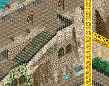
Only thing I don't like is those big egyptian texture bricks. Always hated them
Rest is great, you really rock purple
^Agree - they keep looking like a good idea by themselves in the object window, but as soon as you put them in the environment they stick out in a weird way.
And agree that the rest is great. I'd perhaps cover the merry-go-round, or build some type of latticework there.
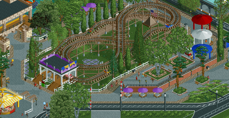
Those red white and blue path covers are great.
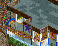
I like the dips ride quite a bit, but it does seem like the carousel looks a bit bare compared to the rest of the screen.
I like this a lot, nice work
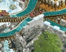
Glad to see the side-friction coaster getting some more love it deserves.
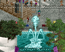
Very nicely laid out piece of parkmaking here.
Very nice! Picturesque. I really like the red/white/blue round covers.
thanks everyone
This is adorable