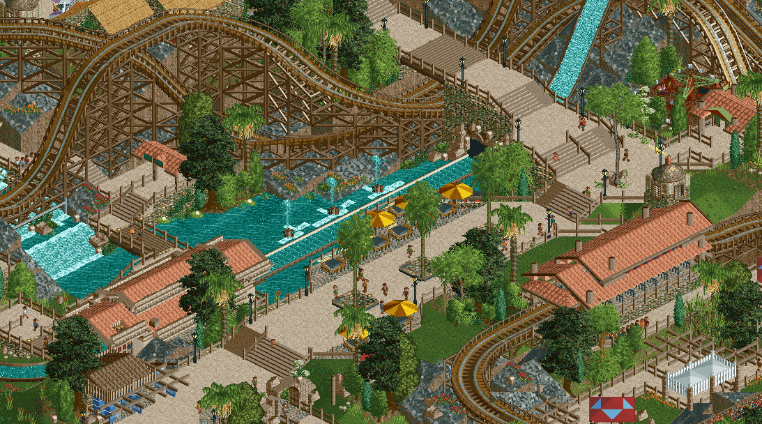
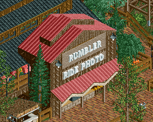
Love the little touches in how you've designed the path and tables. Visually it's tasteful and appealing. Macro wise a great exposure of the main drop element, even with an almost-interaction with the wooden.
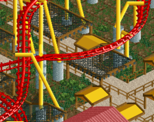
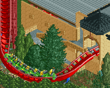
woah, probably my favorite thing from you - macro senses are great. One comment is big slope of the diagonal hill would look better sloped at the bottom than the top, and would also make the cut under the track less head-chopping
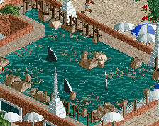
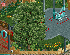
looks good, sweet placement with the water ride. Could add some ivy or something to the cliff side, looks unfinished but i dont really like bare land like that when the other cliffs use the rock wall.
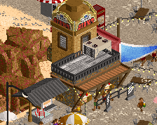
It's super pleasant but also lacking some oomph... Compare the two stations, arguable the most important structures on the map bar the actual rides. Water ride station is begging for an accent of any kind, but that would make it more prominent than the woodie station, whose hardly noticable 1x1 tower is not really doing anything. THEME them, which means more than just picking peach roof tiles.
Thank you for all the different and thoughtful comments. This is really pushing me forward. I feel the first time since H2H like tryharding in this game.
@roygbiv Interesting point. I personally like the simplistic look of it though. I think i had a huge problem with being focused too much on small details with my older projects and this is much better now.
@Liam Hm i'm not sure if i understand you right. I personally think that the stations are simple but realistic. There is actually another large prominent structure on the map. Would you mind, if i contact you for going deeper on this?
 28-December 19
Just beautiful. You've come so far.
Love the little touches in how you've designed the path and tables. Visually it's tasteful and appealing. Macro wise a great exposure of the main drop element, even with an almost-interaction with the wooden.
Glad to see you finishing this.
Big fan, beautiful screen. Id break up that waterfall with some rocks, might add some interest there.
Very nice
Thank you guys for the nice comments! You are keeping me motivated to finish this!
@Mattk48 Gonna take a look at the waterfall again. I think you're right that i can add 1-2 rocks more.
@Posix I'm very glad to hear that, especially your coment about my Macro game. I feel like i improved that a lot when playing LL in H2H8/8.
This is by far your best work I believe. Very nice and colorful.
woah, probably my favorite thing from you - macro senses are great. One comment is big slope of the diagonal hill would look better sloped at the bottom than the top, and would also make the cut under the track less head-chopping
Thank you also to you two! Good comment, dr dirt, it looks much better now!
looks good, sweet placement with the water ride. Could add some ivy or something to the cliff side, looks unfinished but i dont really like bare land like that when the other cliffs use the rock wall.
Thank you for all the different and thoughtful comments. This is really pushing me forward. I feel the first time since H2H like tryharding in this game.
@roygbiv Interesting point. I personally like the simplistic look of it though. I think i had a huge problem with being focused too much on small details with my older projects and this is much better now.
@Liam Hm i'm not sure if i understand you right. I personally think that the stations are simple but realistic. There is actually another large prominent structure on the map. Would you mind, if i contact you for going deeper on this?
Thank you steve!
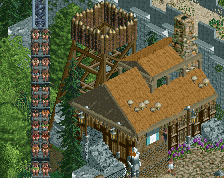
The station on the left is missing a roof, literally unplayable.
Good screen, I like the stations. I think people sometimes forget how simplistic some stations truly are.
I think it only looks like that from this angle, that roof piece is missing because there is a tower there.
I wrote the wrong side on purpose to make you look like a fool.
I meant the left roof.
Thanks for pointing it out v1. It's already fixed.