I can't wait to see how this turns out. Are you planning on including a decent amount of Shambhala? Since you've built some great B&M megas (Goliath and a major portion of Leviathan at Hudson Crossings) I really hope so, especially given the interaction of the 2 coasters.
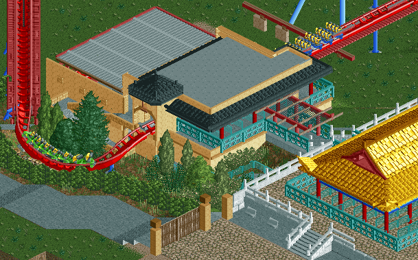
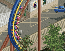
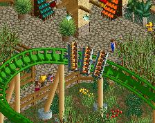
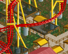
As someone who has never seen Dragon Khan irl I can't judge it's accuracy, however, it's an excellent start. The glitch on the first piece of track outside the station is distracting (but I assume cannot be avoided). I tend to disagree with csw though; yes it's a little distracting but I quite like the hedges to be honest. The queue cover, whilst executed brilliantly, just seems like stuff I've seen before. Given it's a recreation though I'm sure it has been accurately portrayed.
Coasterbill - I'm going for pre-Shambala, mainly due to getting Shambala to work alongside this layout would be a nightmare, but also because I find it more interesting pre-Shambala than post-Shambala. Thanks for the compliment
csw - I understand where you are coming from, unfortunately the game sucks for hedges. I didn't like this at first, but it actually grows on you the more you look at it
Stoksy - The glitch is unfortunately unavoidable, but it is only noticable in this view. Haha, thanks for liking the hedges I agree with the queue cover, but can't be helped.
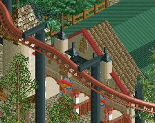
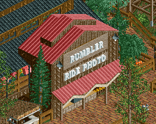
It's technically alright, but aesthetically it's terribly bland. Two different buildings, not quite matching each other in any way, and the individual buildings being quite featureless. There's not even the usual shit on the grey roof.
As you can see here, the building in the front clearly has an orange roof. If you change that, I think it would improve the look of the area. The yellow roof in my opinion clashes with the light brown of the station - they're very similar colours, and in my experience roofs and walls with the same colour, in neighbouring buildings, rarely ever works. Orange won't clash, and I think it'll even make a nice combo. It'll make it feel much warmer.
Lastly, I think the tower could use some work. Maybe make it two tiles wide? It looks more like that in the picture (make it 2 x 1,5 perhaps) and I think it'll just look prettier.
I totally agree with you with the respect that the two buildings don't match. I find this quite odd in reality too. I think when you take the surrounding buildings into context, they tend to look alright.
I did try the orange and it just didn't feel right. It seemed quite overpowering. I read that building as a golden colour rather than orange and tried orange, gold & yellow, and decided that yellow was the better option. But I'll continue to play around.
You mention blandness, but that station is bland. The roof doesn't have anything on it etc, the walls are plain. I can't really jazz it up without it becoming 'inspired by' rather than recreated, unless there is anything specific in that respect that you can suggest.
Maybe just another texture would help for the roof... The texture you used for the emergency path (whatever it is, to the left) is always nice because it is detailed. There's also a lighter version of it, I'm sure it's on your bench. Always works well for roofs.
Have you tried dark orange? It's much easier on the eyes and actually not that dark. It's one of the most underrated colours in RCT. Everyone raged when I used it so much in Legacies, for which I blame the Italians and the Danish.
Liam, I took your comments on board regarding the roof texture, the thickness of the station arch, the height of the station arch's roof and the colour of the queue roof. It's looking better now.
Even though I've never personally been to Port Aventura, I do know this is definitely in the same realm as Kumba as one of the trickier layouts to get right. Looking at your other thread, its clear you're putting much thought into getting everything spot on, just as Kumba did for his rec. Looking forward to seeing more!
It's great to see another serious attempt at a B&M rec in RCT2. Your off to a great start and have clearly put a lot of thought into this. I have the following tips:
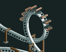
- Up the scale of it. Not by too much, but just spread it all out a bit more. Once you scale-up, I think you can use a mid-size loop that will help solve the problem of the small loop after the mcbr looking way too tight. That second loop does go a little below ground and you have accounted for that, but I think you can go lower. Also if the scale is larger, you might be able to use 45 deg track going into the 0-G and that might look better than step track.
- Try and rec the stats too. On Kumba I made sure to try and get the ride's stats to match the real one. This is always hard, but getting the right speed on Kumba really helped the later flow on the coaster, which was one of its strongest points.
- Use landmarks now. Put in the railroad track and concrete staff access areas below the first loop. I did landmarks right away with Kumba and even though there were a bitch to line-up, it was vital to the overall accuracy. Lucky for you there are a lost less on Dragon Khan, so you might have more flexibility.
 12-March 14
Very nice!
I can't wait to see how this turns out. Are you planning on including a decent amount of Shambhala? Since you've built some great B&M megas (Goliath and a major portion of Leviathan at Hudson Crossings) I really hope so, especially given the interaction of the 2 coasters.
cool start
I know you're going for an accurate recreation, but that hedge fence is terribly distracting.
As someone who has never seen Dragon Khan irl I can't judge it's accuracy, however, it's an excellent start. The glitch on the first piece of track outside the station is distracting (but I assume cannot be avoided). I tend to disagree with csw though; yes it's a little distracting but I quite like the hedges to be honest. The queue cover, whilst executed brilliantly, just seems like stuff I've seen before. Given it's a recreation though I'm sure it has been accurately portrayed.
Coasterbill - I'm going for pre-Shambala, mainly due to getting Shambala to work alongside this layout would be a nightmare, but also because I find it more interesting pre-Shambala than post-Shambala. Thanks for the compliment
csw - I understand where you are coming from, unfortunately the game sucks for hedges. I didn't like this at first, but it actually grows on you the more you look at it
Stoksy - The glitch is unfortunately unavoidable, but it is only noticable in this view. Haha, thanks for liking the hedges I agree with the queue cover, but can't be helped.
Thanks for all the comments guys!
It's technically alright, but aesthetically it's terribly bland. Two different buildings, not quite matching each other in any way, and the individual buildings being quite featureless. There's not even the usual shit on the grey roof.
http://www.themepark...aventura177.jpg
As you can see here, the building in the front clearly has an orange roof. If you change that, I think it would improve the look of the area. The yellow roof in my opinion clashes with the light brown of the station - they're very similar colours, and in my experience roofs and walls with the same colour, in neighbouring buildings, rarely ever works. Orange won't clash, and I think it'll even make a nice combo. It'll make it feel much warmer.
Lastly, I think the tower could use some work. Maybe make it two tiles wide? It looks more like that in the picture (make it 2 x 1,5 perhaps) and I think it'll just look prettier.
I totally agree with you with the respect that the two buildings don't match. I find this quite odd in reality too. I think when you take the surrounding buildings into context, they tend to look alright.
I did try the orange and it just didn't feel right. It seemed quite overpowering. I read that building as a golden colour rather than orange and tried orange, gold & yellow, and decided that yellow was the better option. But I'll continue to play around.
You mention blandness, but that station is bland. The roof doesn't have anything on it etc, the walls are plain. I can't really jazz it up without it becoming 'inspired by' rather than recreated, unless there is anything specific in that respect that you can suggest.
(9322)
Maybe just another texture would help for the roof... The texture you used for the emergency path (whatever it is, to the left) is always nice because it is detailed. There's also a lighter version of it, I'm sure it's on your bench. Always works well for roofs.
Have you tried dark orange? It's much easier on the eyes and actually not that dark. It's one of the most underrated colours in RCT. Everyone raged when I used it so much in Legacies, for which I blame the Italians and the Danish.
Looking good !
Liam, I took your comments on board regarding the roof texture, the thickness of the station arch, the height of the station arch's roof and the colour of the queue roof. It's looking better now.
So thanks for those suggestions
(9326)
Even though I've never personally been to Port Aventura, I do know this is definitely in the same realm as Kumba as one of the trickier layouts to get right. Looking at your other thread, its clear you're putting much thought into getting everything spot on, just as Kumba did for his rec. Looking forward to seeing more!
Very realistic. Very boring.
This is my issue with recreations.
Didn't stop you voting 95% on Kumba
(9330)
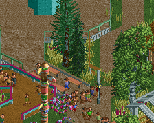
I think the hedges work. I don't know the coaster or park IRL, but what you have done here looks cheerful, so I like it.
Also, are you counting posts?
And they may not stop me with this either
I was counting them in my posts yes, but now I'm counting them on a notepad instead.
It's great to see another serious attempt at a B&M rec in RCT2. Your off to a great start and have clearly put a lot of thought into this. I have the following tips:
- Up the scale of it. Not by too much, but just spread it all out a bit more. Once you scale-up, I think you can use a mid-size loop that will help solve the problem of the small loop after the mcbr looking way too tight. That second loop does go a little below ground and you have accounted for that, but I think you can go lower. Also if the scale is larger, you might be able to use 45 deg track going into the 0-G and that might look better than step track.
- Try and rec the stats too. On Kumba I made sure to try and get the ride's stats to match the real one. This is always hard, but getting the right speed on Kumba really helped the later flow on the coaster, which was one of its strongest points.
- Use landmarks now. Put in the railroad track and concrete staff access areas below the first loop. I did landmarks right away with Kumba and even though there were a bitch to line-up, it was vital to the overall accuracy. Lucky for you there are a lost less on Dragon Khan, so you might have more flexibility.
- Pictures are not the best resource for a rec. YouTube really is, so memorize/copy the full ride POV.
- In a total abuse of admin powers... merge this topic with the one dedicated to the layout
Good luck with this Louis. I know how difficult, yet rewarding a rec like this can be.