This is excellent, so as I usually do in excellent screen threads, I am going to nitpick:
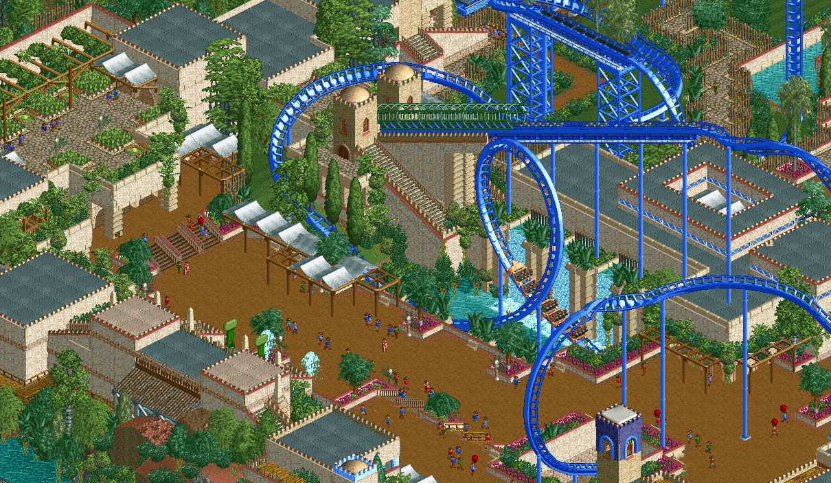
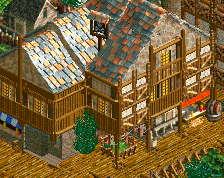
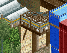
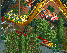
White awnings are usually a color suck and you DO make them work here given that the rest of the area is so vibrant, but I can't help but wonder why not give them a pop of color even still? Apart from the coaster, they're the first thing the eye is drawn to.
I get what you were going for with the paths-as-roofs in the center of the screen and it works but it also distracts. At first I thought they were paths to walk on from the station exit/entrance, especially since on the left side of the screen you have guests walking on the same path type on a roof-level building. I think this could be messed around with, but I applaud the idea all the same.
The structure behind the top spin could be cleaned up in some way, I imagine. It's linear, so there's nothing to "break up" the three unique pieces of the building on the rear even if guests can't see it. Maybe a couple smaller towers or even just one could do the trick back there. Even bringing some of the taller trees forward more could help.
Overall though, brilliant work, dude. Composition and colors are so strong. Looking like a modern-day RoB on your hands.
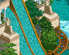
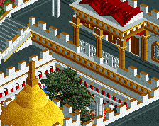
I love the green flowers and the sweeping right turn over the station after the loop. Seems like a restrained color palette (i.e. no yellow or orange) but it works. I wish the temple thingy (the main building) was a bit more grand but I love the details, especially the water pouring out of the grates.
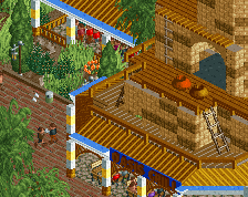
Some of the supports end in funny places (flat roof, middle of path). Otherwise echoing the chime that this is rather glorious. Composition and architecture, and especially the NCSO level, are something else.
 03-January 20
NEW ALEX CONTENT
yeah dude this is fantastic.
Very beautifully composed and easy to read. I love it.
This is excellent, so as I usually do in excellent screen threads, I am going to nitpick:
White awnings are usually a color suck and you DO make them work here given that the rest of the area is so vibrant, but I can't help but wonder why not give them a pop of color even still? Apart from the coaster, they're the first thing the eye is drawn to.
I get what you were going for with the paths-as-roofs in the center of the screen and it works but it also distracts. At first I thought they were paths to walk on from the station exit/entrance, especially since on the left side of the screen you have guests walking on the same path type on a roof-level building. I think this could be messed around with, but I applaud the idea all the same.
The structure behind the top spin could be cleaned up in some way, I imagine. It's linear, so there's nothing to "break up" the three unique pieces of the building on the rear even if guests can't see it. Maybe a couple smaller towers or even just one could do the trick back there. Even bringing some of the taller trees forward more could help.
Overall though, brilliant work, dude. Composition and colors are so strong. Looking like a modern-day RoB on your hands.
I love the green flowers and the sweeping right turn over the station after the loop. Seems like a restrained color palette (i.e. no yellow or orange) but it works. I wish the temple thingy (the main building) was a bit more grand but I love the details, especially the water pouring out of the grates.
How the fuck are you this good? I hate how absolutely effortless you make this game look.
I see Stove already said it, but this does give modern RoB vibes.
I love everything about this
thanks for the kind comments and feedback!
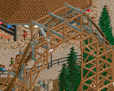
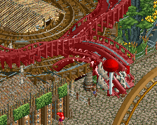
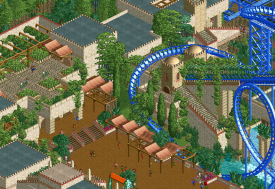
I think Kumba said on discord that you should consider putting some vines on the launch tunnel. I think that would be neat.
Some of the supports end in funny places (flat roof, middle of path). Otherwise echoing the chime that this is rather glorious. Composition and architecture, and especially the NCSO level, are something else.
yeah nice suggestion Kumba:
I think it's sick. And the all blue coaster is ballsy.
Well constructed and easy to understand. Lovely done.
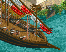
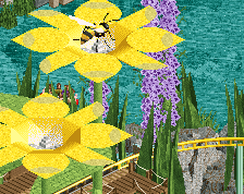
What is the object used there? Doesn't look like something I have ever seen in the base game.
It's just called 'fern' (like giant fern) but i just double checked in the object selector and you're right, its actually custom :-o