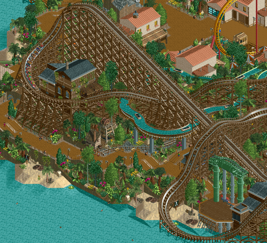
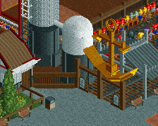
Seeing this, I'm glad you went with some of the layout suggestions on Discord. In general, this is really impressive looking.
I see that you're using the pro tour bench; I'm a little conflicted by the screamin' swing - at the very least it could use some railings on the platform, and I'm not sure how I feel about the pipes for the swing arms. Be careful not to overuse the moulding; I don't know if it works as well on the wooden buildings as it does on the stucco. It kinda sticks out a bit.
Interesting hybrid NCSO/pro tour style you have going here. Will be very keen on seeing how it all turns out.
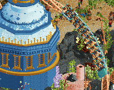
Love this. The woodie looks great in and of itself, but the way it interacts with the path is what really elevates this screen. The PT/NCSO vibe is super nice, very relaxed and inviting.
Two observations about possible improvements:
- I agree that the swing ride looks a bit unrefined. I think it needs more "connective" geometry, e.g. something at the base of the supports (rather than just connecting directly to the wooden platform as they are), plus fencing and some other details as suggested.
- I'd also touch up the landscaping along the shoreline. Right now there is a lot of vertical dirt, which I think looks a bit unconvincing. Either try to make the slope more gradual, or otherwise try making the steep sections look a bit more rocky, either by using rock land texture and/or ruins and perhaps even the LOTR mountains (really liking the usefulness of them now that OpenRCT allows you to easily cluster them and sink them far into the ground). Also, the land under the water needs more variation as opposed to being completely flat.
Other than those two things, the screen is great! Really looking forward to seeing it in-game!
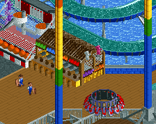
Love how the rides and elevation look. The foliage is a bit of a mess though, to be honest. Even for a jungle I would try and cut down a bit on the texture and colour palette. It's a bit of a problem with the jungle object set that they do not look so great when used all together - the difference between the very dark tall tree and the extremely bright, saturated bush is too much contrast.
I would also suggest losing the random objects (piles of logs, treasure chests, barrels) which are mixed in, and being more deliberate with your theming placement.
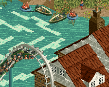
Love the composition with the woodie over the flume and the water. Like Alex said though, the foliage needs work to build some sort of hierarchy; currently it’s too scattered for my taste. Also not sure of the glass window up top, kinda kills the theme.
Some of your best work, the scale and height of it all is really imposing and cool. The theming is simple but keeps your attention, and the framing of the flume is pretty neat and contributes to the scale factor quite a bit. Looking upwards through the supports of it to see the top of the woodie but would be dope.
My only real suggestions would be to finesse the blending of shore to water a bit, and to color the land underneath to suggest depth. As mentioned the foliage is fun but a bit chaotic. Fewer tree/shrub types and more density would help a lot.
 16-January 20
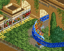
Seeing this, I'm glad you went with some of the layout suggestions on Discord. In general, this is really impressive looking.
I see that you're using the pro tour bench; I'm a little conflicted by the screamin' swing - at the very least it could use some railings on the platform, and I'm not sure how I feel about the pipes for the swing arms. Be careful not to overuse the moulding; I don't know if it works as well on the wooden buildings as it does on the stucco. It kinda sticks out a bit.
Interesting hybrid NCSO/pro tour style you have going here. Will be very keen on seeing how it all turns out.
that wood is gonna rot on the water
cool vibe though, loving this comeback of pt era shit
Cool indeed, I think the swing looks a bit off b/c the pipes are supposed to be both static supports as well as moving arms. Easy fix.
The drop toward water should be at least one unit higher fosho. Also an easy fix.
Otherwise, I like the diagonal double-up, that airtime would be a blast.
Flume looks really good, and I really like the overgrown mossy building that first drop is built around.
~B-]
Looks solid. I agree with CC9 on the crown molding.. might not need it. Great interactions here.
Strongest work I've seen from you yet. I think your design classes are really paying off - this is excellent composition.
Excited to see a release from you hopefully soon!
Lovely screen, a lot of cool interaction happening!
Two observations about possible improvements:
- I agree that the swing ride looks a bit unrefined. I think it needs more "connective" geometry, e.g. something at the base of the supports (rather than just connecting directly to the wooden platform as they are), plus fencing and some other details as suggested.
- I'd also touch up the landscaping along the shoreline. Right now there is a lot of vertical dirt, which I think looks a bit unconvincing. Either try to make the slope more gradual, or otherwise try making the steep sections look a bit more rocky, either by using rock land texture and/or ruins and perhaps even the LOTR mountains (really liking the usefulness of them now that OpenRCT allows you to easily cluster them and sink them far into the ground). Also, the land under the water needs more variation as opposed to being completely flat.
Other than those two things, the screen is great! Really looking forward to seeing it in-game!
This looks amazing
Love how the rides and elevation look. The foliage is a bit of a mess though, to be honest. Even for a jungle I would try and cut down a bit on the texture and colour palette. It's a bit of a problem with the jungle object set that they do not look so great when used all together - the difference between the very dark tall tree and the extremely bright, saturated bush is too much contrast.
I would also suggest losing the random objects (piles of logs, treasure chests, barrels) which are mixed in, and being more deliberate with your theming placement.
Bump, but I'm just now seeing this screen.
Some of your best work, the scale and height of it all is really imposing and cool. The theming is simple but keeps your attention, and the framing of the flume is pretty neat and contributes to the scale factor quite a bit. Looking upwards through the supports of it to see the top of the woodie but would be dope.
My only real suggestions would be to finesse the blending of shore to water a bit, and to color the land underneath to suggest depth. As mentioned the foliage is fun but a bit chaotic. Fewer tree/shrub types and more density would help a lot.
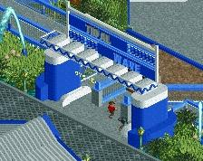
Keep going.
Lovely
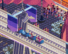
Wow, took me a while to even realize this was CSO, this looks really good.