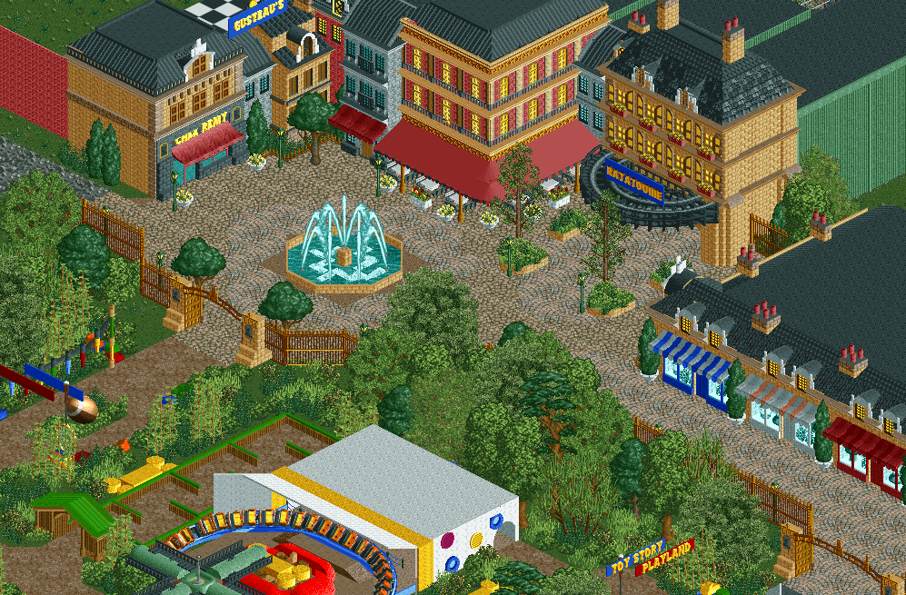
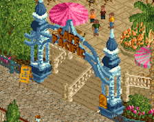
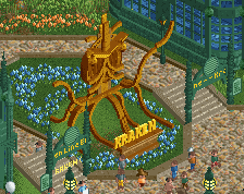
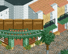
Superb screen. That gate is very very arousing as pointed out by BarnNID. The Ratatoille stuff is especially good I think, really loving that patio.
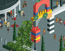
Perhaps that black woodie awning is just a tad bit too bulky though, and it feels like it would be hard to read that sign up there. One idea is to move the awning one tile closer to the building, and to use diagonal track pieces instead to widen the curve. Then you'd probably need to hide parts of those curves with the TI as they would extend back into the building and out to the sides. I think this would make it less bulky while still retaining that nice curved style, plus the sign would be located on the edge of the awning instead of a tile back. I'd also experiment with other track types, maybe mixing several in layers to smooth things out. A bit unfortunate too that you can't fit capital L's in the 3D sign but using the I instead is a good compromise
Thnx for the feedback guys! Good to hear that those gates get your juices flowing
@G Force: I'll try some different colours to see if I can break up the tan. I've tried some variations with the grey and dark brown but it tends to get dark and gloomy, which I don't think works in a Disneypark. But I'll try some more; see if I can find some more balance.
@Splitvision: thnx for the advice on the trackitecture. I don't have that much experience with it, so this really helps. I'll try it out. And if it doesn't work, I'll try to make it more refined with some custom objects.
@Jappy: Thnx, I'm interested to hear what it is that reminds you of H2H5?
Jene, I'd argue that as a Disney park the tan we have in game isn't really a proper "base" color either. Could be wrong here but they usually avoid it especially in their more urban themed areas. Not sure if you're looking at any specific parks for reference, but maybe checkout the urban areas of Disney Sea, Disney's Hollywood Studios in Orlando and Disney Studios Paris to get a feel for their color schemes.
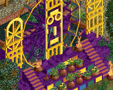
Glad you tried the diagonal track, you made it look great with that
added trim! Is the blue for the sign negotiable though? I didn't think of it before but I do feel like it sticks out a bit - I'd either experiment with other colors, or alternatively use the 3D sign that is one unit slimmer. I also feel like it looks just a little bit too busy in front of that building now that you've added two new planters there. Could they be consolidated into two slightly larger planters? And that single tree in the upper corner of the square might need some mulch underneath it.
Overall a great improvement to a screen that was already very good, nice work!
 22-March 20

Looking very good so far.
that gate is sex
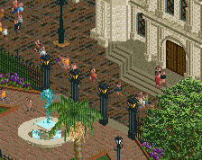
I'd change at least two of those tan buildings to a different color and maybe experiment with grey or something for the fountain and planters.
Superb screen. That gate is very very arousing as pointed out by BarnNID. The Ratatoille stuff is especially good I think, really loving that patio.
Perhaps that black woodie awning is just a tad bit too bulky though, and it feels like it would be hard to read that sign up there. One idea is to move the awning one tile closer to the building, and to use diagonal track pieces instead to widen the curve. Then you'd probably need to hide parts of those curves with the TI as they would extend back into the building and out to the sides. I think this would make it less bulky while still retaining that nice curved style, plus the sign would be located on the edge of the awning instead of a tile back. I'd also experiment with other track types, maybe mixing several in layers to smooth things out. A bit unfortunate too that you can't fit capital L's in the 3D sign but using the I instead is a good compromise
I like it. It has a H2H5 feel about it.
Thnx for the feedback guys! Good to hear that those gates get your juices flowing
@G Force: I'll try some different colours to see if I can break up the tan. I've tried some variations with the grey and dark brown but it tends to get dark and gloomy, which I don't think works in a Disneypark. But I'll try some more; see if I can find some more balance.
@Splitvision: thnx for the advice on the trackitecture. I don't have that much experience with it, so this really helps. I'll try it out. And if it doesn't work, I'll try to make it more refined with some custom objects.
@Jappy: Thnx, I'm interested to hear what it is that reminds you of H2H5?
Jene, I'd argue that as a Disney park the tan we have in game isn't really a proper "base" color either. Could be wrong here but they usually avoid it especially in their more urban themed areas. Not sure if you're looking at any specific parks for reference, but maybe checkout the urban areas of Disney Sea, Disney's Hollywood Studios in Orlando and Disney Studios Paris to get a feel for their color schemes.
The row of storefronts on the right are kinda bland compared to the storefronts around the Ratatouille entrance.. I'd consider sprucing them up a bit.
https://drive.google...iew?usp=sharing
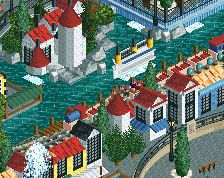
I´ve worked on the Ratatouille area and tried to incorporate your feedback. I think it´s an improvement
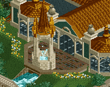
That's looking better, the new fountain is wonderful.
Wow really nice.
Glad you tried the diagonal track, you made it look great with that
added trim! Is the blue for the sign negotiable though? I didn't think of it before but I do feel like it sticks out a bit - I'd either experiment with other colors, or alternatively use the 3D sign that is one unit slimmer. I also feel like it looks just a little bit too busy in front of that building now that you've added two new planters there. Could they be consolidated into two slightly larger planters? And that single tree in the upper corner of the square might need some mulch underneath it.
Overall a great improvement to a screen that was already very good, nice work!
I agree
barnNID said:
that gate is sex (lol)