Very nice atmopshere going on. You are improving your archy, I like how you did your roofs. Still not a fan of the wooden landtexture but oh well... at least it's less and thus better than at first.
Wow Jappy, this is much further already than I expected. Looking good. A bit wild design wise perhaps, but it fits with the theme you're going for here. I love the composition btw. Well done!
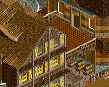
I love this so much!All these different wood textures you used with the different colors make it all kinds of interesting but at the same time very consistent...
It makes me want to go to disney
This is good stuff! Really immersive and great vibe. Some of the buildings are perhaps a little bit on the blocky side but I think it works for the theme. Colors, foliage and landscaping all come together in a neat way. Queue interaction is tasty!
I applaud this simply because it's real fun, but otherwise this isn't coming together for me compositionally. I think the culprit is room to breathe. A cramped vibe may be what you wanted, but I think having a couple of the buildings not pushed up to the path edge with a row of trees or gardens would make a world of difference. Same with the brake run being right up on the path.
Also not a huge fan of what you're doing with the roofs but that may be just me. I'm a big proponent of less-is-more, and I think you'll be surprised by how clean a simple A-shaped roof with trim could help this out. Keep going!
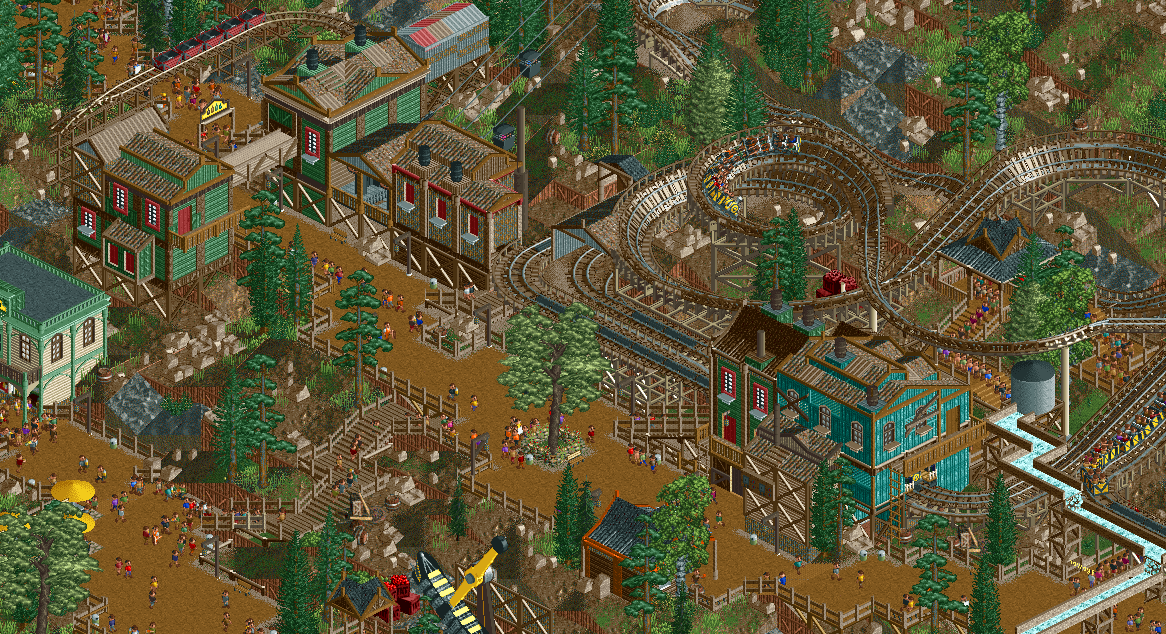
You've done too much, in my opinion, twice over. There's so many support wall pieces framing the buildings, or just used in general. The trims that are a different color on the roofs is forcing an extra level of variation which isn't necessary, and is actually a drawback. A lot of these buildings are close to having strong shapes that you don't need all that to try to boost it up. You're missing some chances to add actual interest to the forms - for example, you have lots of chimneys/smoke stacks, but none are attached to the periphery; they're just added to the roofs. You can get beautiful forms just by giving the chimneys shapes here.
All the walls are vertically framed, if not framed in boxes too; which is okay but it makes everything look like tiny boxes rather than full, comprehensive shapes. The roofs that are supposed to be tattered just add distracting additional textures and disruptive bits - the rusting roofs are already tattered.
I don't understand why the sides of the land are wood, I'm guessing they're retaining walls? I think you'd be better suited to lining it with stone texture. Additionally, I think you should use the 1k ruins much, much more sparingly - they're all clawing for my attention. I'd opt to drop them all together, but that's just because I don't like landscaping with them.
Finally those fences, there's so many vertical poles, supports, frames, etc, and these just make the screen look like poles everywhere.
The atmosphere is starting to build though, which is important.
Great mine train interaction with the queue but it can get a little busy. I think little touches like exposed boards over windows and on the roofing works, but the multitexture portions are over the top. And I don't know if the barrel chimneys need to be different colors.
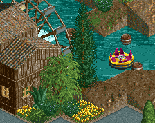
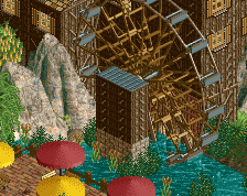
Nice busyness and queue interaction around the mine train, which I think helps add to the whole 'runaway' theme. The cut-through path linking the upper and lower sections is really well done too.
 31-May 20
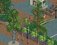
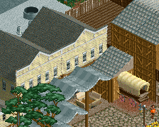
Really nice - I think the foliage should be more bushy than grassy though. Would give it more of a dense overgrown feel.
some vibey shit for sure
Very nice atmopshere going on. You are improving your archy, I like how you did your roofs. Still not a fan of the wooden landtexture but oh well... at least it's less and thus better than at first.
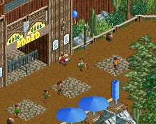
Very lively. You do love your mine trains jappy
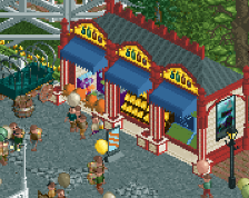
This is good, although I almost feel like it would benefit from a difference fence type. Coaster looks solid.
Wow Jappy, this is much further already than I expected. Looking good. A bit wild design wise perhaps, but it fits with the theme you're going for here. I love the composition btw. Well done!
I love this so much!All these different wood textures you used with the different colors make it all kinds of interesting but at the same time very consistent...
It makes me want to go to disney
This is good stuff! Really immersive and great vibe. Some of the buildings are perhaps a little bit on the blocky side but I think it works for the theme. Colors, foliage and landscaping all come together in a neat way. Queue interaction is tasty!
Isn't scenarioplay fun?
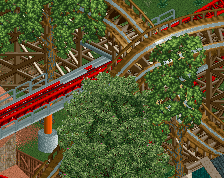
Track Layering is spot on here. Great atmosphere
I applaud this simply because it's real fun, but otherwise this isn't coming together for me compositionally. I think the culprit is room to breathe. A cramped vibe may be what you wanted, but I think having a couple of the buildings not pushed up to the path edge with a row of trees or gardens would make a world of difference. Same with the brake run being right up on the path.
Also not a huge fan of what you're doing with the roofs but that may be just me. I'm a big proponent of less-is-more, and I think you'll be surprised by how clean a simple A-shaped roof with trim could help this out. Keep going!
You've done too much, in my opinion, twice over. There's so many support wall pieces framing the buildings, or just used in general. The trims that are a different color on the roofs is forcing an extra level of variation which isn't necessary, and is actually a drawback. A lot of these buildings are close to having strong shapes that you don't need all that to try to boost it up. You're missing some chances to add actual interest to the forms - for example, you have lots of chimneys/smoke stacks, but none are attached to the periphery; they're just added to the roofs. You can get beautiful forms just by giving the chimneys shapes here.
All the walls are vertically framed, if not framed in boxes too; which is okay but it makes everything look like tiny boxes rather than full, comprehensive shapes. The roofs that are supposed to be tattered just add distracting additional textures and disruptive bits - the rusting roofs are already tattered.
I don't understand why the sides of the land are wood, I'm guessing they're retaining walls? I think you'd be better suited to lining it with stone texture. Additionally, I think you should use the 1k ruins much, much more sparingly - they're all clawing for my attention. I'd opt to drop them all together, but that's just because I don't like landscaping with them.
Finally those fences, there's so many vertical poles, supports, frames, etc, and these just make the screen look like poles everywhere.
The atmosphere is starting to build though, which is important.
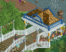
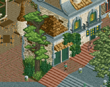
I love those steps, very tastefully designed.
Great mine train interaction with the queue but it can get a little busy. I think little touches like exposed boards over windows and on the roofing works, but the multitexture portions are over the top. And I don't know if the barrel chimneys need to be different colors.
Nice busyness and queue interaction around the mine train, which I think helps add to the whole 'runaway' theme. The cut-through path linking the upper and lower sections is really well done too.