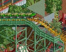
Screenshot / Lake Cryptid - Sasquatch Area 2
-
 28-June 20
-
Lake Cryptid
-
2 of 3
- Views 1,611
- Fans 0
- Comments 7
-
Description
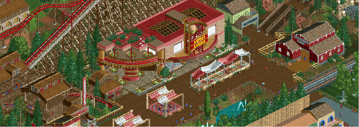
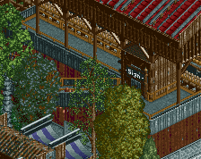
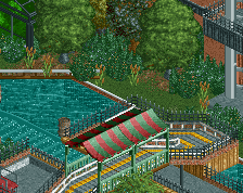
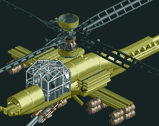
Part of my Lake Cryptid project, the Sasquatch area also features a large restaurant called BigFoot burger, inspired heavily by Terry Inferno - Raspberry Acres.
My first full-scale project working with tricks of the trade such as shoestringing, rides in test mode, and loads of trackitecture. I started this park as part of a contest on the DKMP server and will probably try to expand on the park now that the contest is over. -
Full-Size
-
No fans of this screenshot
-
Tags
![screen_137_[Holding] Concrete Jungle #2/3](https://www.nedesigns.com/uploads/screens/137/137_thumb.png)
I love that burger sign, its super cool. There may be a bit of an overload of red detailing here that is washing out some atmosphere. I'd probably change those bobsled awnings, flowers, signs, and window stuff so that the main red detailing is in the restaurant and really pops more.
great stuff.. the bobsled track over the flowerbeds is a bit overkill, but overall this is very enjoyable.
I appreciate the feedback and will definitely use the comments when I keep working on the park. I wasn't expecting any feedback, let alone some positive stuff; it gives me some more motivation to keep working on the project
Also I know DKMP server in general has a sign fetish but I think it's gotten way out of hand. Stray track piece for the coaster, monstrously large ambiguous construction with random bits and pieces and a burger jammed in. Less is more. Same with all the different types of awnings, and pretty much everything. Monorail for the front of the restaurant, and to the side it suddenly becomes wooden coaster track with stuff on top, in like three different colours, but nothing means anything. The difference between the red and the brown pieces is literally zero other than the busier look. Columns for this awning... The one in the middle looks very different for no apparant reason, and the middle columns itself has random layers again.
If you cut back on random stuff, you're giving your composition room to breathe and it'll bring your work to the next level.
The burger sign is definitely neat, but I see what you mean Liampie. Less trackitecture could help here and there.
@adkbrittany: keep us updated on your park's progress!
love this!
I believe that it is the colors, not the trackitecture itself, that is holding this screen--Bigfoot Burgers in particular--back. You're mixing three very different shades of brown with all three shades of red, and as a result, none of it really pops. Being the original architect behind this design, I obviously don't believe anything is wrong with the building itself (except perhaps with the launched freefalls bleeding through the base blocks), but the paint scheme seems somewhat random.
The colors will pop if you give them a purpose. I wanted a fancy retro neon sign, so I put the neon colors up front, and I gave the rest of the building a traditional "diner" color scheme that makes the sign pop without sacrificing the building's "Hollywood" identity. This is what you want to think about when you're choosing your colors - what do they mean in the context of the building? Why choose this color for this building and not that color? Would this building pass as believable in the world that I've created? All important aspects to assess in RCT architecture.
You're on your way! You've definitely been studying the shapes of buildings. The next step for you will be to study context, which includes color schemes.