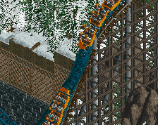
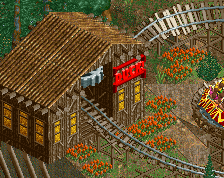
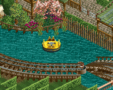
In the final version, the reverser element is for show. It's just a merge of two straight pieces, one forward and one backward. So the log goes from forward to backwards turned 90 degrees. (It's in shuttle mode so it doesn't crash, just reverses.) It doesn't do a nice spinning animation. You could merge two reverser tables together and you'd get the same end effect but with more spinning animation, but then you run more risk of logs piling up behind it while it's doing the reverse animation twice, which is why I changed it to just a merge of straight pieces. Will upload the park soon and it should be clearer when you see it in game.
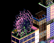
I agree with Liampie, not a fan. Just seems to strange to be taken seriously. A start to something in another dimension that really doesn't make that much sense at the moment. Would be interesting to see what evolves from it though.
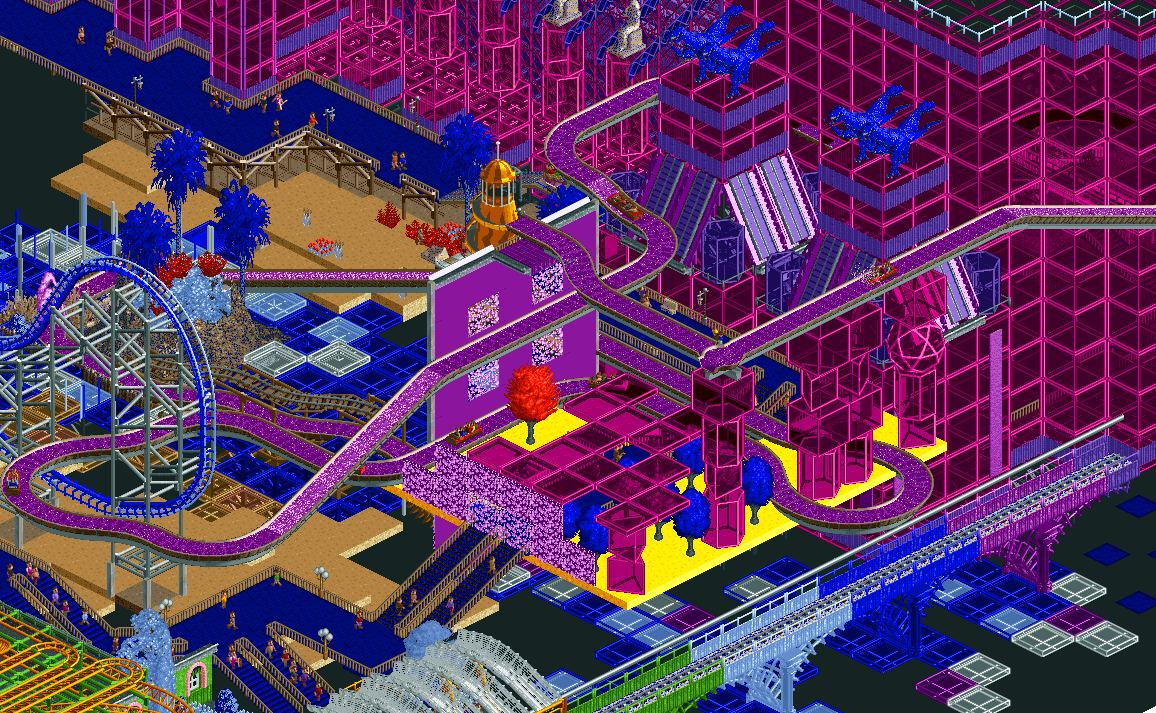
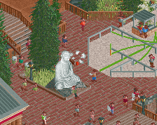
I like this kind of stuff and I want to see more of it. It does feel a tad unrefined, relatively speaking for something more abstract. There are multiple good set pieces but not a lot of consideration in how they fit together. A wacky flume idea with a 4D track plus path and sculptures more interwoven would be great.
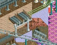
This falls somewhere in the middle of abstract and plausible with floating sections and then other things that are well supported. The glass at ground level with the texturing under it is more subtle and a nice accent for this type of thing, it stands out a little better from the aggressively stacked glass objects.
This has potential but needs to be more composed better IMO. It's a bit too piled on top of each other here. But this has potential and I look forward to more.
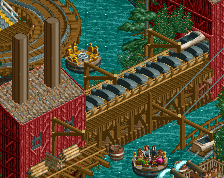
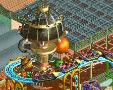
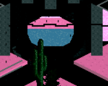
Here's my first attempt to clean this up a little. Chose colors that would help the log flume "station" pop out more from the church behind it, and tried to give it an identity with a more fully formed orchard theme. Kind of debating whether it is worth it to keep working on this, or just start another project in a similar style but with more space between elements
 28-December 20
RaunchyRussell Offline
Really cool concept! I dig it.
this works quite well, I find often the vaporwave stuff doesn't quite work in rct but I enjoy this a lot. the purple shapes are wonderful
I love it.
f u t u r e
Not a fan of this, it seems to lack some composition. The colour scheme is great, and the log flume track in purple looks really cool.
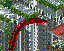
hey does that overlapping log flume reverser make the train turn 270 degrees? cool if so
In the final version, the reverser element is for show. It's just a merge of two straight pieces, one forward and one backward. So the log goes from forward to backwards turned 90 degrees. (It's in shuttle mode so it doesn't crash, just reverses.) It doesn't do a nice spinning animation. You could merge two reverser tables together and you'd get the same end effect but with more spinning animation, but then you run more risk of logs piling up behind it while it's doing the reverse animation twice, which is why I changed it to just a merge of straight pieces. Will upload the park soon and it should be clearer when you see it in game.
I agree with Liampie, not a fan. Just seems to strange to be taken seriously. A start to something in another dimension that really doesn't make that much sense at the moment. Would be interesting to see what evolves from it though.
Looks good to me. I can't wait to see the completed work in game.
I like this kind of stuff and I want to see more of it. It does feel a tad unrefined, relatively speaking for something more abstract. There are multiple good set pieces but not a lot of consideration in how they fit together. A wacky flume idea with a 4D track plus path and sculptures more interwoven would be great.
This falls somewhere in the middle of abstract and plausible with floating sections and then other things that are well supported. The glass at ground level with the texturing under it is more subtle and a nice accent for this type of thing, it stands out a little better from the aggressively stacked glass objects.
This has potential but needs to be more composed better IMO. It's a bit too piled on top of each other here. But this has potential and I look forward to more.
Here's my first attempt to clean this up a little. Chose colors that would help the log flume "station" pop out more from the church behind it, and tried to give it an identity with a more fully formed orchard theme. Kind of debating whether it is worth it to keep working on this, or just start another project in a similar style but with more space between elements