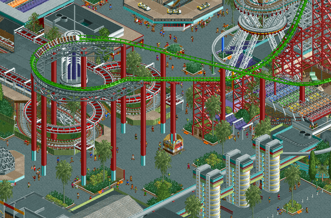
I have to agree with some people above about the color cohesion and the overload of grey. On the other hand, there's so much cool inventive stuff in this screen it's unbelievable. Perhaps you could add some smaller food stalls or arcade games to complete chaotic look you're going for.
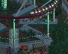
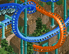
I don't mind the greyness at all, with the bright green track it makes the screen for me.
One method for a wide colour scheme that I think always works nicely is to imagine a colour wheel, but with one colour taken out like a slice of cake, doesn't matter which one. Avoid that colour and the rest will come together as an aesthetic. Maybe in this case, deliberately avoid yellow and saturated brown hues.
I actually dig these colors. I don't think a park would color match their whole park, especially across several decades and eras. That arrow looks really cool and i love how all the supports are done, its unique but raddddddd. I also love all the different styles of awnings in this screen.
This is the alex I've been waiting to see since I first discovered Luna Park. Everything about this I love... the donut shop columns are nothing short of genius.
 13-March 21
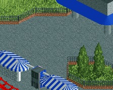
I have to agree with some people above about the color cohesion and the overload of grey. On the other hand, there's so much cool inventive stuff in this screen it's unbelievable. Perhaps you could add some smaller food stalls or arcade games to complete chaotic look you're going for.
Making a wider colour palette look good is hard yea. Maybe look at some Cocoa stuff. He manages quite well I think.
dope!
One method for a wide colour scheme that I think always works nicely is to imagine a colour wheel, but with one colour taken out like a slice of cake, doesn't matter which one. Avoid that colour and the rest will come together as an aesthetic. Maybe in this case, deliberately avoid yellow and saturated brown hues.
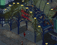
Ah sweet is this the rct1ll seaside park luna park?
the bright green is awesome.
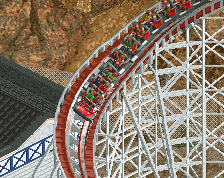
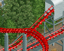
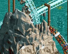
Cool entrance and coaster
I actually dig these colors. I don't think a park would color match their whole park, especially across several decades and eras. That arrow looks really cool and i love how all the supports are done, its unique but raddddddd. I also love all the different styles of awnings in this screen.
This is the alex I've been waiting to see since I first discovered Luna Park. Everything about this I love... the donut shop columns are nothing short of genius.