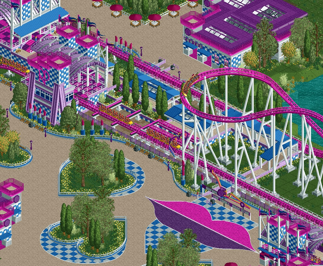
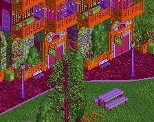
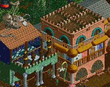
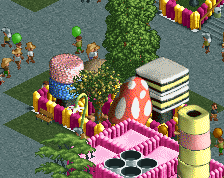
Some great stuff in there like the hearts, kiss. You nailed the station. For me it's a bit too pink/purple, I think adding a third color would be good but ofc I don't know if that fits the narrative?! I don't know the IP.
For a theme that has a potential to be overwhelmingly over-the-top, I adore how you've managed to really tread that line between garish and tasteful here. The busy-ness is offset by the repetition of the motifs here, and it makes it striking and impactful right at the first view; the skill level of the detailing only makes it even more enjoyable to do a deep dive into.
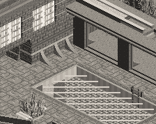
Amazing idea ! The only thing I would improve is the top part of the screen. Path and archy + the nickbrellas feel a bit uninspired and respects the grid a bit too much.
Otherwise everything else is pure fire and super original.
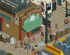
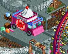
This is fantastic, The checkerboard pattern + texture is great as is the little drag racer sign.
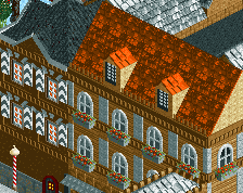
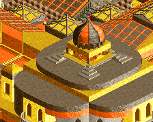
My only critique is that I don't really like the dark purple roof on the building on the top right. This colour only comes back in very small doses in the rest of the screen and suddenly you have this big blob of dark purple which really stands out and catches they eye imo. I would maybe consider using a different colour here which draws a bit less attention, but not really sure which colour would fit well.
 18-March 21
What...
Some great stuff in there like the hearts, kiss. You nailed the station. For me it's a bit too pink/purple, I think adding a third color would be good but ofc I don't know if that fits the narrative?! I don't know the IP.
For a theme that has a potential to be overwhelmingly over-the-top, I adore how you've managed to really tread that line between garish and tasteful here. The busy-ness is offset by the repetition of the motifs here, and it makes it striking and impactful right at the first view; the skill level of the detailing only makes it even more enjoyable to do a deep dive into.
love the checkerboard overload
Love this even if I never watched the show.
Amazing idea ! The only thing I would improve is the top part of the screen. Path and archy + the nickbrellas feel a bit uninspired and respects the grid a bit too much.
Otherwise everything else is pure fire and super original.
gorgeous.
not sure if anyone has mentioned the foliage yet, but wow, that foliage is incredible.
This is fantastic, The checkerboard pattern + texture is great as is the little drag racer sign.
My only critique is that I don't really like the dark purple roof on the building on the top right. This colour only comes back in very small doses in the rest of the screen and suddenly you have this big blob of dark purple which really stands out and catches they eye imo. I would maybe consider using a different colour here which draws a bit less attention, but not really sure which colour would fit well.
i dunno how you did the checker board rounded, but that's cool. nice color set here.