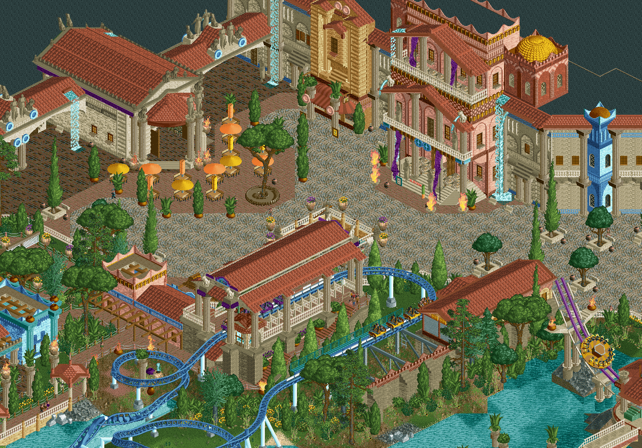
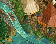
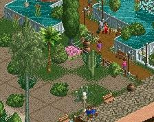
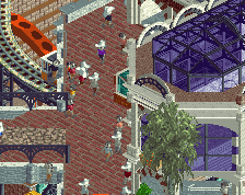
Already feels very vibrant and full of life despite no peeps. I think you can push the atmosphere even further actually. Consider more lighting options (even the typical string lights in certain areas would look great). I like the idea with the fire as lighting, but maybe we can look at finding a different object to use that wouldn't be so devastatingly dangerous irl haha.
Foliage is nice, but can definitely be cleaned up a bit along the bottom part of the screen around the coaster. Maybe some of it even thicker and use less medium size trees. That way there's a good difference between the tall trees and shrubbery.
Very minor nitpicks of course - this is honestly the coolest thing I've seen on this site in a long time. Huge fan!
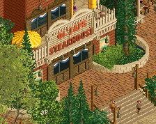
The dark brick path on the left is great. But to me it feels like it should be at a different elevation than the rest of the path. Maybe consider raising it up by a half unit or so - and have stairs that lead down to the current cobblestone-ish texture level. Also consider raising the section with the tables and chairs slightly and fence it in to have a hard vertical edge that you can line with small planters like those you currently have.
The only thing I'm not into here is the colors of the umbrellas actually. Bright yellow and orange sorta clashes with the more pastel colors of the rest. Maybe play with those a bit.
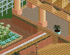
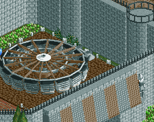
That's something Liam also mentioned to me, I really forgot about that and it's everywhere like this in this zone. I'm too far with this zone to adjust everything imo. Stupid mistake, I learned about this in school. But that's also like 15 years or more ago...
Go on a quest to find the mythical civilization Atlantis! Watch out for the Kraken, don't fall into the Abyssus and watch out for the torn of Poseidon...
(upper left & right is not done and therefore blacked out)
 23-December 22
Hell yeah Fred!!!
epic
God dude this is too good.
Already feels very vibrant and full of life despite no peeps. I think you can push the atmosphere even further actually. Consider more lighting options (even the typical string lights in certain areas would look great). I like the idea with the fire as lighting, but maybe we can look at finding a different object to use that wouldn't be so devastatingly dangerous irl haha.
Foliage is nice, but can definitely be cleaned up a bit along the bottom part of the screen around the coaster. Maybe some of it even thicker and use less medium size trees. That way there's a good difference between the tall trees and shrubbery.
Very minor nitpicks of course - this is honestly the coolest thing I've seen on this site in a long time. Huge fan!
SOOOOO Good! Great job!
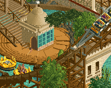
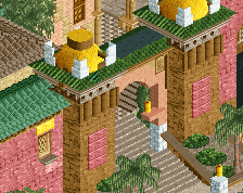
Love the huge, grandiose architecture. Hard not to imagine yourself getting lost in it all. I will say some of the paths feel a little empty though.
Another suggestion if thats cool.
The dark brick path on the left is great. But to me it feels like it should be at a different elevation than the rest of the path. Maybe consider raising it up by a half unit or so - and have stairs that lead down to the current cobblestone-ish texture level. Also consider raising the section with the tables and chairs slightly and fence it in to have a hard vertical edge that you can line with small planters like those you currently have.
Big
Loving the size and scale of this.
Ah come on, you know what I have to say now...
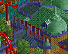
christ this is excellent i love it. great little splashes of color, so vibrant
One note though - the larger building doesn’t read right to me, usually the pediment Is solid in this type of architecture.
Some examples below.
http://www.institute...ent-Heights.jpg
That's something Liam also mentioned to me, I really forgot about that and it's everywhere like this in this zone. I'm too far with this zone to adjust everything imo. Stupid mistake, I learned about this in school. But that's also like 15 years or more ago...
FRED!
TIM!