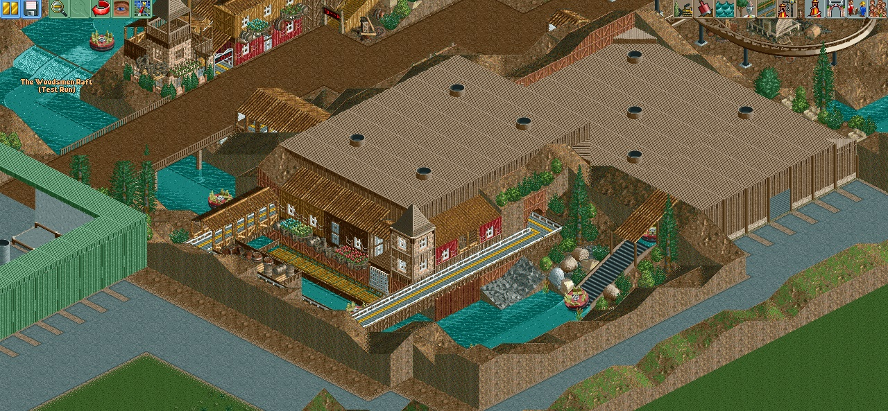
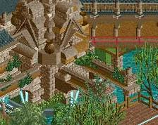
Screenshot / The Adventuremine
-
 13-April 14
-
Golden Gate Theme Park (Finished)
-
2 of 9
- Views 1,658
- Fans 0
- Comments 10
Community Forum Software by IP.Board
![screen_7497_[Cancelled] Stadtpark Stuhr](https://www.nedesigns.com/uploads/screens/7497/7497_thumb.png)
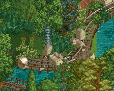
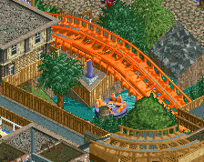
i like it . The rapids are cool . The houses are good in my opinion . But please theme the bridge over the rapids .
you´re improving.
good,
I don't like it. The colours are waaay to dull and lifeless for me. Everything is brown, even the roofs and the paths.
The ideas are there, but it needs a few things to spice it up. As Faas said, there is too much brown, but instead of the roof/paths, I think it's more down to the landscape. Maybe try changing some areas of the dirt into red sand.
The roof definitely needs something more though, I'd even suggest taking most of it away so that you can theme the inside of the building.
It would be nice if the architecture was a bit more detailed, but not critical.
This definitely has potential, it just needs more refinement to get there.
There are some good things here, but the massive flat brown roofs sort of kill it for me.
^^This.
I'd say that if most of the ride is under that roof then a cut-away/see-through areas would do a world of good and make it look a lot less plain.
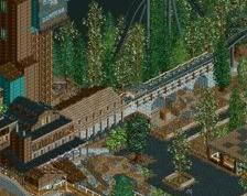
Not really feeling the backstage area; I guess its realistic but in my opinion it really takes away from any atmosphere that you have.
I also think that the bridge should go up and then down rather than be completely flat, although that's just a minor thing.
Bland, sterile, and safe structures, really. You've got some nice design choices here and there but the textures (brick!) and the way it's composed ruins it for me. The huge rooves aren't helping the situation, either. 30%
Too random details and textures. You've got some good ideas though.
When I first looked at this screen I have to be honest... I wasn't a fan. But the more I look at it the more I like some of the things you did here.
The composition of this screen is very brown and unappealing, but from the viewpoint of the guests it's actually much more appealing. It seems like you put a lot of thought into hiding the backstage areas from guests, and for the most part you did a very good job.
From a guests perspective, that canyon area would be very nice. I would suggest adding some shade... probably from trees but besides that and the obnoxious green wall that would only be partially obscured by the trees that are there now it's a very immersive area. It's not without faults (it's still very brown) but it's nice.
I want to preface the rest of this comment by saying that there are a lot of people here who have a much better understanding of this game and how to use it as an art medium than I do. In addition to that, everyone is going to have different priorities when playing the game so there will never be a "right" and "wrong" way to do anything. That being said, this is my opinion...
While in real life, a park can be really ugly backstage because guests will never see those areas, I think that in RCT you need to be conscious of the fact that the viewer will be looking at it from one of four birds eye angles so you should spend some time thinking about composition from the viewpoint of the people viewing your park AND from the viewpoint of the peeps. If this park were real, the brown roof wouldn't matter because guests would never see it but in RCT2 it does matter because everyone playing the game will see it and it does detract from the area around it. I think it would help this park a lot if you focus more on color and design in areas that guests won't see.
Feel free to disagree as this is a matter of opinion. Like I said, real parks are free to ignore these types of things in backstage areas and if you want to cite that as a counterargument then you can absolutely do that. Personally though I think this would be much better if you spent as much time thinking about the people playing the game as you do the peeps in the park.
It's far from perfect, but overall there are some nice things here.
Thanks for this awesome comment Coasterbill. I love that you really took the time to explain your opinion.
About the Screenshot:
This may sound crazy, but this "style" of building is actually based on myself. When I visited Toverland and Efteling a few weeks ago I noticed, that I was really interested in how the backstage area is constructed and how these big halls are implementet in the theming. So I decided that building this style will probably help me to enjoy the game a little bit more.
I agree that the screen is pretty brown, but I actually don't like other colors with the wooden texture. I basically added the brick building just to break this brown wooden thing I've got going on. Again, I don't really know why a rather poor miner's town shouldn't be brown. I guess I will try to bring some other colors in, but I really find it difficult to implemend colors that fit to what I want to achieve.
I actually do think about changing the roof into a more realistic grey, just to tone down the brown a bit, and to add some realistic details. I will look at various theme parks in google maps to generate ideas.