As per usual so strong on a number of levels. What stands out to me as of late, also in your recent Design win, is the cleanliness improvement of your micro, despite how hard you decide to go with it.
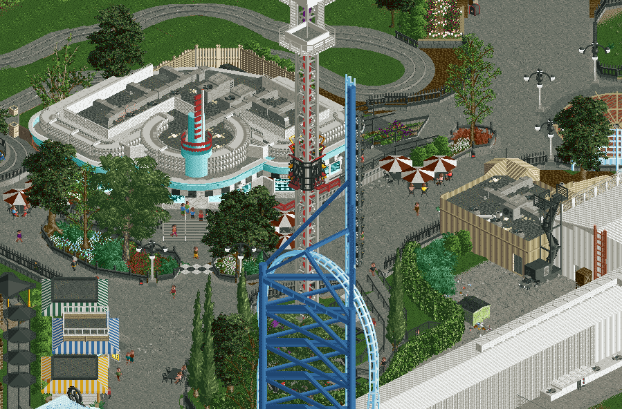
I wouldn't change too much here, but I think for future projects you'll want to be more mindful of sightlines. The big coaster is blocking the tower, which is blocking the building front, which is blocked by big trees.
And NB to everyone: I will be moderating screen ratings, including this one, and very quickly hand out bans to anything ill intended. There's already one account affected.
Agreed on the sightlines - which is tough because we always want to try and account for both the view of the "guests" from within the park as well as our own isometric view. I wouldn't necessarily change anything though because it's excellent as is - just something to keep in mind as you go. Colors and detail are on point as always.
this is more on me not taking good screenshots than inherent poor planning; it reads a bunch better from basically any other angle, but i wanted to festure the diner prominently.
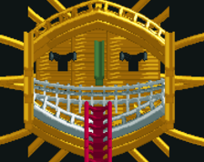
outstanding, absolutely love the reels in the architecture. so clean. i really love that rust color as an accent (like the ladder on the far right in the backstage area), feel like a few more pops of that would work very well.
also the little checkerboard path between the planters is a beautiful touch.
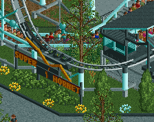
there's definitely some details missing, and i am considering redoing the support structure for that very reason.
That might be a worthwhile cause, I think of everything here the coaster is probably the weakest. However it's still quite good, so if it doesn't immediately feel better then it's probably best just to leave as is and add a few extra details.
One thing I did notice though is that the IRL ride only has a 5 car train instead of a 6 car like you have.
 09-October 23


Agreed on the sightlines - which is tough because we always want to try and account for both the view of the "guests" from within the park as well as our own isometric view. I wouldn't necessarily change anything though because it's excellent as is - just something to keep in mind as you go. Colors and detail are on point as always.
i kinda like the sightline- adds to the realism. Its really gorge, love this. want those 15$ chicken tender basket
Otherwise I think it all looks pretty good.
there's definitely some details missing, and i am considering redoing the support structure for that very reason.
outstanding, absolutely love the reels in the architecture. so clean. i really love that rust color as an accent (like the ladder on the far right in the backstage area), feel like a few more pops of that would work very well.
also the little checkerboard path between the planters is a beautiful touch.
That might be a worthwhile cause, I think of everything here the coaster is probably the weakest. However it's still quite good, so if it doesn't immediately feel better then it's probably best just to leave as is and add a few extra details.
One thing I did notice though is that the IRL ride only has a 5 car train instead of a 6 car like you have.
Love that diner.