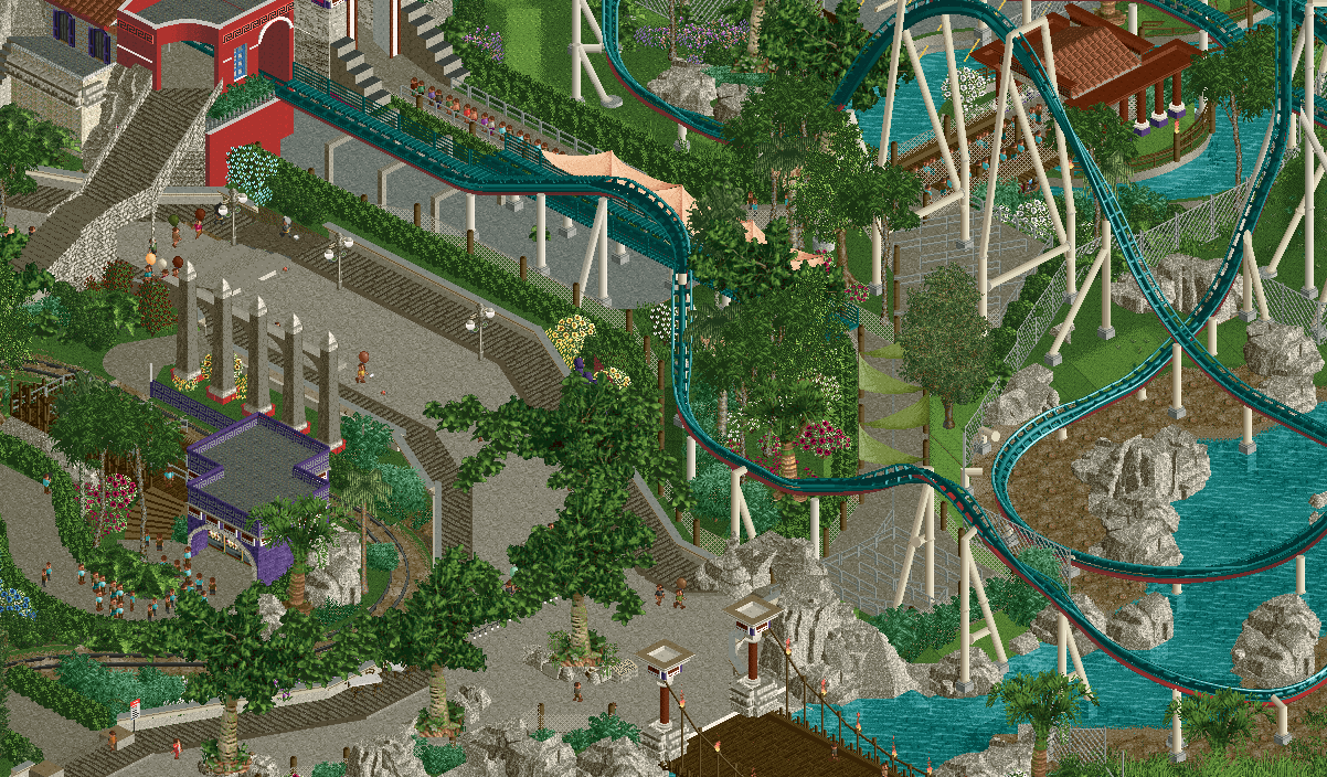
Not entirely keen on the textures - never really been a huge fan of those trees or flowers, and there's a lot of repetition among those ride-cars-as-bushes (those seem to work better on curves than in straight lines) - but I suppose it's a stylistic choice here. Are those peep objects making up the queue?
Coaster seems nice with some good interaction, and I like the big trees in the path.
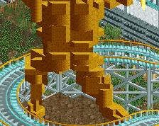
It's all pretty good. There's like kumba levels of jungle bush here hah, maybe just use a bush that doesn't match the tree type you have I think the trees are well done.
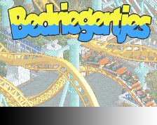
I'm loving the scale here, as well as the generally unique aesthetic. I think there's some textural cleaning up to do though. I also think the capitols on the bridge columns are a bit too large/heavy looking.
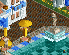
i agree with alex here - my favorite parts of the screen are the peach awnings, the red station and the yellow flower bush - i feel like a few more of those tones spotted around would make the atmosphere a little more cohesive. right now you have a ton of dark washed out colors on top of each other than make it a little hard to read whats happening.
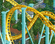
the coaster color being a brighter shade of teal would also help I think.
I can see what you're going for with the bit tree canopies, and I like the idea a lot - it just doesn't quite read cleanly enough. not sure what an alternative would be, though, you'd def know better than me
 01-August 23


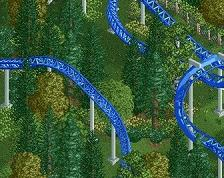
Not entirely keen on the textures - never really been a huge fan of those trees or flowers, and there's a lot of repetition among those ride-cars-as-bushes (those seem to work better on curves than in straight lines) - but I suppose it's a stylistic choice here. Are those peep objects making up the queue?
Coaster seems nice with some good interaction, and I like the big trees in the path.
Cool stuff- I think it's just lacking a few more pops of colour
I'm loving the scale here, as well as the generally unique aesthetic. I think there's some textural cleaning up to do though. I also think the capitols on the bridge columns are a bit too large/heavy looking.
Exciting project!
i agree with alex here - my favorite parts of the screen are the peach awnings, the red station and the yellow flower bush - i feel like a few more of those tones spotted around would make the atmosphere a little more cohesive. right now you have a ton of dark washed out colors on top of each other than make it a little hard to read whats happening.
the coaster color being a brighter shade of teal would also help I think.
I can see what you're going for with the bit tree canopies, and I like the idea a lot - it just doesn't quite read cleanly enough. not sure what an alternative would be, though, you'd def know better than me
I really like the lower left of this screen. The half diagonal bridge just seems extremely forced. Could just be the textures though.