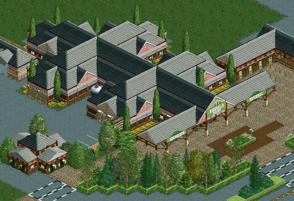
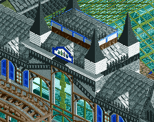
Some sort of weird visual effect of this building feeling shorter than it really is. I think it has to do with the layer cake of textures. I like the forms, and it's appealing in general - just a bit of a strange illusion.
I'm actually really enjoying this, along with the other two screenshots from this project. I think the clean, technical and somewhat minimalist style you're working with is a great development for you and then this use of unorthodox objects is pushing it even further.
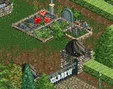
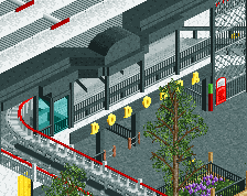
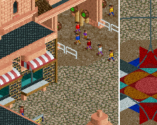
Just so I'm reading this right, guests go thru the building beginning under the Emerald Park sign, and go into the park in the top left? Or is it a ticket window building?
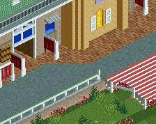
Either way, I do like the use of the roof object. That wwtt object has definitely grown on me. I do agree with CC9, perhaps you don't need the wooden walls that look like skinny tree branches. Not sure they go well with brick.
Thanks for the feedback! Really helps making decisions. I still need to make some changes here and there.
@Ottersalad, most guests actually enter the park on the right hand side of the building. I need to change that small building to make it more clear. The building itself is more like an information center and gift shop. Besides the front there are also entries for guests on the right and top left. Left side of the building is for staff.
 12-November 23
Some sort of weird visual effect of this building feeling shorter than it really is. I think it has to do with the layer cake of textures. I like the forms, and it's appealing in general - just a bit of a strange illusion.
I'm actually really enjoying this, along with the other two screenshots from this project. I think the clean, technical and somewhat minimalist style you're working with is a great development for you and then this use of unorthodox objects is pushing it even further.
Just so I'm reading this right, guests go thru the building beginning under the Emerald Park sign, and go into the park in the top left? Or is it a ticket window building?
Either way, I do like the use of the roof object. That wwtt object has definitely grown on me. I do agree with CC9, perhaps you don't need the wooden walls that look like skinny tree branches. Not sure they go well with brick.
@Ottersalad, most guests actually enter the park on the right hand side of the building. I need to change that small building to make it more clear. The building itself is more like an information center and gift shop. Besides the front there are also entries for guests on the right and top left. Left side of the building is for staff.
I want to see more thats so clean NCSO in sutch an perfect level of using objects
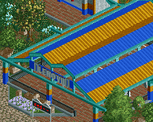
Quite decent, but that roof texture is demanding a lot of attention.
Name slaps