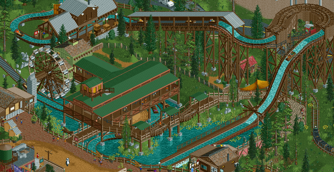
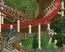
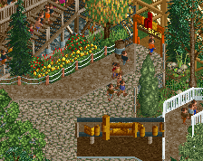
It's really god to see you active, and I really like these screens. The contrast between the dark brown supports and the saturated green backgrounds is very nice and easy to look at. The station's roof is the only exception to this, it pushes it back into the background. I'd pick silver or another lighter colour/texture.
A smaller nitpick: the building on the far left has some perspective issues; I couldn't figure out how the wall worked until I realised the roof was extended by a quarter tile. Improve clarity with some perpendicular beams.
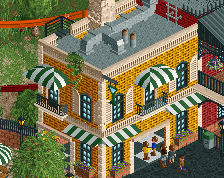
This is nice. Very enjoyable naturalistic theme, relatively complex layering but working very well. Lots of nice little detail touches everywhere too. Hoping for a release from you.
great to see more! i would change the colour of the roof like liam suggested, and maybe add a tower or something to break up the roof a bit - as it stands it could be a bit more interesting/significant as a station. right now the other building looks more significant
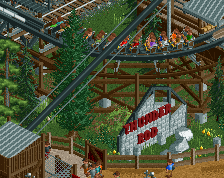
Only thing I'm not a fan of is the ferris-wheel as water-wheel. I think you can make something much more convincing from custom objects and it would be worth sacrificing the movement.
I might be part of the minority, but i actually prefer the green above the red here. The red is too jarring for me and destroys the nice calm atmosphere you had here. Like what Liam said i would try out a lighter color here.
Yeah I don't mean to be disrespectful, because you've spent time building some great RCT, but the first screen was much better for me. Mainly the style and colours of the station and the ferris wheel in place. I think you'd nailed it.
 16-February 24
![screen_4989_[H2H8 Semifinals] Allegheny Adventures](https://www.nedesigns.com/uploads/screens/4989/4989_thumb.png)
It's really god to see you active, and I really like these screens. The contrast between the dark brown supports and the saturated green backgrounds is very nice and easy to look at. The station's roof is the only exception to this, it pushes it back into the background. I'd pick silver or another lighter colour/texture.
A smaller nitpick: the building on the far left has some perspective issues; I couldn't figure out how the wall worked until I realised the roof was extended by a quarter tile. Improve clarity with some perpendicular beams.
This is nice. Very enjoyable naturalistic theme, relatively complex layering but working very well. Lots of nice little detail touches everywhere too. Hoping for a release from you.
great to see more! i would change the colour of the roof like liam suggested, and maybe add a tower or something to break up the roof a bit - as it stands it could be a bit more interesting/significant as a station. right now the other building looks more significant
Another beautiful screen!
Only thing I'm not a fan of is the ferris-wheel as water-wheel. I think you can make something much more convincing from custom objects and it would be worth sacrificing the movement.
great work! so glad to see you building!
some changes based on suggestions:
Attached Thumbnails
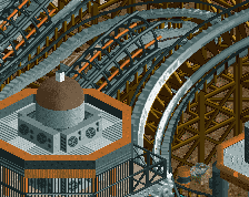
Excellent work with that elevated flume tunnel. It might be my favorite one I've ever seen in RCT.
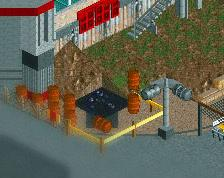
Great improvement. Really like it, the red roof works great here. Also love how you did the queue. Not such a fan of the brick/brown path combo.
Great move on the green. I think it works much better here
I might be part of the minority, but i actually prefer the green above the red here. The red is too jarring for me and destroys the nice calm atmosphere you had here. Like what Liam said i would try out a lighter color here.
Yeah I don't mean to be disrespectful, because you've spent time building some great RCT, but the first screen was much better for me. Mainly the style and colours of the station and the ferris wheel in place. I think you'd nailed it.
This is great! Really rustic and charming. I preferred the original green roof as well, but they both look nice.
I agree with Terry; the elevated tunnel is really nice. Excellent use of the half-diagonal walls!