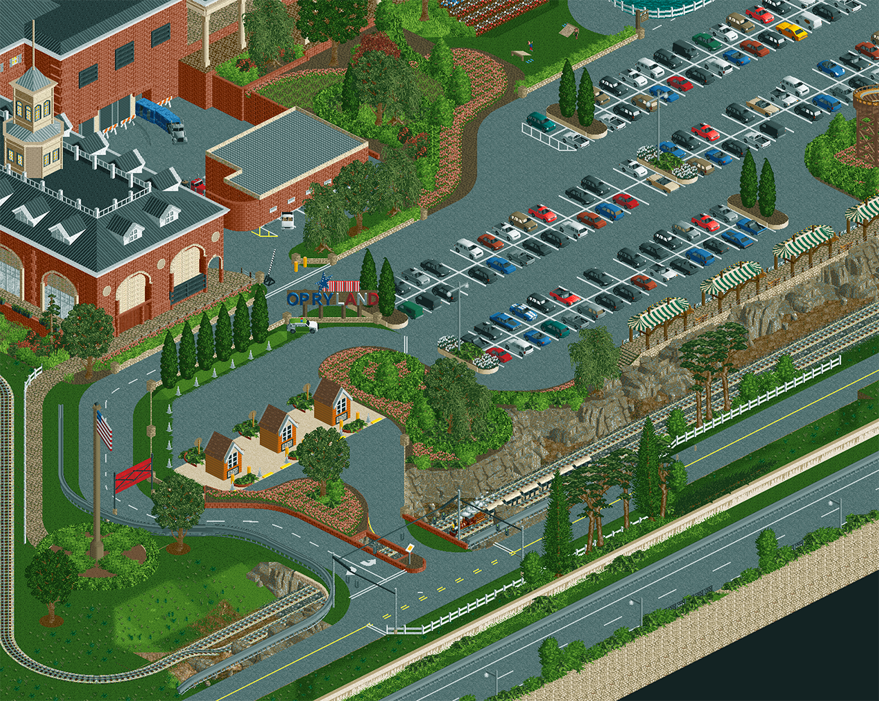
Screenshot / Welcome to Opryland Y'All!
-
 16-February 24
- Views 938
- Fans 1
- Comments 9
-
Description
Having a blast creating what Opryland might look like in 2024. I posted this last week on Discord and have cleaned the area up a little based on some great feedback. Just enjoying building in the game again and re-imagining Nashvilles missing theme park!
-
Full-Size
-
1 fan Fans of this screenshot
-
Tags
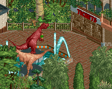
Cool screen! Great job on the rockwork alongside the train.
this is really cool! makes me think of a 2024 RCTNW. keep up the great work!
very nice work. thinking the red building needs some more detailing, but otherwise its fantastic.
@alex - thanks!
@SSSammy - it's funny you should say that. I remember back in the day when RCTNW would just churn out these maps full of hotels and golf courses, wow, dude really is just building as he wants for his own pleasure. Now I find myself in the same stage of like RCTNW probably was back in the early 2000s building the exact same types of maps for likely very similar reasons - some fun and stress relief from adulting!
@RWE - ty, the red wall above the truck is really a stop gap in a ton of detailing either side of it, I think in the context of scrolling either way outside the screen it makes some more sense. But I could see it benefiting from some worker grime or cracks or something like that just to make it a little more interesting.
I really like this, hope we can see more
really like where this park is going, it's clean and well planned out, with some great little details. as alex said, the rockwork really looks nice and organic, and the foliage is great. a little layer of realistic details could elevate this even further.
one thing i'm not super keen on is the flower color, if there's a way to get more variation into there, or at least an accent color here and there i think it would liven it up a little.
Great shaping and coloring on the rocks!
The one texture that feels out of place is the grey roof on the short building. It's both too close to the surrounding path color and too busy of a pattern to occupy a plain, flat roof in its entirety. You could probably work this texture into a black roof (the same texture as you've used on the surrounding flat roofs) with some clever shading.
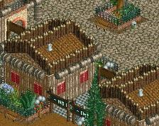
Lovely screen, everything looks very clean. The rocks are great and I also love the sign. I do agree the buildings could use a bit more detail. Looking forward to more.
@walto - for sure, there is tons more already built! Will share some more soon.
@turtle - consider it done! I may have gone overboard adding a purple grass, but why not
@terry - great point, I'll at least change the color. IRL it's a maintenance building with a corrugated roof so it's ugly as sin there too
@Fred - TY, appreciate it! On building details, I chose a particularly bland part of the building to post. That said, I find building to the level of detail that others do to be too slow, as I don't have tons of time on a daily basis for RCT. But the next screen, I'll find a more interesting building to post for sure!