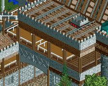
I think you could do a shared support system for the lift. The angled supports could be attached a little lower as well, they don't have to be right up at the top (and usually aren't). Last, I would consider making the drops less of just a flat turn and then a drop and make it dive. Might alter your layout but the diving drop would be much better for this.
Go to your Saved Games folder, find the savegame this is in, select it, right click it, then press delete. If it prompts you, click "yes". Problem solved.
Go to your Saved Games folder, find the savegame this is in, select it, right click it, then press delete. If it prompts you, click "yes". Problem solved.
That's funny, the admin section works in a similar way when banning members.
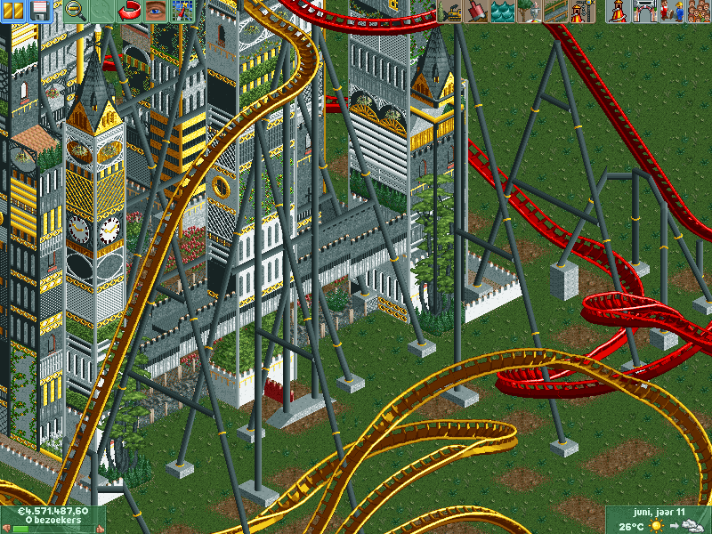
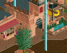
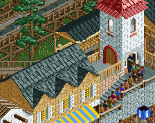
Your old screen looked like it was going for a castly feel, now this looks like some kinda fantasy-city thing, but it's hard to get much from it, because a ton of it looks chaotic and random. I think it'd be a lot better if you settled on a theme or idea instead of spamming random textures.
Your old screen looked like it was going for a castly feel, now this looks like some kinda fantasy-city thing, but it's hard to get much from it, because a ton of it looks chaotic and random. I think it'd be a lot better if you settled on a theme or idea instead of spamming random textures.
I am going with a sort of Steampunk/Fantasy style.
I am going with a sort of Steampunk/Fantasy style.
And not everything has to be of use :/
If you're going for a steampunk fantasy approach, really sell it. Use wood and gears and moving parts and a bunch of things like that to sell it, not seemingly random textures. Corsair Veridian is a good reference for steampunk style stuff, but it looks like you're going for a different approach.
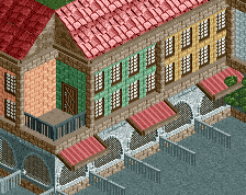
And yes, while not everything has to have a practical use, some things can be there purely for looks. But then they should either be pretty or interesting, or have the appearance of actually doing something. These towers don't do that for me.
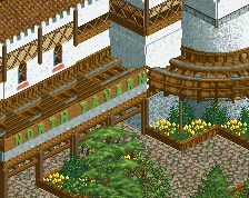
I still think the empty grass is a major opportunity wasted... You can make this awesome if you fill the map with crazy content, but if you have this thing sit on a giant empty field it's going to stick out like a sore thumb.
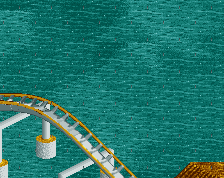
I can see why you won't fill every tile with dense towers and shit, but that doesn't mean these tiles have to be without content... There are other ways to make them a part of the concept. The easiest thing here would be to add landscaping, for example have the coaster sit on water. You'd get something like this:
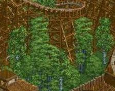
But a properly executed (not-flat) desert/wasteland/forest could work just as well, potentially.
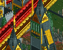
To avoid the towers from getting to repetitive, you might consider incorporating quartertile stuff. You could take a look at Azuris City or The Atlantean Ark for ideas, they share some similarities with your park it seems.
I still think the empty grass is a major opportunity wasted... You can make this awesome if you fill the map with crazy content, but if you have this thing sit on a giant empty field it's going to stick out like a sore thumb.
I know, it is still a work in progress.
Right now I was focusing on supports and thanks for the ideas.
In my humble opinion I think it looks fine; the only real reason the supports look like a complete mess right now is because that's all there is. The issue with dueling/racing coasters is how many supports there area, but if the towers (which I actually quite like) continue throughout the ride then the messiness of the supports will be an awful lot less obvious.
This will also depend on the layouts (can't tell much from the provided screens), at the moment it seems as if it's basically two mirrored layouts, which isn't ideal for supporting because you get a lot of repetition.
I think if you left the default supports there as a guide you wouldn't end up with this amount of un-necessary supports. Delete the default supports as you go. I typically go for example, Lifthill 3 default supports I'd put a support in the middle of the 3.... so for a lifthill with 9 default supports I'd have 3 custom supports... If you get what i'm saying.
I typically go for example, Lifthill 3 default supports I'd put a support in the middle of the 3.... so for a lifthill with 9 default supports I'd have 3 custom supports... If you get what i'm saying.
I enjoy this a lot. It is something that I haven't seen here before! I would love to see a whole map just crazy like this! I am a HUGE fan of steampunk, and you should not listen to Wouter. Never listen to anyone who over-steps the boundaries of constructive criticism like he does.
I think it may be a tad busy, but I think you could make it work very very well if you just continue on the path you are on right now. If you look at some of the Disney castles you will find that they are jammed with crazy amounts of details just like you towers, so I think they are fine
In all honesty, I think you should continue doing exactly what you're doing. What you're making is unique and vibrant, and variants of this style would certainly create an interesting park. Also, I can't say I agree with any comment saying that the textures are unnecessary. Sure, they're random but, essentially, anything that isn't a flat wall could be considered "unnecessary", so I say go ahead with it.
 03-May 14
How can I make this better?
I think you could do a shared support system for the lift. The angled supports could be attached a little lower as well, they don't have to be right up at the top (and usually aren't). Last, I would consider making the drops less of just a flat turn and then a drop and make it dive. Might alter your layout but the diving drop would be much better for this.
Go to your Saved Games folder, find the savegame this is in, select it, right click it, then press delete. If it prompts you, click "yes". Problem solved.
This has the potential to be something really cool.
That's funny, the admin section works in a similar way when banning members.
Wouter VL -->
To be honest, it's so overly messy that i can't even comment on it. Hard to explain.
Your old screen looked like it was going for a castly feel, now this looks like some kinda fantasy-city thing, but it's hard to get much from it, because a ton of it looks chaotic and random. I think it'd be a lot better if you settled on a theme or idea instead of spamming random textures.
And not everything has to be of use :/
If you're going for a steampunk fantasy approach, really sell it. Use wood and gears and moving parts and a bunch of things like that to sell it, not seemingly random textures. Corsair Veridian is a good reference for steampunk style stuff, but it looks like you're going for a different approach.
And yes, while not everything has to have a practical use, some things can be there purely for looks. But then they should either be pretty or interesting, or have the appearance of actually doing something. These towers don't do that for me.
I still think the empty grass is a major opportunity wasted... You can make this awesome if you fill the map with crazy content, but if you have this thing sit on a giant empty field it's going to stick out like a sore thumb.
I can see why you won't fill every tile with dense towers and shit, but that doesn't mean these tiles have to be without content... There are other ways to make them a part of the concept. The easiest thing here would be to add landscaping, for example have the coaster sit on water. You'd get something like this:
But a properly executed (not-flat) desert/wasteland/forest could work just as well, potentially.
To avoid the towers from getting to repetitive, you might consider incorporating quartertile stuff. You could take a look at Azuris City or The Atlantean Ark for ideas, they share some similarities with your park it seems.
I know, it is still a work in progress.
Right now I was focusing on supports and thanks for the ideas.
In my humble opinion I think it looks fine; the only real reason the supports look like a complete mess right now is because that's all there is. The issue with dueling/racing coasters is how many supports there area, but if the towers (which I actually quite like) continue throughout the ride then the messiness of the supports will be an awful lot less obvious.
This will also depend on the layouts (can't tell much from the provided screens), at the moment it seems as if it's basically two mirrored layouts, which isn't ideal for supporting because you get a lot of repetition.
I think if you left the default supports there as a guide you wouldn't end up with this amount of un-necessary supports. Delete the default supports as you go. I typically go for example, Lifthill 3 default supports I'd put a support in the middle of the 3.... so for a lifthill with 9 default supports I'd have 3 custom supports... If you get what i'm saying.
But that will only work for the lifthill.
And i'm trying to keep symmetry in everything.
I enjoy this a lot. It is something that I haven't seen here before! I would love to see a whole map just crazy like this! I am a HUGE fan of steampunk, and you should not listen to Wouter. Never listen to anyone who over-steps the boundaries of constructive criticism like he does.
I think it may be a tad busy, but I think you could make it work very very well if you just continue on the path you are on right now. If you look at some of the Disney castles you will find that they are jammed with crazy amounts of details just like you towers, so I think they are fine
Try looking at some parks by Beejer, looks like a pretty similar style to this:
http://www.nedesigns...ejer/?tab=parks
In all honesty, I think you should continue doing exactly what you're doing. What you're making is unique and vibrant, and variants of this style would certainly create an interesting park. Also, I can't say I agree with any comment saying that the textures are unnecessary. Sure, they're random but, essentially, anything that isn't a flat wall could be considered "unnecessary", so I say go ahead with it.