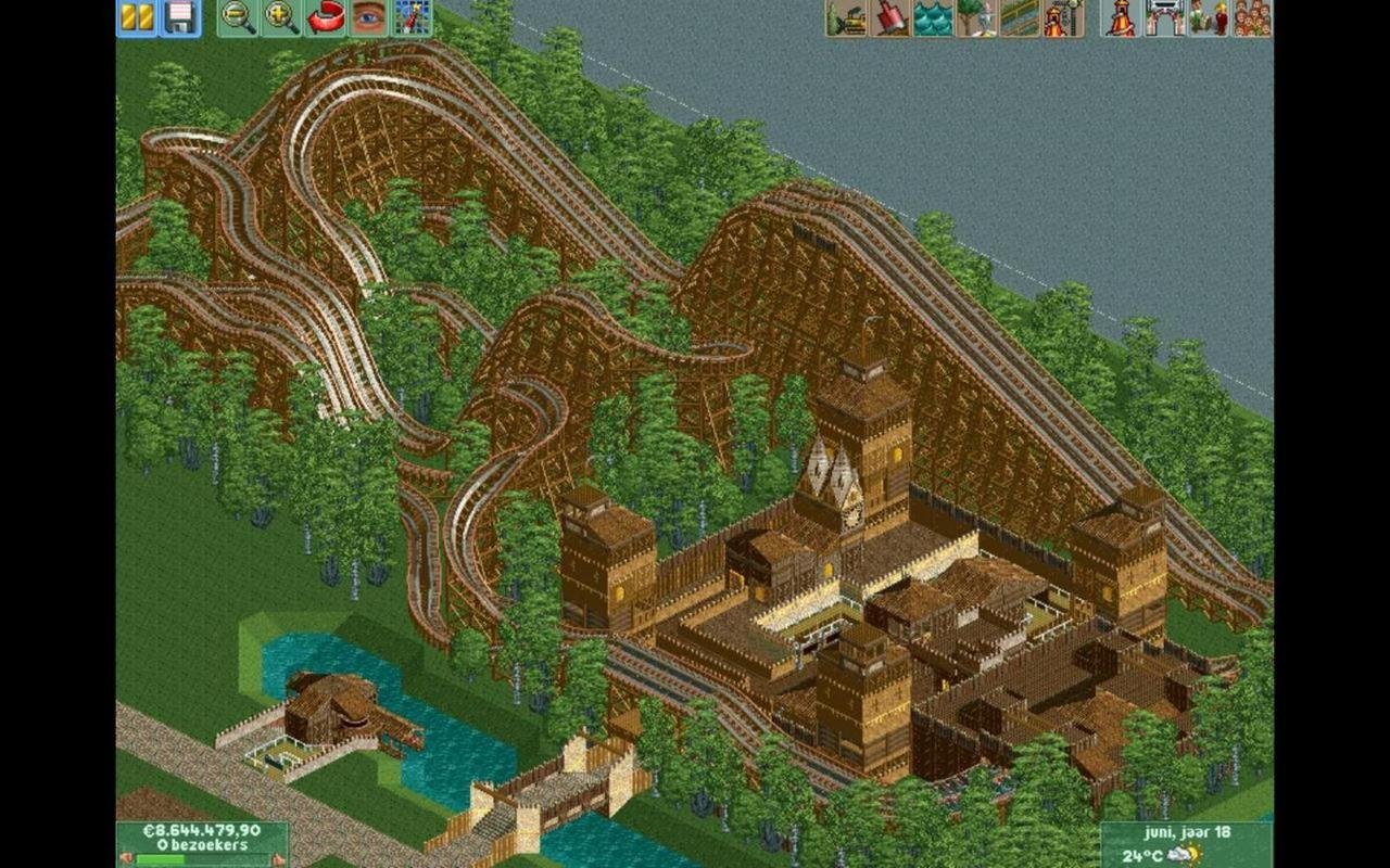
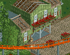
Me too! The tree selection and placement does a very good job of hiding and revealing the coaster, which I imagine would make it quite exciting in real life. i hope the racing element works out nicely.
How did you get that flag behind your name already ;_;
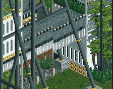
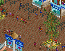
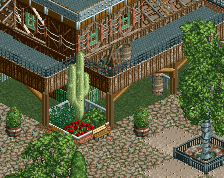
Also, the buildings look a bit weird, i don't know a lot about "textures" but its definitely overtextured. The foliage seems fine, but you've used the same trees too much. Try adding some in with different colours.
Just to make sure that you understand, I was being as sarcastic as I could be. Where is the colour? You literally didn't use ANY other colour than brown. Not in the architecture, not on the roller coaster, and not in the pathing. Why?
i agree with almost everything said above, try making the walls white, that way you atleast got some variation going, and try to make the coaster in another colour so that it stands out a little.
Yeah I guess; I just don't hate brown like some people. Your textures are confusing though. Why would a building use wooden and castle wall? Surely, you would use one or the other. I'm just presuming it's a medieval style anyway.
Over time you will realize just how much you rely on brown for everything everywhere all the time. Much of it, unfortunately, is necessary so you have to look for every opportunity to get away with using other colors.
 24-April 14
Me too! The tree selection and placement does a very good job of hiding and revealing the coaster, which I imagine would make it quite exciting in real life. i hope the racing element works out nicely.
How did you get that flag behind your name already ;_;
Also, the buildings look a bit weird, i don't know a lot about "textures" but its definitely overtextured. The foliage seems fine, but you've used the same trees too much. Try adding some in with different colours.
Maybe some more use of a brown colour. I think it's all a bit too colourful.
I don't.
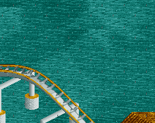
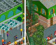
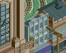
The bridge is sick though
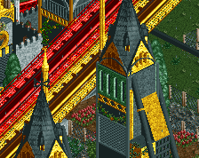
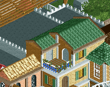
wow nice station theming
Just to make sure that you understand, I was being as sarcastic as I could be. Where is the colour? You literally didn't use ANY other colour than brown. Not in the architecture, not on the roller coaster, and not in the pathing. Why?
Nice. I actually like all the brown. The tiny bits of yellow compliment it.
I really want to like this but the brown kills it for me. I'm not a big fan of the tree selection either.
Come on Poke, even the flags are brown. Brown flags?!
i agree with almost everything said above, try making the walls white, that way you atleast got some variation going, and try to make the coaster in another colour so that it stands out a little.
Yeah I guess; I just don't hate brown like some people. Your textures are confusing though. Why would a building use wooden and castle wall? Surely, you would use one or the other. I'm just presuming it's a medieval style anyway.
Over time you will realize just how much you rely on brown for everything everywhere all the time. Much of it, unfortunately, is necessary so you have to look for every opportunity to get away with using other colors.
This much brown isn't bad, but it would look a whole lot better with one or two accent colors to offset it.
What should be changed then (colorwise)?