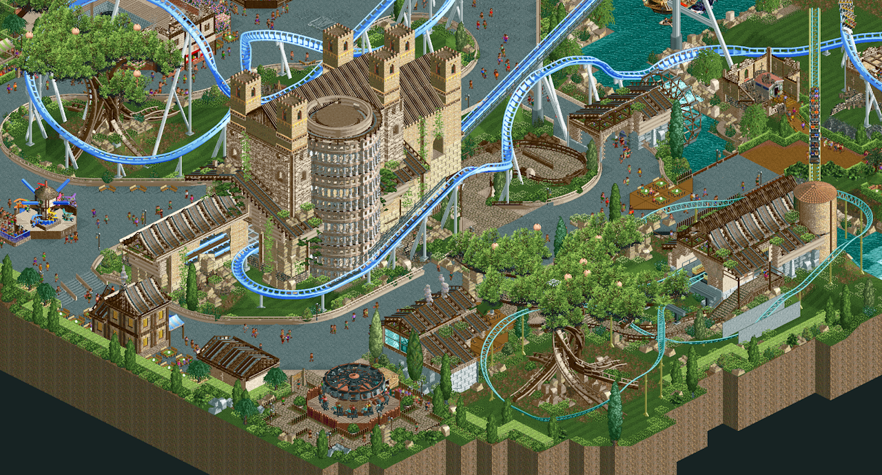
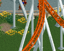
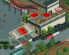
Good main station and colour taste with the greens, beige and light blue. Also a clean and nice interaction of the coaster track where it looks like you have great skill here. The small portion of integration with the queue there is beautifully done.
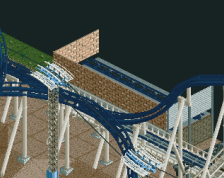
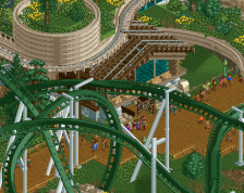
The stylistic tropes of DKMPism hurt this very noticeably for me however: the sharp and technocratic lines of a fence edges made of (more than one?) ride, the wild showy trackitecture set piece focus like the big custom trees, the mix of trackitecture in general for rooves even though they don't work aesthetically, the mowed grass because of the linear design approach to add bit after bit, where negative space isn't incorporated.
I hope you may be open to let yourself be influenced by other building approaches you can find on NE, and stick around, as you're clearly talented, and it would be nice to see what happens if you develop further.
Really enjoyed the station and the use of those specific single-tile roof pieces to get a convincing metallic look! That building was very cool in this, very grand.
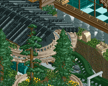
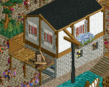
Some of the smaller architecture in this particular side of the map was a little bit more bland than the flip side of the park, but even on some the shown buildings in here, you can see the use of quarter tile objects and monorail walls to get an extra bit of depth you don't normally see in NCSO/DKSO (any style that's primarily full-tile design).
I thought this was really nice, and the layout is superb, but then it was pointed out to me that you used multiple rides for fences and I don't like any of it anymore.
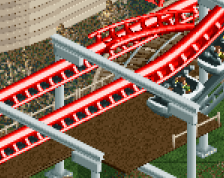
Overall composition looks really nice, i like the huge scale of the station building and this definitely shows some talent. I agree with posix regarding the intense usage of trackitecture on this screen. I think some of the stuff could be made much cleaner and better looking without it. The building materials are a bit too diverse in my opinion as well. I think sticking to 1-2 brick types would give this a bit more clearity too. The parts of the layout we see here look promising though, can't wait to check it out!
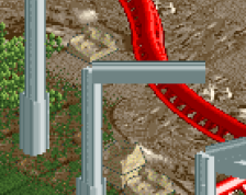
If you guys submit this here, I would recommend making the rails on the tree trackitecture invisible. It'll look more like roots. For the paths, I'd also change the monorail pieces to suspended single rail - less bulky, looks more like an actual fence. The shallow sloped roofs can also be replaced with wooden roof pieces. Other than that, there's a lot of nice stuff present.
 01-January 25
So creative, looking great!
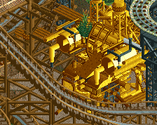
Awesome chunky scale with the hyper's station!
Some of the smaller architecture in this particular side of the map was a little bit more bland than the flip side of the park, but even on some the shown buildings in here, you can see the use of quarter tile objects and monorail walls to get an extra bit of depth you don't normally see in NCSO/DKSO (any style that's primarily full-tile design).
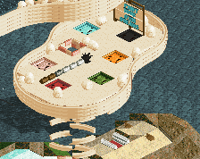
I still think the standout to me was the layout!
Great stuff and congrats on your podium spot!
Buildings look poop
I thought this was really nice, and the layout is superb, but then it was pointed out to me that you used multiple rides for fences and I don't like any of it anymore.
this was really excellent!!!
Overall composition looks really nice, i like the huge scale of the station building and this definitely shows some talent. I agree with posix regarding the intense usage of trackitecture on this screen. I think some of the stuff could be made much cleaner and better looking without it. The building materials are a bit too diverse in my opinion as well. I think sticking to 1-2 brick types would give this a bit more clearity too. The parts of the layout we see here look promising though, can't wait to check it out!
Both stations are really cool. Lovely style. Agree about the overuse of trackitecture.
If you guys submit this here, I would recommend making the rails on the tree trackitecture invisible. It'll look more like roots. For the paths, I'd also change the monorail pieces to suspended single rail - less bulky, looks more like an actual fence. The shallow sloped roofs can also be replaced with wooden roof pieces. Other than that, there's a lot of nice stuff present.
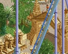
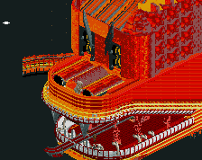
The big tree looks nice and so does the castle