Screenshot / Village Square
-
 25-August 25
-
Creag Mhor
-
3 of 4
- Views 1,980
- Fans 1
- Comments 14
-
Description
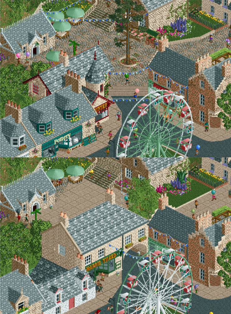
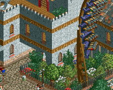
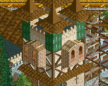
Another update on this! And I thought it would be nice to show a before/after comparison. After all the recent discussions about macro, flow and sightlines I decided to rework this corner of the 'main street' area which I wasn't really happy with. I liked the arch under the old building (which is inspired by a real-life one) and feel it would be fun as a guest to discover what's through there, but it did block the view and made that back section a bit awkward. The building at the top is a chairlift station so it needed to be a bit easier to find. Hopefully you agree the new version is an improvement! Plus wanted to show some of the new objects I previewed on Discord :P
-
Full-Size
-
1 fan Fans of this screenshot
-
Tags
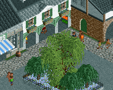
Love it, it looks so Scottish, so many great touches across the board really selling it.
I know the roof colours will be spot on, but just a bit of variation across them would improve this in the realms of RCT. I have no doubt in real life these towns have the same colour roofing, but in isometric land it's a sea of the same tone. A birds nest, bit of moss maybe some broken tiles would help, but I think the biggest impact could be another grey just to give variation.
Very good improvement! The old version has some nice elements missing from the new version, but overall it's better! Looks like an expansion of Zippo's. Love it!
Beautiful screen.
great improvement! very interesting to see the process!
Ta! I had the same concern about all the grey roofs J K. Might hit you up separately to get some palette advice (that's one of the newfangled things I've not attempted to break into yet!)
Substantial improvement. Opening up that plaza area was a true pro-gamer move.
Sure thing pal, newly discovered it myself thanks to a run-through from Josh but if you're a Photoshop user it's so easy. If not I'll just do it for you.
beautiful, big upgrade from the older version too. Great little courtyard, lovely use of flower colors and foliage. new path type is way better. love it
So cozy. The new version feels so much more dynamic and off the grid with a great diagonal sightline.
Great update; I love how you managed to make it look cozy and authentic, with various buildings scattered at different places and angles, while keeping a clear path and sense of direction for guests and viewers. Next to the roof colours that others mentioned you could also try to spice up the texture and colours of the building walls that are now a bit homogeneous. Perhaps the fieldstone objects could be a nice fit?
wow, that is great
Great improvement. Love the diagonal sightline into the plaza.