Screenshot / Phuong Hoang & Rong
-
 24-October 25
-
 Yangshou Valley Thrill & Water Park
-

 12 of 12
- Views 679
- Fans 0
- Comments 18
-
 Description
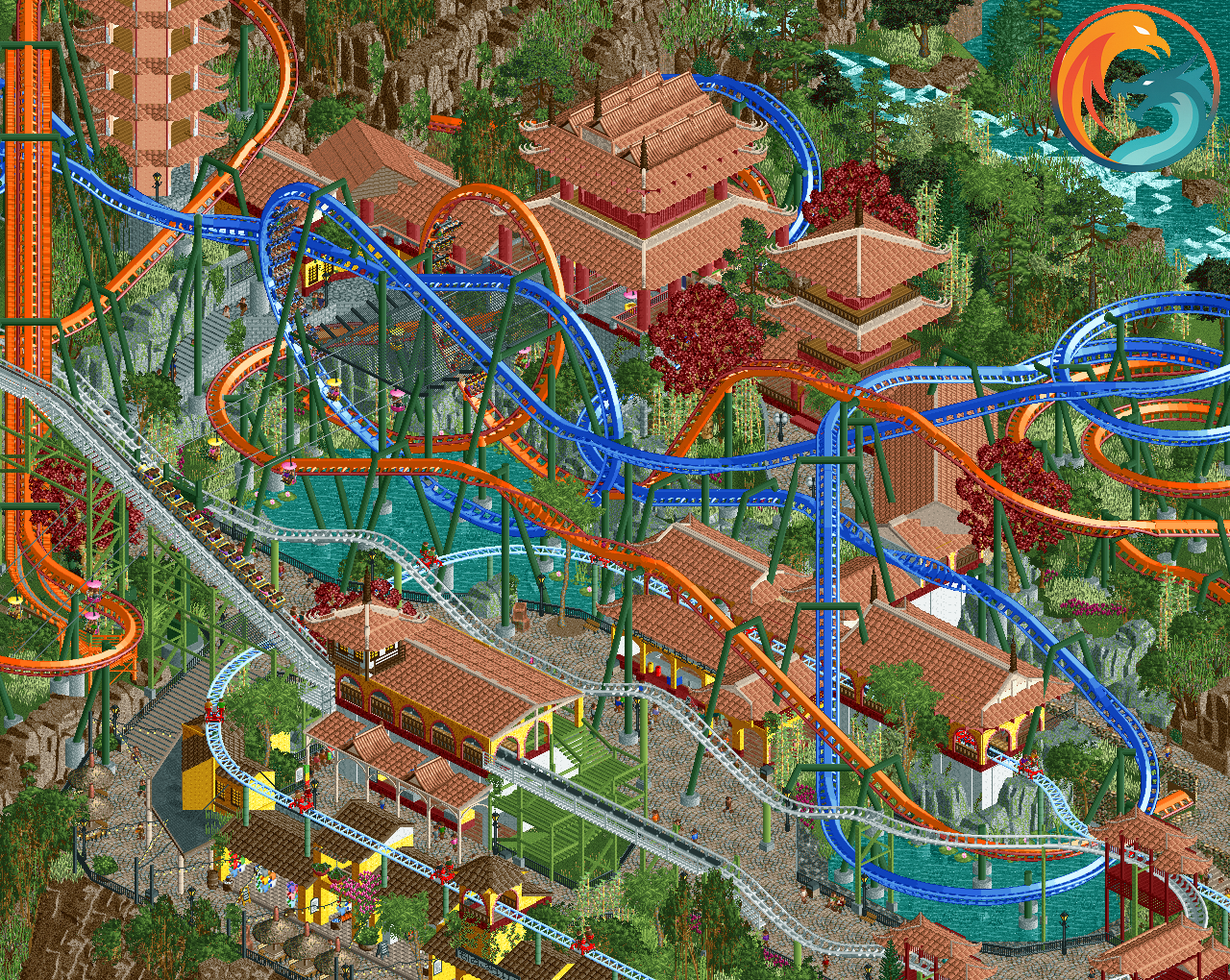
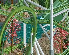
Two ancient forces have awakened in Yangshuo Valley Thrill & Water Park. From the mists of myth rise Phuong Hoang, the blazing Phoenix of Fire, and Rong, the mighty Dragon of Water.
Dare to soar on twin dueling flying coasters that intertwine through temples, waterfalls, and fiery caverns in an epic aerial showdown. Feel the heat as the Phoenix dives from the heavens, or glide with the Dragon as it twists through rushing torrents below.
Choose your side: Ride the Phoenix or tame the Dragon. Two legends. One sky. Endless thrills.
Now open exclusively at Yangshuo Valley Thrill & Water Park. -
 Full-Size
-
 No fans of this screenshot
-
 Tags
Tags
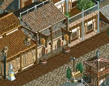
Pretty spectacular, I love it! Look Scoop I'm not too impressed with the peach roofs, but I'm unsure which colour would be better without making it duller - otherwise black would be the obvious choice. But of an out of the box option, but Steve-tan could be interesting.
Very strong but I think all the buildings can be upgraded with some pillars to break the flat faces up considerably. 1x16 work on the buildings will go hard here.
Very nice work Recurious! I agree some more details would do this good, but already dig the atmosphere here, I actually really like the color scheme..
Great work so far
This is my immediate suggestion.
Dense.. wow!
I agree on the roof colors.. darker like Scoopy said would be nice. Heck, even a 2nd color could mix things up. Even if it's just a different red.
Love it! Remarkably clean considering how much is going on. Really like the landscaping and foliage. I'll wade into this roof debate... I like the peach but perhaps there's a little too much of it. Perhaps try changing the colour of the roof of the white coaster station?
really cool, very dense, very fun. obviously great work, but the colors aren't quite vibing - personally i think i'd change the coaster colors first if poss to something more harmonious. i understand why they're blue and orange, but that clashes a little, and neither of those work great with the green supports.
This is such an exciting project with the bold landscaping you've shown and now these duellers. Love it!
I'm with Turtle on changing the coaster colours rather than the roofs - peach tile roofs makes sense for a Vietnam theme. You could try bright teal for 'water' and a dark red for 'fire'?
I keep looking at this screen, going back and forth if I like the colours. Honestly... part of me thinks they're great as they are.
I agree with Posix the colors aren't the "problem" here. I think the screen is fine actually, it's something I trust will look clearer in-game when the movement and context help. The density definitely feels like it would be realistic for this type of park, and there is nothing here that feels immersion breaking per say.
However, if you are trying to optimize this as a whole, I would recommend removing the jet coaster and pedal ride entirely and focus on the dueling coasters. That would make the visual hierarchy of the area much more clear and allow you to channel the sightlines and archy to frame that ride better. I don't know if you should actually go to this length or not without seeing more, and really you know best what you are trying to accomplish with this project. But if you were to follow a classical parkmaking approach this is what I would personally do to improve this area.
Thanks everyone for the comments. Quite an interesting mix of reactions! Personally I actually thought this was one of the strongest screens I have shown of this project, so it is interesting and for me also a little bit surprising to see that it also appears to be one of the most critiqued ones. I don't think that is a bad thing though! It's been great seeing the feedback come in!
I don't really want to come across as defensive, because I do appreciate the feedback and am trying to make improvements based on it. But I thought it would be good to lay out some of my thought process and decision making, as it may help in the discussion and it may also show a little bit some of the dilemma's I am facing.
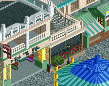
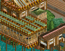
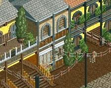
- The peach roofs: the architecture here is very loosely based on the "perfume pagoda" near Hanoi in Vietnam and that is where the peach roofs come from. I could change it, but the park consists of several different Asian countries, and I worry a bit that if I mix up the colours of the roofs more here, this area may not be distinct enough from the other areas (although there are other distinct elements). I know that roof colour shouldn't be the only distinguishing feature, but I do think because the game is in isometric the roof colours do have a large influence in the overall vibe and feeling of the area. I think changing the colours on the pagoda on the left could definitely help, so I will play around with that a little. I did try changing the roof of the jet coaster station colours to be brown to match the archy below, but I didn't really think it looked better, so I did reverse that change again.
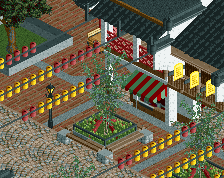
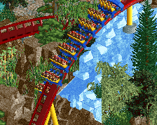
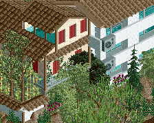
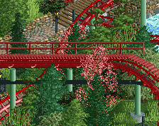
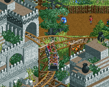
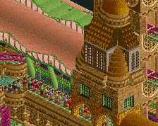
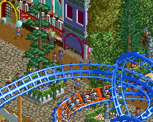
- The coaster colours: I tried some different colours for the coasters as was suggested. I didn't really specifically find a combination that I am really sold on yet, but I have attached some of the combinations I liked most below:
What do you guys think of any of these combinations? Maybe some of them also in combination with a change in the support colours would look better?
- Adding more details to the buildings: I will see if I can add some more details. I feel like I maybe got a little to excited to post a screen and rushed a little bit with the details in the end. So I will make sure to add some more details to the facades! Good points!
@posix and @g force Totally no offense taken to the negative feedback! I don't take it as ill spirited and I think it is good to get a different perspective. It will also help me improve my game, so I think it is a good thing. I can definitely see a bit where you are coming from, this is probably one of the busiest areas in the park and it is really kind of a hub for multiple rides that actually stretch out further into the park into different less busy areas (the skycycle, the jet coaster, the sky ride) with the flying coaster being the centerpoint of this area itself. I do see how it can be a bit much, especially the jet coaster is maybe a bit over the top and I actually considered removing it myself, but I also got a little bit married to the idea of having an old school jet coaster in the park.
I do think that in the broader context of the surroundings it doesn't look as crowded as on this screen, and it is ofcourse also not unheard to have a lot of densely layered rides in a park (thinking of Phantasialand or Blackpool pleasure beach here). I think especially given the context of this park (where this section is on a mountain ridge, so there isn't a lot of space) it makes sense to have multiple rides close together and stacked on each other. Having said that, I definitely see the concerns you guys raised, so don't take this as me just waving the critique away and not listening to it! I will definitely also try to keep it in mind in other sections of the park which are less developed where this problem may also occur.
The only thing I do kind of disagree with is the comment on the supports through the roofs. Assuming you are talking about the coaster and not the skycycle this is only really present on one section of the coaster (mostly on the right hand side of the screen where the blue track goes over the buildings, and 1 support on the left on the orange track), but this is also quite common in real life. If you look at Taron or FLY at Phantasialand they have a lot of supports that poke through the roofs of buildings in their themed areas, and I don't think anyone would argue that Rookburg or Klugheim are ill composed because of that. Hope that doesn't come across as defensive, I definitely see where you are coming from with the rest of your comment!
Thanks for feeding back. Very good to read your perspective.
I had almost suggested to remove the jet coaster myself, but then felt it would be sad to see such a sweet ride go, especially because "calmer" rides like this one benefit so much from being as multi-integrated as you have achieved here. Still, like you say, the area is a bit too busy. I wouldn't change it though. It's too much work that would be lost. I would just make a note about it somewhere in the back of your mind, and move on. I wouldn't let this taint your pride of the project either, that it should be "flawed" in any way or such thinking. Just a feedback that existed and that you may consider.
On the colour options: I like #2 best as it looks the happiest to me. But I also don't think this should be a question of you making options and doing what people tell you to. You should trust your artistic intuition and let it grow naturally, and not bend it (I know you're not doing that, just saying).
On the roof piercing: You are right about PHL. But perhaps you could design it so that it's possible to see the roof had to be opened to allow the support to go there, if that's not too much. Just to signal the intentionality. If a support goes straight into theming, it looks like there was no design dialogue here, and just a misfortunate happenstance. Better yet I think would be to conceive a design and overall macro that cleverly integrates both supports and theming. Done in such a way that where one building ends, a big support tree can grow from, framed with planters around it if you will. That's what I meant with the coherence that's missing for me, if supports just go down onto things. And I know that's not easy to do, and can even stifle design and building flow, if you're feeling you have to overthink everything about your composition. Ideally you can develop aiding techniques that allow you to quickly pin point support ends once a layout is done, kind of like a preview with say a barrel object where supports end, without having to do the full custom supports yet, and then arrange and design your buildings and other park features accordingly.
I'd def go for option 3 or 4 for the coaster colors, as I like these combos with the support colors way better. And it is way more easy on the eye, looks less disturbing/messy.
Other than that, lovely screen. Most stuff has been pointed out already. I think getting rid of the Togo would solve a lot as it kinda steals the show from the flyers.