Crazy, I was just thinking about this park today and hoped you were still working on it. Glad to see you’re still making progress and very excited for the eventual release!
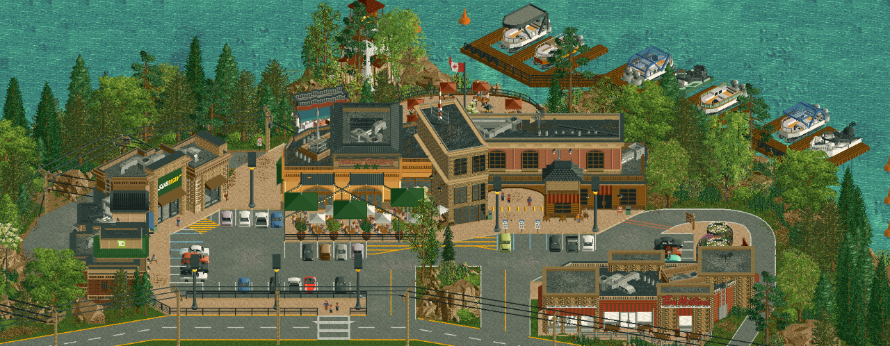
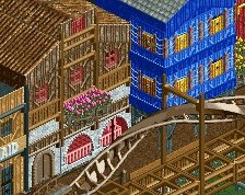
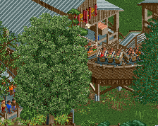
The heavy diagonal layout is really cool. Very unique and visually interesting. Foliage also looks top notch. And the screen is packed with details big and small that are really impressive - the boat docks, how realistic that strip mall looks, and the hugely impactful yet restrained use of the half diagonal.
My only criticism is that I agree the restaurant sign could use some more contrast. I actually didn’t see it until I read In:Cities’ comment.
Sorry to be the dissenting opinion, but having this much on the diagonal makes everything feel panacke flat and 2D. I think the biggest culprits are the buildings on the righthand side. Needs more depth and diagonals tend to be the opposite of that for me.
Having said that, the patio infront of the tan building helps break up that facade nicely, and the curved storefronts on the left are really cozy. Good blend of diagonal/half-diagonal/normal. (is that what we call not diagonal buildings? I have no idea!)
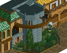
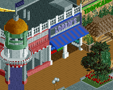
Everything in this screenshot is fantastic except for one small bit. The brick half diagonal structure centered in the thumbnail, right next to the archyway.
Just feels a bit unnecessary, and under detailed compared to the rest of the archy. Doesn't really have a clear purpose or intent compared to everything else which absolutely excels in that department.
i think i agree with otter although this is obviously still absolutely brilliant. the orange and the dark green on the main building work so well together.
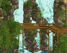
the rocks on the backside pic look slightly flat texture wise, might need a little more grit on them?
 22-March 26
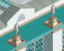
Your diagonal game is getting so strong
so excellent.
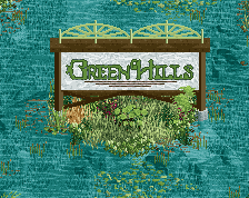
A small suggestion would be to use a lighter hue for the sign text on the main Eatery - it desperately needs some contrast for legibility.
Another fun idea could be to subtly darken the shade of the path underneath the archway area.
The heavy diagonal layout is really cool. Very unique and visually interesting. Foliage also looks top notch. And the screen is packed with details big and small that are really impressive - the boat docks, how realistic that strip mall looks, and the hugely impactful yet restrained use of the half diagonal.
My only criticism is that I agree the restaurant sign could use some more contrast. I actually didn’t see it until I read In:Cities’ comment.
Can’t wait!
Sorry to be the dissenting opinion, but having this much on the diagonal makes everything feel panacke flat and 2D. I think the biggest culprits are the buildings on the righthand side. Needs more depth and diagonals tend to be the opposite of that for me.
Having said that, the patio infront of the tan building helps break up that facade nicely, and the curved storefronts on the left are really cozy. Good blend of diagonal/half-diagonal/normal. (is that what we call not diagonal buildings? I have no idea!)
Everything in this screenshot is fantastic except for one small bit. The brick half diagonal structure centered in the thumbnail, right next to the archyway.
Just feels a bit unnecessary, and under detailed compared to the rest of the archy. Doesn't really have a clear purpose or intent compared to everything else which absolutely excels in that department.
Really amazing work!
i think i agree with otter although this is obviously still absolutely brilliant. the orange and the dark green on the main building work so well together.
the rocks on the backside pic look slightly flat texture wise, might need a little more grit on them?