(Archive) Advertising District / Batman: Night Flyer
-
 05-May 06
-
 JDP
Offline
Well anyone can tell that your an experinced LL play, for the fact that you have some 2x2 and doors for windows. Other wise i find your buildings over detailed and ugly, in a way. And how is this bat man? It looks like an old mansion from the 1800's...
JDP
Offline
Well anyone can tell that your an experinced LL play, for the fact that you have some 2x2 and doors for windows. Other wise i find your buildings over detailed and ugly, in a way. And how is this bat man? It looks like an old mansion from the 1800's...
-JDP -
Xcoaster Offline
I think it looks pretty good, though a bit unfinished. I like what you did with those poles. I'm getting the Wayne Manor vibe. It reminds me of this:
http://www.themepark...w2006/wbmw5.htm
Although that's supposed to by Arkham Asylum, not the mansion. -

Fatha' Offline
To give it a more dark feeling, I probably would have used darker colored rooves, but I didn't pick them in the editor and im too lazy to go back. -
 FK+Coastermind
Offline
i have to say i like it. i might go back and re-do the lower rooves with a darker color but thats just me. look good. especially for someone who is normally RCT1.
FK+Coastermind
Offline
i have to say i like it. i might go back and re-do the lower rooves with a darker color but thats just me. look good. especially for someone who is normally RCT1.
FK+Coastermind -
Fatha' Offline
http://www.rcdb.com/...6.htm?picture=2
As far as supports go, I think the ones in the screen are on point. And the queue is def unfinnished. -

Corkscrewed Offline
Pffffft. It totally sucks. In fact, Stefon, you should just give up right now. Don't even participate in H2H. People are totally going to laugh and stuff. And um... you won't like that. So um... totally don't play H2H. At all. 'K?
Cool.
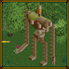
And that one shrub on top of the support looks weird. I know what you're going for, but it looks weird.
Just another thing people will totally laugh at you for, which is why you should drop out of H2H right now. Like immediately. Go play RCT 3. -
 mantis
Offline
I like the tunnels made out of the land blocks, but I don't like the FDS-crater land effect minimised like that. It fucks with my eyes. Would be cool to see a bit less isometric-collapse-look. If that means anything to you.
mantis
Offline
I like the tunnels made out of the land blocks, but I don't like the FDS-crater land effect minimised like that. It fucks with my eyes. Would be cool to see a bit less isometric-collapse-look. If that means anything to you.
Otherwise it looks great. Sucks I won't be able to look at it. -
 Turtle
Offline
Yeah, i'm with mantis here. The landscape looks a little too steep, for me. I'd prefer it if some of it flowed a bit better, with little dirt faces in other places.
Turtle
Offline
Yeah, i'm with mantis here. The landscape looks a little too steep, for me. I'd prefer it if some of it flowed a bit better, with little dirt faces in other places.
It doesn't look bad, I just think it could look better. -
 Ride6
Offline
Ride6
Offline
Pffffft. It totally sucks. In fact, Stefon, you should just give up right now. Don't even participate in H2H. People are totally going to laugh and stuff. And um... you won't like that. So um... totally don't play H2H. At all. 'K?
Cool.
And that one shrub on top of the support looks weird. I know what you're going for, but it looks weird.
Just another thing people will totally laugh at you for, which is why you should drop out of H2H right now. Like immediately. Go play RCT 3.
LMAO, You're afraid, very very afraid.
Ride6 -
 Toon
Offline
I have to agree with Mantis & Turtle on the landscaping front. Using too many 1/4 tile land blocks can be a very dangerous game in terms of overall aesthetic. I always prefer if the majority of the landscaping is done the old fashioned way with some accenting done with the 1/4 tile blocks. You definitely need to break up that pattern a little bit as it does become too optically dominating on the screen. The rest of it is beautiful tho. I love what you're doing with my babies
Toon
Offline
I have to agree with Mantis & Turtle on the landscaping front. Using too many 1/4 tile land blocks can be a very dangerous game in terms of overall aesthetic. I always prefer if the majority of the landscaping is done the old fashioned way with some accenting done with the 1/4 tile blocks. You definitely need to break up that pattern a little bit as it does become too optically dominating on the screen. The rest of it is beautiful tho. I love what you're doing with my babies I'm sure the coaster will be very much to my liking as yours always are.
-

PBJ Offline
Holy shit you're gonna be dangerous in H2H lol. Fantastic landscaping.
-X-
LOL
---
Fatha' you just made me planning a design
your 3 screens don't feel like fatha work. can't say why...
screen 2 and 3 are far out the best. the building is nice done as well but can't get a good feeling with it...
but i must say good work. great use of land-bb and nice use of the greenness...
can't wait to see more.. -
 laz0rz
Offline
laz0rz
Offline
You need to look at more RCT2 parks, methinks.Damn, That's the best RCT2 work I've ever seen.
-
 Emergo
Offline
I´m sure you´ll very soon (too soon?, LOL!) be excellent at RCT2 as you are in RCt1.
Emergo
Offline
I´m sure you´ll very soon (too soon?, LOL!) be excellent at RCT2 as you are in RCt1.
But how some people can admire that "landscaping" really puzzles me.....
To me me it just looks awfully unnatural, "gritty" and forced, not flowing at all...
Think even most amusement-parks do better (although still lousy) if they man-made try to recreate "landscaping".
Well, Turtle, Mantis and Toon already gave their 2 cents on that.....
Other than that I think it's looking very good and promising.
So, really looking forward to more. -
 Carl
Offline
The coaster and theming look good, but the color scheme is what I really like!
Carl
Offline
The coaster and theming look good, but the color scheme is what I really like!
A suggestion might be to put a single window on each side of the uppermost section of that tower at the top of the screen. I guess it depends on the alignment of the walls, though, I dont know what window objects you have. Looks like you would need 1/2 of 1/4 windows to do that.Edited by ride_exchanger, 10 May 2006 - 04:28 PM.


Tags
- No Tags