(Archive) Advertising District / Marriott's Project "Triple X"
-
 10-October 06
-
 zburns999
Offline
My personal favorite part of the screen is the set of stairs near the bottom center of the screen. Freaking great. The white and blue works so well together.
zburns999
Offline
My personal favorite part of the screen is the set of stairs near the bottom center of the screen. Freaking great. The white and blue works so well together. -
 RCTNW
Offline
JDP - Thanks
RCTNW
Offline
JDP - Thanks
Genius638 - hmmmmm. There might be!
zodiac - You are one sick puppy!
tracidEdge - umm ok, thanks!
Xcoaster - Thanks. I do try!
zburns999 - Thanks (I think)
twister12 - Thanks -
RCTNW
Offline
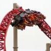
Small update today.
The below screenshot is that of the "Tidal Wave". The themeing is pretty basic as I wanted to keep the original look and feel.
Thanks
James - RCTNWEdited by RCTNW, 19 November 2006 - 10:49 AM.
-
 X250
Offline
I really like it, the station is simple but it does its job. The wave architecture is very neat, nice one mate. Keep it goin!
X250
Offline
I really like it, the station is simple but it does its job. The wave architecture is very neat, nice one mate. Keep it goin!
-X- -
 FK+Coastermind
Offline
i love the way this park is developing. the architecture is very good for the atmoshpere your going with. it looks like an amazingly realistic park. keep it up.
FK+Coastermind
Offline
i love the way this park is developing. the architecture is very good for the atmoshpere your going with. it looks like an amazingly realistic park. keep it up.
FK+Coastermind -
 Metropole
Offline
I love to see it when people realise you don't have to have the most complex detailed buildings to make them look good. A perfect example here, great work james.
Metropole
Offline
I love to see it when people realise you don't have to have the most complex detailed buildings to make them look good. A perfect example here, great work james. -
 Gwazi
Offline
^ Yeah, I started to learn that after looking at artist's IoE. He uses detail, but doesn't overload it. It's my kinda style.
Gwazi
Offline
^ Yeah, I started to learn that after looking at artist's IoE. He uses detail, but doesn't overload it. It's my kinda style.
-
 Jazz
Offline
I honestly can't say I'm impressed. Infact, I wouldn't necessarily call any of this no more than above-average at best. I mean, in that screen, the station just doesn't look good to me at all. The tidal wave is a neat touch, but besides that, the station is weak IMO and the foilage is below-average. Similar to Beagle's park, I don't know why it's getting so much praise. Although I understand you're going for realism, I just don't think it's brilliant by any means.
Jazz
Offline
I honestly can't say I'm impressed. Infact, I wouldn't necessarily call any of this no more than above-average at best. I mean, in that screen, the station just doesn't look good to me at all. The tidal wave is a neat touch, but besides that, the station is weak IMO and the foilage is below-average. Similar to Beagle's park, I don't know why it's getting so much praise. Although I understand you're going for realism, I just don't think it's brilliant by any means. -
RCTNW
Offline
Wow. A lot if replies for a simple screenshot.

Leighx - Thanks but the blocks are not being used for a sign.
RCTFAN - Thanks
sfgadv02 - I thought you would like it. Brings back old memories for me.
trav, JDP - Thanks
X250 - Thanks buddy. Sometimes simple just works
FK+Coastermind - Thanks
Metropole - Thanks Mark! I had been thinking about this one for a few days now and I really liked the way the ride was themed in the actual park(s). In RCT terms, it is very simple but I think it works.
Gwazi - Thanks
Jazz - Thanks for the comments and I hope you are basing the "no more than above average" comment on just this screen as I feel the rest of the project is way above just average. The station is similar to a boat house and the intent is to make it very basic (as per my initial comment when I posted the ss). Not everything things needs to be over detailed. in fact if you over detail every aspect of a park, IMO, it loses its appeal to me. Again, IMO, you need to have some basic or plain structures so that you find a good balance throughout the project. With that said, I do thank you for your comments though even if I don't agree with them.
Thanks again everyone
James - RCTNW -
 RCFanB&M
Offline
Looks nice...
RCFanB&M
Offline
Looks nice...
I'm not sure if I like the foliage...it's just that there's beach foliage and the other one are practically together. Anyway, this is still looking pretty interesting, and I like the waves thingies...keep going. -
Jazz
Offline
I appreciate you replying in a respectful manner, RCTNW, as I do think you have some talent. Although I do think you were jumping to conclusions, I can see what you're saying for the most part. However, I never said it was "under-detailed" or anything, it just doesn't look that great to me at all. Also, if you think it's better than above-average, that's fine with me, but it is my opinion, and just because you think otherwise doesn't necessarily mean you're right.
Some advice that I've learned is that if you can't accept criticism, let alone constructive criticism, you shouldn't be advertising. I'm not directing this at you RCTNW, I'm just saying this about advertising in general. -
 Genius638
Offline
Tidal Wave looks fine...excellent use of quarter tile blocks BTW. This isn't the best screenshot we've seen. true, but the park overall I believe is well above average!
Genius638
Offline
Tidal Wave looks fine...excellent use of quarter tile blocks BTW. This isn't the best screenshot we've seen. true, but the park overall I believe is well above average! -
RCTNW
Offline
I honestly can't say I'm impressed. Infact, I wouldn't necessarily call any of this no more than above-average at best. I mean, in that screen, the station just doesn't look good to me at all. The tidal wave is a neat touch, but besides that, the station is weak IMO and the foilage is below-average. Similar to Beagle's park, I don't know why it's getting so much praise. Although I understand you're going for realism, I just don't think it's brilliant by any means.
You know, I have no problem with constructive criticism . However what part of "the station just doesn't look good to me at all. The tidal wave is a neat touch, but besides that, the station is weak IMO and the foilage is below-average" was constructive or any suggestions on how to make it better.
No worries though
 dang boy great work there


Tags
- No Tags