(Archive) Advertising District / Dump-Place
-
 19-April 07
-
 Scoop
Offline
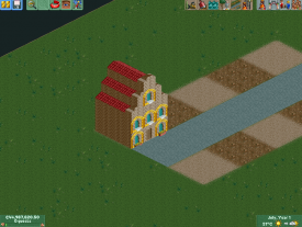
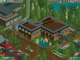
Bc i like the purple building in the secound screen but the other building is just plain bad. anyways as said before you need to work on all sides of the buildings unless you have a facade which you don't. keep working
Scoop
Offline
Bc i like the purple building in the secound screen but the other building is just plain bad. anyways as said before you need to work on all sides of the buildings unless you have a facade which you don't. keep working
here is another instalment of my park Charleston gardens.Attached Thumbnails
-
-
 Xeccah
Offline
Xeccah
Offline
blahblahblah
Your getting better. Try using blocks instead of walls to build. Look at google, pick a building, and build it.
Oh, By the way.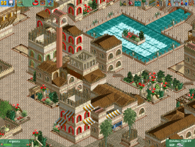
-
 A.S.Coasters
Offline
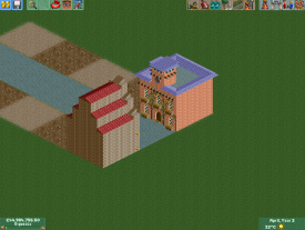
MCI it doesn't look bad, definitely mix up the buildings though. Something about the little bridge over the path reminds me of a lot of the buildings in Busch Gardens Williamsburg, where did you get inspiration for that?
A.S.Coasters
Offline
MCI it doesn't look bad, definitely mix up the buildings though. Something about the little bridge over the path reminds me of a lot of the buildings in Busch Gardens Williamsburg, where did you get inspiration for that? -
 Fizzix
Offline
Shotguns?, not every wall needs a window, or 4 for that matter. Liking it though, gives me a really old school vibe. If you want this to be a successful peepable park, go ahead and add some benches and trash bins as well.
Fizzix
Offline
Shotguns?, not every wall needs a window, or 4 for that matter. Liking it though, gives me a really old school vibe. If you want this to be a successful peepable park, go ahead and add some benches and trash bins as well. -
 trav
Offline
I think the red you've used is too bright and as a result is sucking the atmosphere out of the screen
trav
Offline
I think the red you've used is too bright and as a result is sucking the atmosphere out of the screen -
 BelgianGuy
Offline
I wouldn't say only use blocks like shotguns says but rather a mixture...
BelgianGuy
Offline
I wouldn't say only use blocks like shotguns says but rather a mixture...
I am personally a very wall oriented builder and it never gave me the feeling I made boring buildings... you just need to give it more shape to make it stand out, add multiple stories and such, detailling and stuff to give it a distinctive look... -
 Pacificoaster
Offline
Here is my viewpoint:
Pacificoaster
Offline
Here is my viewpoint:
If you are going to use custom scenery, you should utilize the 1/4 blocks to add more depth to your architecture. Buildings made of walls are not always as great as those built with more intricate objects. Not only do walls display laziness by the builder, but it makes it more difficult for the viewer to identify the theme (for example Worlds of Fun in week 3 of H2H6). In that park, almost every building was built with the same bones and it was truly hard to depict what each area was trying to translate. Only by viewing the Read-me, did I know what each area was attempting to be.
What I am trying to emphasize is that there are many more objects available to us in this day and age, that if one is going to build with custom scenery, take the time too really get into the construction of each building so it not only identifies itself from the ones next to it, but also has a notable purpose. -
 Six Frags
Offline
I completely agree pacificoaster. That reply only strengthens why you're my favourite parkmaker at this site currently
Six Frags
Offline
I completely agree pacificoaster. That reply only strengthens why you're my favourite parkmaker at this site currently
-
 posix
Offline
MCI that's not bad at all, but you have razor sharp straight lines in your composition. Try to make them more flowing, more organic, more like water kind of. It's much more complex of course, but it's just closer to life. Smooth your park around your composition. This will require a great landscaping flexibility from you so you can adjust fillers well. You can see examples of great organic composition just by looking at the overviews here and here. If you were to fit lines through the composition like I did in your screen you would have nice smoothly flowing lines predominantly. I'd like you to try that yourself.
posix
Offline
MCI that's not bad at all, but you have razor sharp straight lines in your composition. Try to make them more flowing, more organic, more like water kind of. It's much more complex of course, but it's just closer to life. Smooth your park around your composition. This will require a great landscaping flexibility from you so you can adjust fillers well. You can see examples of great organic composition just by looking at the overviews here and here. If you were to fit lines through the composition like I did in your screen you would have nice smoothly flowing lines predominantly. I'd like you to try that yourself.
Now: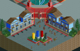
I think better would be:
hulkpower, that's pretty spectacular. Really looking forward to seeing this submitted. -
 Maverix
Offline
@ Shotguns, I think others have pointed this out, but to me what it looks like you've done is play LL in RCT2. It's not a bad screen, but there's a reason that most people here tend to shy away from NCSO or something close to it. This site has always been pushing the boundaries of what was thought to be possible in the game, creating CSO, trainers, ect and it is through this we've been blessed with many of the fantastic new accolades today. When people see NCSO they tend to see it as a step backwards rather than a step forwards. It makes you wonder why you would use old tools to try and accomplish the same job that can be done with new, better ones. You wouldn't use a horse and buggy to get to school if you had a car would you? Sure CSO might take some getting used to, but in the end, the results look much better. The screen you've showed tells me that you've got a good eye for building in this game, but that screen would look so much better if you added curves and depth, which is possible with CSO.
Maverix
Offline
@ Shotguns, I think others have pointed this out, but to me what it looks like you've done is play LL in RCT2. It's not a bad screen, but there's a reason that most people here tend to shy away from NCSO or something close to it. This site has always been pushing the boundaries of what was thought to be possible in the game, creating CSO, trainers, ect and it is through this we've been blessed with many of the fantastic new accolades today. When people see NCSO they tend to see it as a step backwards rather than a step forwards. It makes you wonder why you would use old tools to try and accomplish the same job that can be done with new, better ones. You wouldn't use a horse and buggy to get to school if you had a car would you? Sure CSO might take some getting used to, but in the end, the results look much better. The screen you've showed tells me that you've got a good eye for building in this game, but that screen would look so much better if you added curves and depth, which is possible with CSO.
I'll ecco Pacificoaster for my final thought, utilize what there is today. -
Scoop
Offline
Personally I love it. But the reason I do is because I am taking it in perspective to what his style is. He likes nsco and cso. You said it was good. I say... Keep on building
Edit: u could choose different colors however. The blue and read are horrible together. -
 Mr. Coaster
Offline
I'm sorry but I just had to do this.
Mr. Coaster
Offline
I'm sorry but I just had to do this.
Its modeled after Season 1 Week 1, and I am currently working on making it peepable -
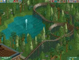
 ScOtLaNdS_FiNeSt
Offline
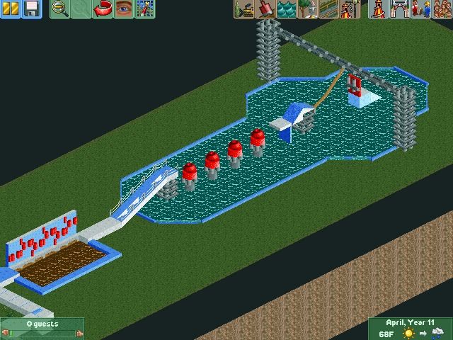
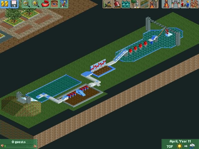
Lol Wipeout ?
ScOtLaNdS_FiNeSt
Offline
Lol Wipeout ?
Edit: its a bit obvious now i have seen the sign. I knew straight away though The big red balls, I have seen like 5 people ever get across them Would be cool if you done a wipeout park with the wipeout zone and shit.
-
 BC(rct2)
Offline
Wipeout! It looks cool!
BC(rct2)
Offline
Wipeout! It looks cool!
In the first screen I though that was a sanitarian...hahahaha -
 leonidas
Offline
Lol, I really liked it as some sort of abstract Joan Miro creation, until I discovered it was wipeout. Still good though!
leonidas
Offline
Lol, I really liked it as some sort of abstract Joan Miro creation, until I discovered it was wipeout. Still good though!


Tags
- No Tags