(Archive) Advertising District / Dump-Place
-
 19-April 07
-
 Mattk48
Offline
Im not into this kind of art, so don't take me seriously. It looks like someone threw a bunch of small blocks on the floor and went HEY, that looks like a building kinda-sorta-not-really.
Mattk48
Offline
Im not into this kind of art, so don't take me seriously. It looks like someone threw a bunch of small blocks on the floor and went HEY, that looks like a building kinda-sorta-not-really. -
 FK+Coastermind
Offline
meh, these aren't as good as the others you had. You walk a very tricky line between highly artistic structure and bunch of shapes. These pics i would say are more on the side of bunch of shapes, but the last ones you had were perfectly balanced, IMO. My true comment would be, find a way to put these into a park of some kind. Then you will be one of my favorite artistic RCT-ers
FK+Coastermind
Offline
meh, these aren't as good as the others you had. You walk a very tricky line between highly artistic structure and bunch of shapes. These pics i would say are more on the side of bunch of shapes, but the last ones you had were perfectly balanced, IMO. My true comment would be, find a way to put these into a park of some kind. Then you will be one of my favorite artistic RCT-ers
FK -
 Cocoa
Offline
I do like the way the foliage looks and hugs it though. it feels sort of like abandoned mayan work.
Cocoa
Offline
I do like the way the foliage looks and hugs it though. it feels sort of like abandoned mayan work. -
 ELVISthePELVIS
Offline
Ca me plait!
ELVISthePELVIS
Offline
Ca me plait!
I believe the structure suffers from the isometric view, because it looks much better when i focus on any specific part, but as a whole, it is quite confusing.
Maybe try and simplify it? Je ne sais pas... -
 leonidas
Offline
I especially like the colors and how it's integrated in the landscape and foliage.
leonidas
Offline
I especially like the colors and how it's integrated in the landscape and foliage.
I think the structure itself could be more clear and simplified.
But overall, I like it! -
Mattk48
Offline
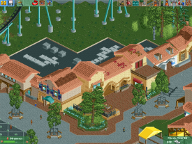
I think there's a problem with how you break up your paths. The seats with the brown under them doesn't look right.
The planters with the single trees don't work. Try scrapping them and putting a bigger planter in it's place?
Also I think that blue building with the yellow walls should have a black roof.
Not sure if you can do anything to change it but, the way the brown roof at the top of the screen, blends in with the wood dock/ patio should probably be changed
Too late now but that yellow building on the left could have been centered better
It's a good screen, I always like realism -
 Austin55
Offline
You look like a young Pac/CP6/Me/Coups/ any other realistic theme park builder.
Austin55
Offline
You look like a young Pac/CP6/Me/Coups/ any other realistic theme park builder.
There is to much path for sure, I'd try and keep the buildings closer together, and maybe even make them a taaad bit bigger, like that building on the left is great but one or two tiles to short.
Looks good dude! -
Cocoa
Offline
its technically good but it feels so lifeless. you need things inside the buildings to give them purpose, and a reason for your park to be layed out like that. the tables on the brown path just look wrong, they're too dense and they seem to not have a purpose. you may have the detailing almost there, but the park still needs to 'work'.
-
 That Guy
Offline
Having worked at Worlds of Fun for a few years in highschool, that's a very accurate screen. I don't know how close to recreation you want to be, but if you ever need an eye for the small things give me a shout. One thing you should do is use Liampie's custom trees to capture the large trees in that section of the park, because right now the cement is a little overbearing.
That Guy
Offline
Having worked at Worlds of Fun for a few years in highschool, that's a very accurate screen. I don't know how close to recreation you want to be, but if you ever need an eye for the small things give me a shout. One thing you should do is use Liampie's custom trees to capture the large trees in that section of the park, because right now the cement is a little overbearing. -
 Pacificoaster
Offline
If this is a recreation, I highly recommend looking at Google street view of Worlds Of Fun as you will create a much more accurate park. However what you have shows great promise. Keep it up bud.
Pacificoaster
Offline
If this is a recreation, I highly recommend looking at Google street view of Worlds Of Fun as you will create a much more accurate park. However what you have shows great promise. Keep it up bud. -
 Xeccah
Offline
I'm sorry, but I just can't go on hijacking your streams, pac.
Xeccah
Offline
I'm sorry, but I just can't go on hijacking your streams, pac.
 />/>
/>/>
edit: fk, don't you dare
-
 RCT2day
Offline
Not a fan of those birch tree's planters and fences or the monotony of the architecture.
RCT2day
Offline
Not a fan of those birch tree's planters and fences or the monotony of the architecture. -
Cocoa
Offline
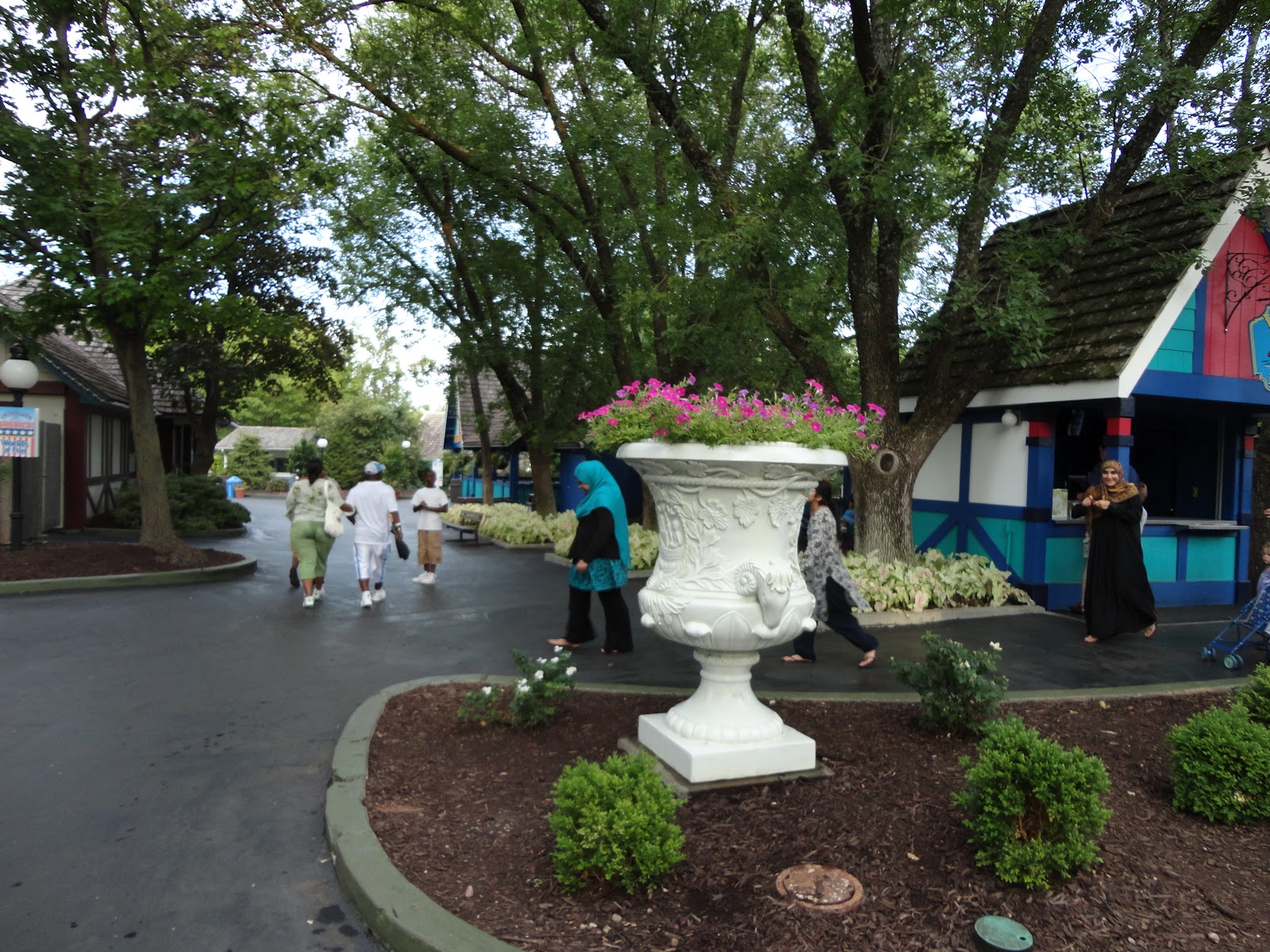
wait-that is meant to be world of fun? I'm sorry. but that was my home park. and that is not worlds of fun. I can barely place that just because of the all-stars restaurant. But nothing in that screen feels in the right place, or with the right style/atmosphere.
worlds of fun has trees that overhang the path, and, at least in the entrance, a really classy, old-school vibe.
take a look:
http://3.bp.blogspot...00/DSC00658.jpg
anyway, sorry if I'm being too critical but it is telling that I couldn't even recognize a park I've been to dozens of times. at least change the path color to the blackish tarmac.
I assume the brick on the right is the bridge to the orient? Doesn't it cross a ravine next to where the flumes are?
But anyway, I would love to see the park as no one has ever really attempted a rec before. Maybe I can help out a bit
Is it your home park or just felt like attempting it? -
FK+Coastermind
Offline
don't i dare do what Shotguns? mentioned how you better finish something, or YOU'LL NEVER BEEN NOTHING!!!

 />
/> 


Tags
- No Tags