(Archive) Advertising District / Dump-Place
-
 19-April 07
-
 inthemanual
Offline
Csw, I can't believe you're doing this without codex after the banner limit already got screwed up. Building without banners just seems like it would blow. I think you need a brighter color or two in there, but I think that would be difficult with how you're building
inthemanual
Offline
Csw, I can't believe you're doing this without codex after the banner limit already got screwed up. Building without banners just seems like it would blow. I think you need a brighter color or two in there, but I think that would be difficult with how you're building -
 Hex
Offline
Hex
Offline
Custom SLC, he made that element when I was watching his stream, personally I think it's different and it looks cool.Majordomo idk what the fuck that is....
-S.C. -
 csw
Offline
csw
Offline
I actually haven't used one banner yet. It seems I can use 4 before the limit is reached, but I'm doing just fine without them.Csw, I can't believe you're doing this without codex after the banner limit already got screwed up. Building without banners just seems like it would blow. I think you need a brighter color or two in there, but I think that would be difficult with how you're building
-
csw
Offline
Well, none of the other lamps look any better and I think they fit the atmosphere I'm going for. They're just to give some life to the paths, because just benches is boring@csw: I don't mean to be picky but the 3-globe lights aren't Roman..
-
 Majordomo
Offline
Majordomo
Offline
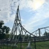
Custom SLC, he made that element when I was watching his stream, personally I think it's different and it looks cool.
-S.C.
Exactly what it is. It's supposed to be a different take on the "rollover" element common on SLCs. And a sidewinder is in the bottom-left of that screen. -
 panther33
Offline
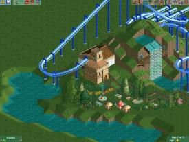
Hey guys, Im back, now in Charleston. Since Im going to Carowinds in 2 weeks, I've gotten a little bit of inspiration. What you guys think? Better? or still rusty?
panther33
Offline
Hey guys, Im back, now in Charleston. Since Im going to Carowinds in 2 weeks, I've gotten a little bit of inspiration. What you guys think? Better? or still rusty?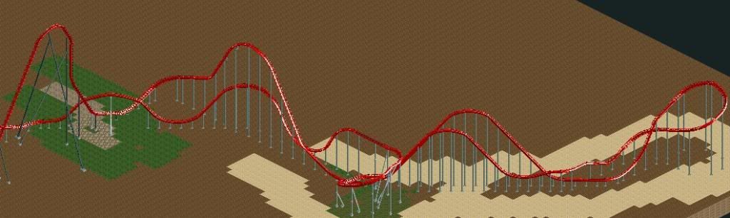
Heres Intimidator, and the land will all change in a few days! Glad to be back. -
 Louis!
Offline
Not bad layout wise. I think you could do with improving the overall flow of a lot of the elements.
Louis!
Offline
Not bad layout wise. I think you could do with improving the overall flow of a lot of the elements.
I mean a good coaster has a good layout, a great coaster has #datflow -
 Mattk48
Offline
First of all,
Mattk48
Offline
First of all,
DISCLAIMER: I don't think this is an awful layout, just needs some work
That being said, the whole thing seems the to lack flow imo. Its just not pleasing to look at. Specifically the first turn into the airtime hill, after the first drop. The other problem spot for me is the series of turns after the turnaround. That section looks incredibly forced
#butTHATfirstDROPthough
EDIT: louis posted his comment as I was typing. Took the words right out of my mouth -
 Cocoa
Offline
you have a lot of really jarring elements, like the first hill/turn, and the turn after the turnaround.
Cocoa
Offline
you have a lot of really jarring elements, like the first hill/turn, and the turn after the turnaround. -
 Sephiroth
Offline
The problem here is RCT: I can clearly see the elements you are trying to convey, but the limited selection of track pieces in this game is distorting what would be an awesome layout in real life. It kind of sucks how RCT only looks good in a certain "scale", if that makes sense, and anytime someone tries to build something more unique RCT's track pieces mess it up. Oh well, I like the layout, it just needs more gradual element transitions, which we unfortunately don't have available to us.
Sephiroth
Offline
The problem here is RCT: I can clearly see the elements you are trying to convey, but the limited selection of track pieces in this game is distorting what would be an awesome layout in real life. It kind of sucks how RCT only looks good in a certain "scale", if that makes sense, and anytime someone tries to build something more unique RCT's track pieces mess it up. Oh well, I like the layout, it just needs more gradual element transitions, which we unfortunately don't have available to us. -
Louis!
Offline
I also wonder about the pacing. The first drop is very close in height to the first hill, and the turnaround seems to be taller or the same height as the second hill.
I know B&M hyper pacing is relatively difficult to get right (you need the coaster to cruise gently over the hills but pick up speed for other elements and to keep the coaster going), it seems like you've tried to go for this, but it just seems like it's gonna be too slow. -
csw
Offline
Not a fan of the bright blue. I would choose something that's different enough from the color of the water, since you seem to be using a lot of it. I would go with a red or dark purple, perhaps?
-
 Levis
Offline
Nothing really special. Just wanted to show I'm working on something again.
Levis
Offline
Nothing really special. Just wanted to show I'm working on something again.
I wont say anything more about it though and asking me about it might dampen my motivation


Tags
- No Tags