(Archive) Advertising District / Dump-Place
-
 19-April 07
-
 Ling
Offline
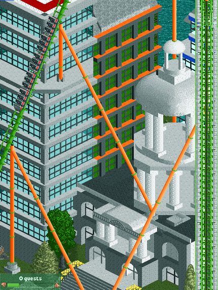
I love the coaster going over those buildings and the cliffs... but the archy (especially the one that's just black bars) is not at all pleasing to my eyes. The colors don't flow very well for the area, the iron roofs on top of the building on the left look unsupported and out-of-place, and the black and red crowning below the roofs looks like a poor attempt at detail...
Ling
Offline
I love the coaster going over those buildings and the cliffs... but the archy (especially the one that's just black bars) is not at all pleasing to my eyes. The colors don't flow very well for the area, the iron roofs on top of the building on the left look unsupported and out-of-place, and the black and red crowning below the roofs looks like a poor attempt at detail...
Sorry, I don't like it very much. -
 Cocoa
Offline
It doesn't exist.
Cocoa
Offline
It doesn't exist.
EDIT- never mind, it does exist now. Reasonably good. Bad colors, but the archy's pretty good.Edited by RaPiPo, 13 July 2007 - 01:00 PM.
-
 Panic
Offline
bernts_matte is going to be a superb parkmaker pretty soon; all of that screen's problems are things that people generally tend to fix over time (small buildings -> more cohesive architecture; window selection; symmetry, etc.) and I am sure he will too.
Panic
Offline
bernts_matte is going to be a superb parkmaker pretty soon; all of that screen's problems are things that people generally tend to fix over time (small buildings -> more cohesive architecture; window selection; symmetry, etc.) and I am sure he will too. -
Sparks
Offline

Pretty basic. Looking for helpful criticism. I'm not sure if architecture would be necessary in the second lift in Big Thunder Mountain, since its just mining tools and stuff. And ignore that 1x1 block. -
jon
Offline
Holy shit Lucas! I want more. It looks like a theme park you'd find in Japan or something. But that one tree in the middle is too green.
-
 JJ
Offline
The woodie I'm fine with. With the looping is hard to decide though. (and i haven't recoloured the ferris wheel yet)
JJ
Offline
The woodie I'm fine with. With the looping is hard to decide though. (and i haven't recoloured the ferris wheel yet)


Tags
- No Tags